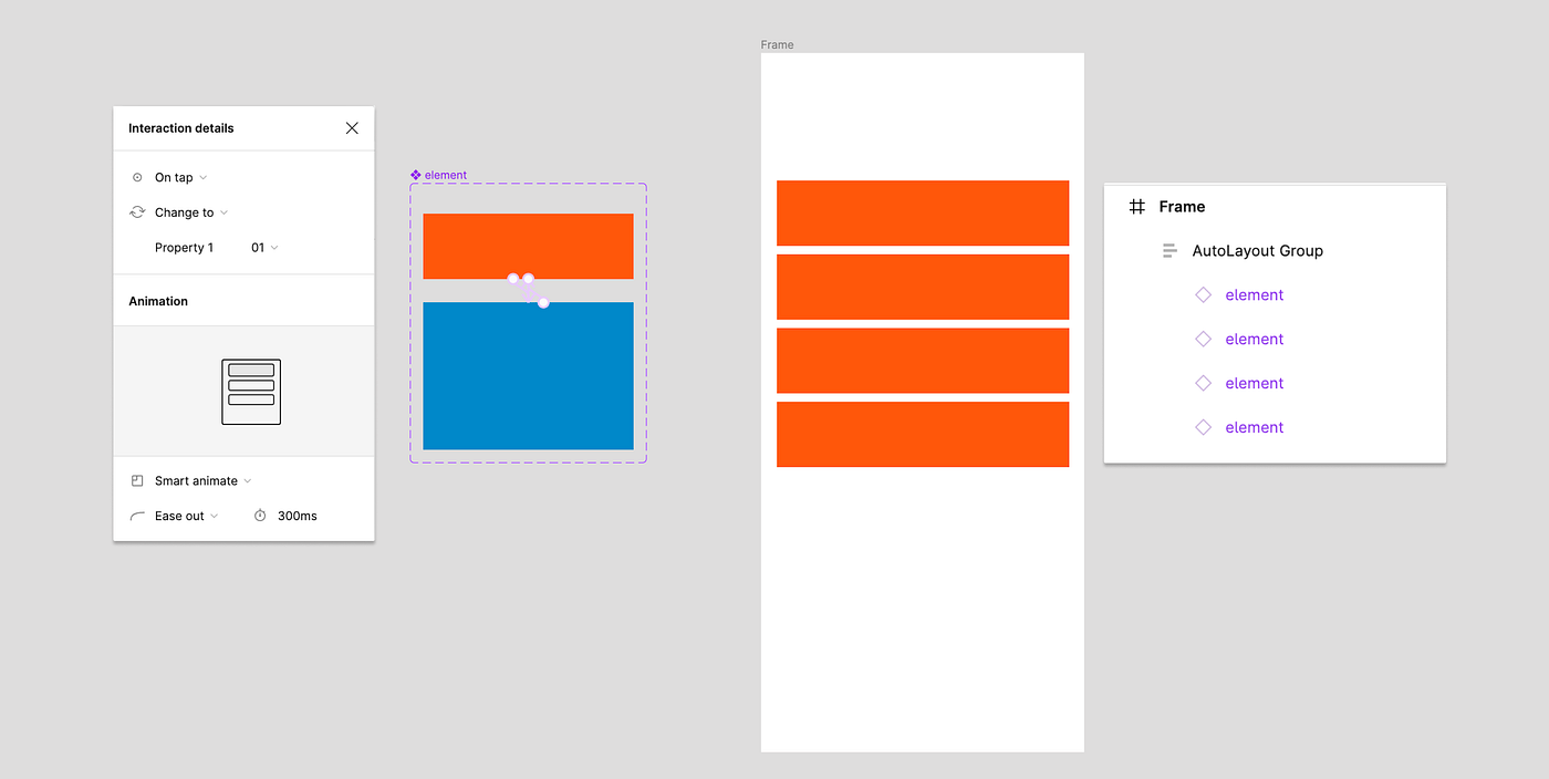
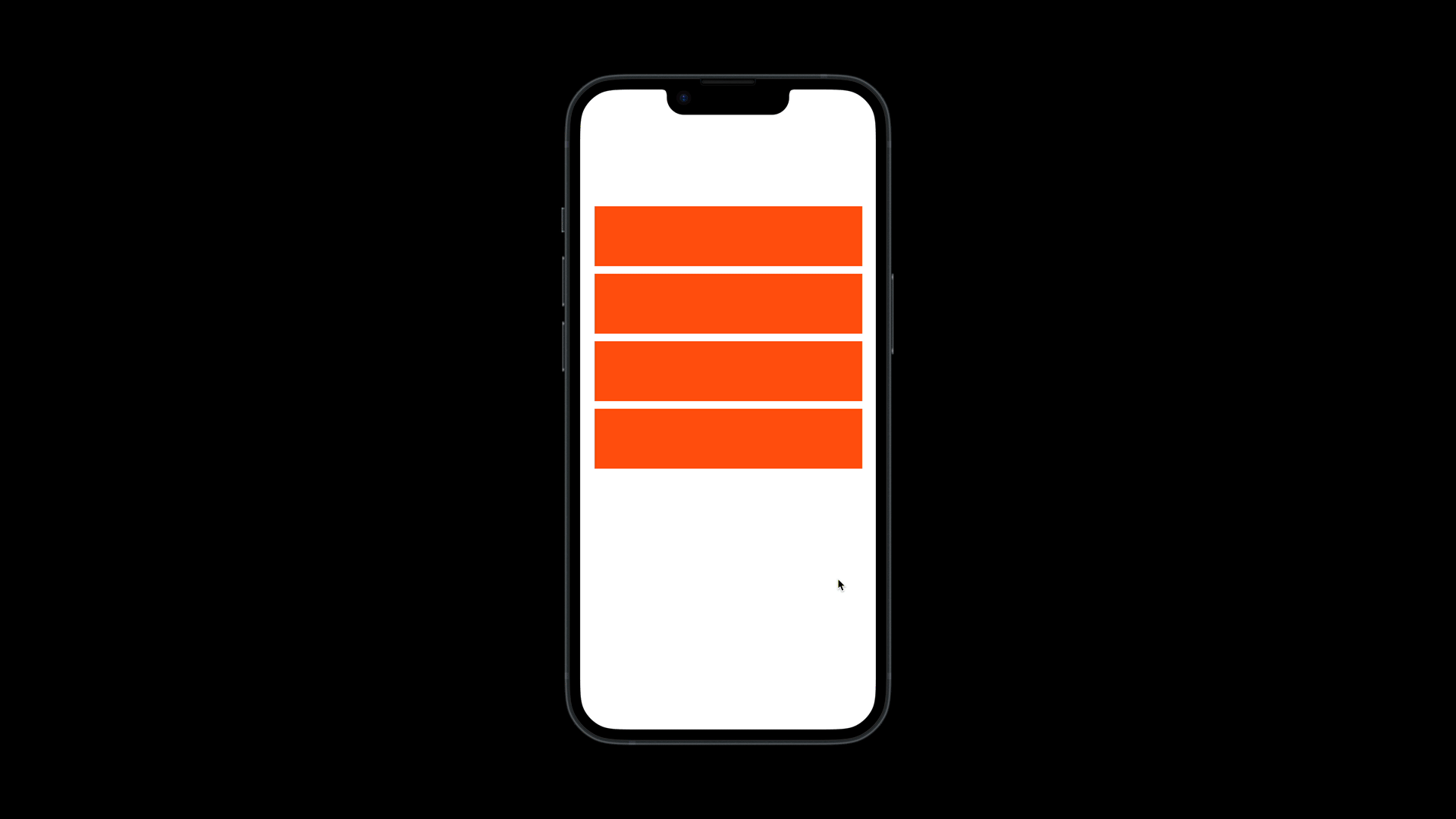
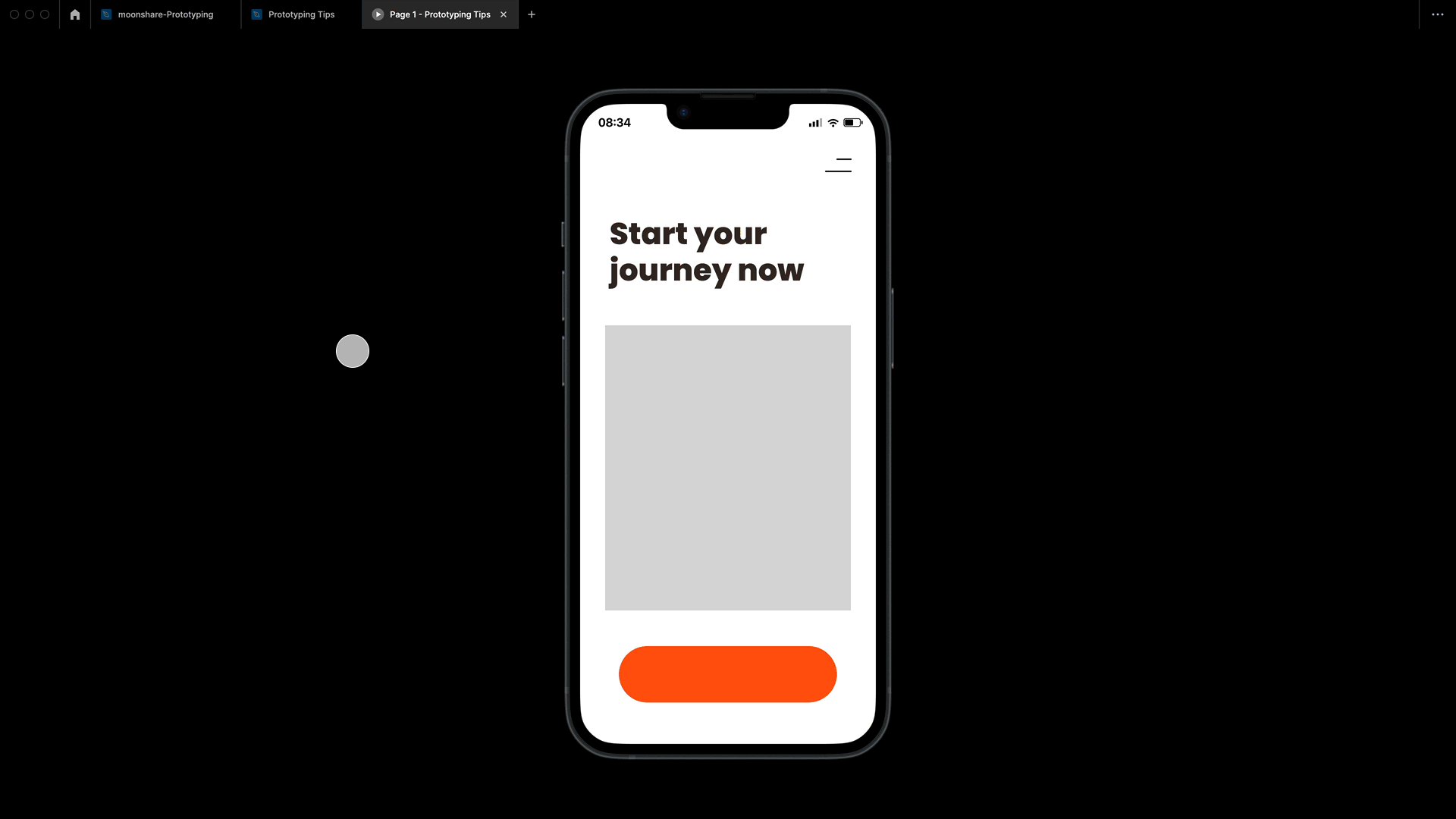
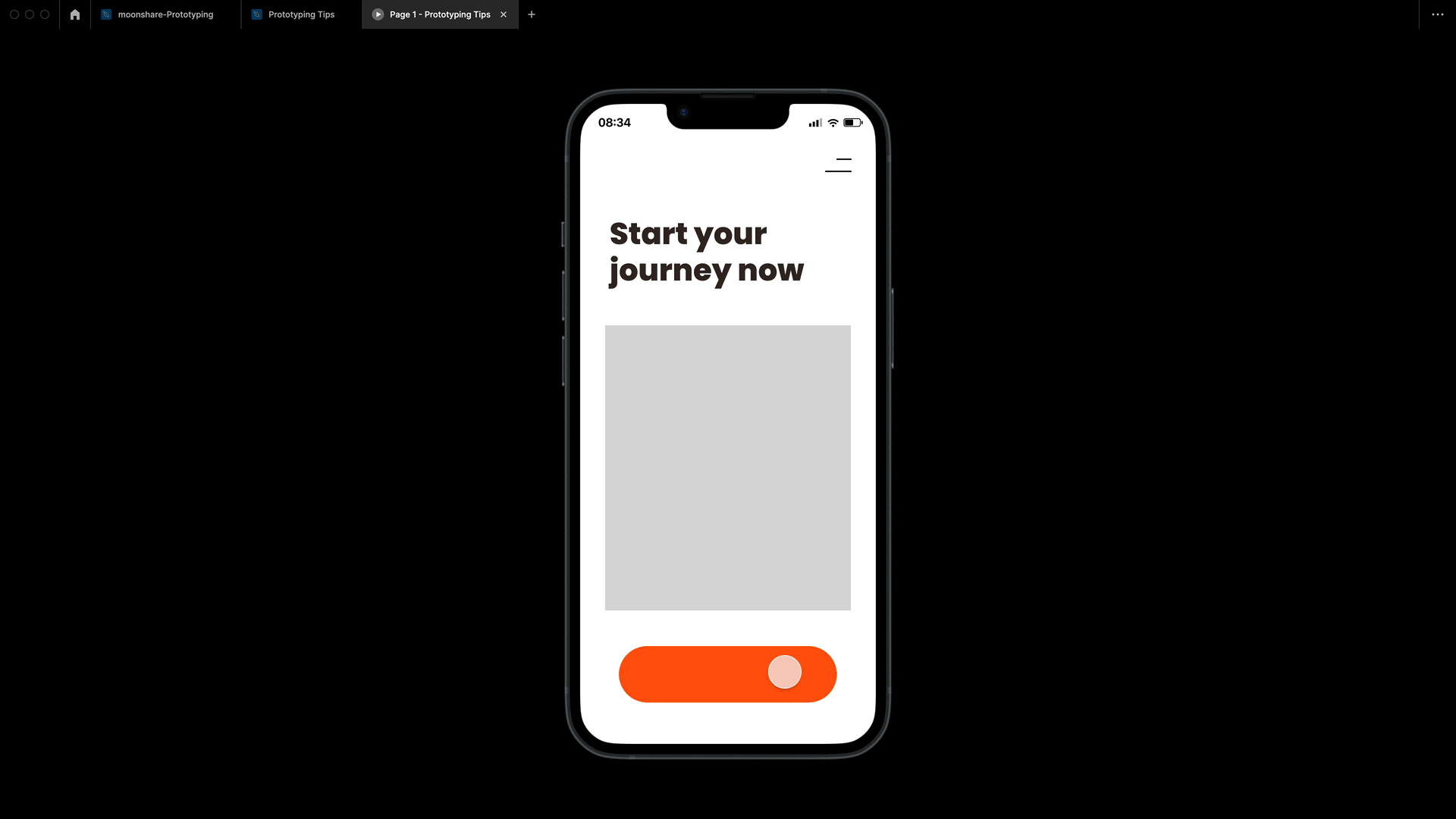
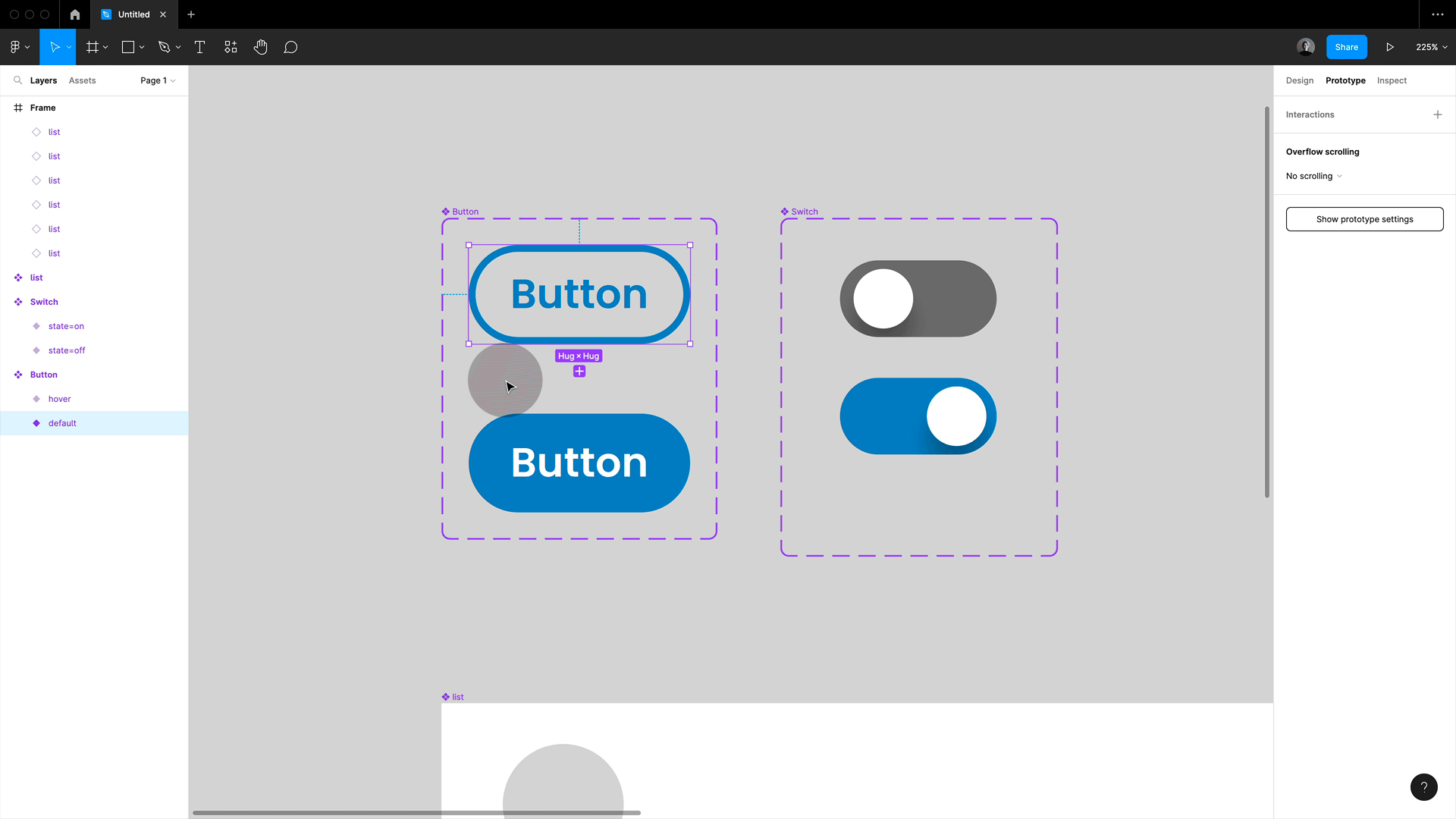
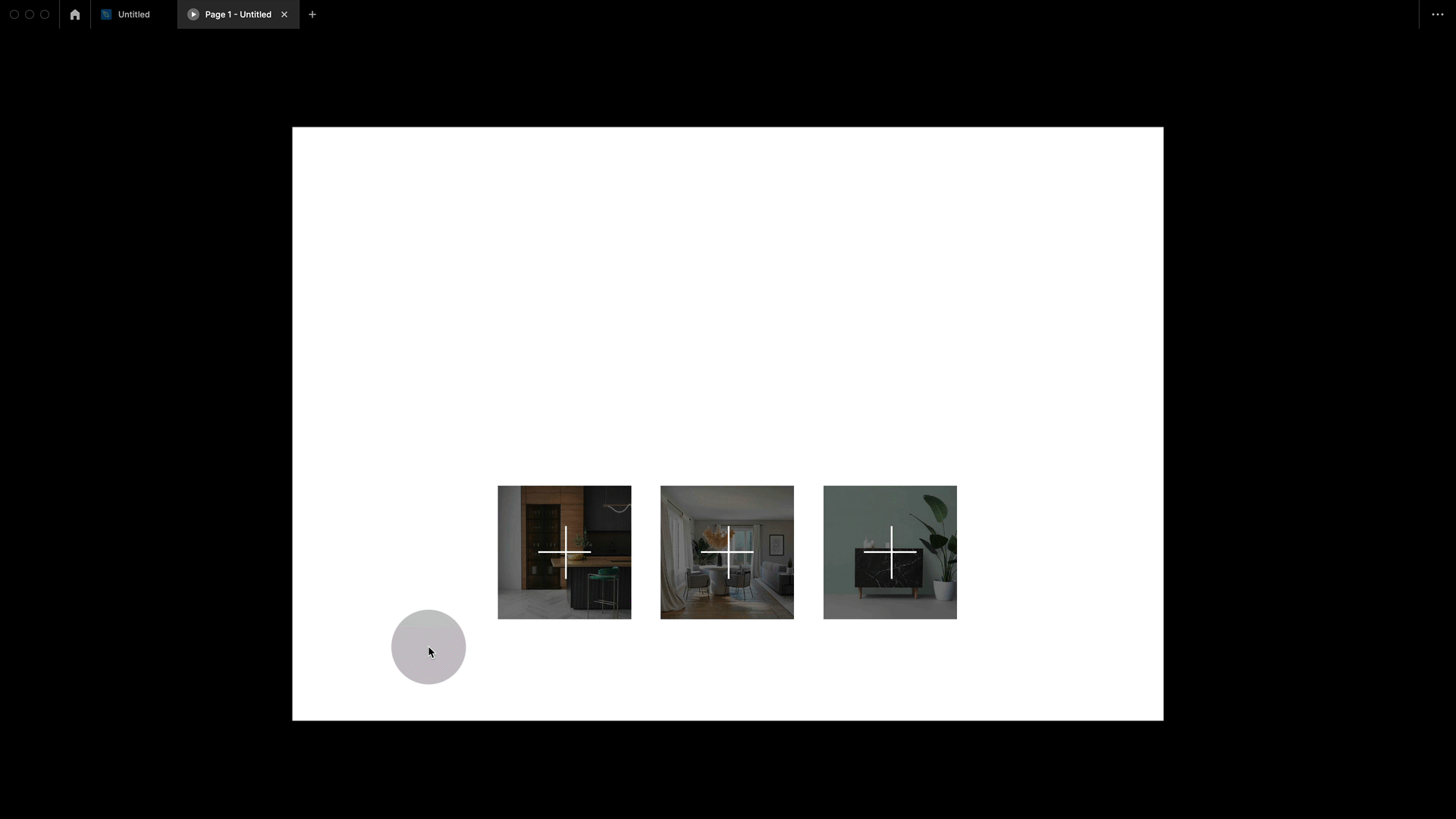
1. Auto layout and smart animated components are a match made in heaven
Let’s start with my favourite one that will surely blow mind. So Figma becomes really powerful when you combine auto layout, interactive components and smart animate. Think about it, auto layout will automatically fill up any freed space. So if you are creating interactive components with smart animate, and later package the instances in an auto layout frame, then that lets you play with different sizes. The perfect method for designing things things like accordions.
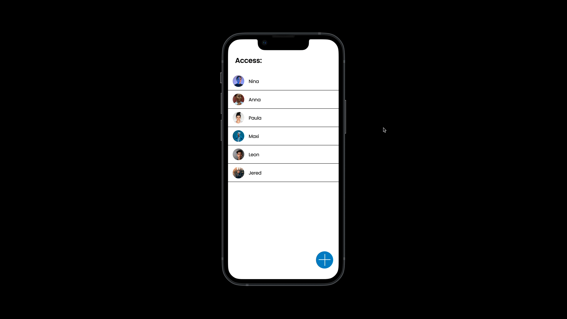
Simulating Delete:
You can also combine several states and create this nice effect of deleting items on drag. The key to making this work is to set last variant to a height of 0, everything else will move up, and it looks like the instance was deleted. It is still there but with a height of zero hence invisible.
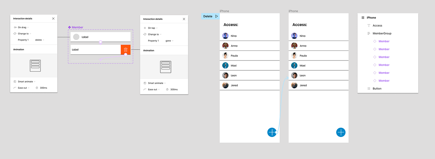
💥Tip: Figma does not let you use heights of 0, so you would need to go for 1px. That’s fine too, but if you set the height to 0,004 or similar, then Figma is forced to round down to 0
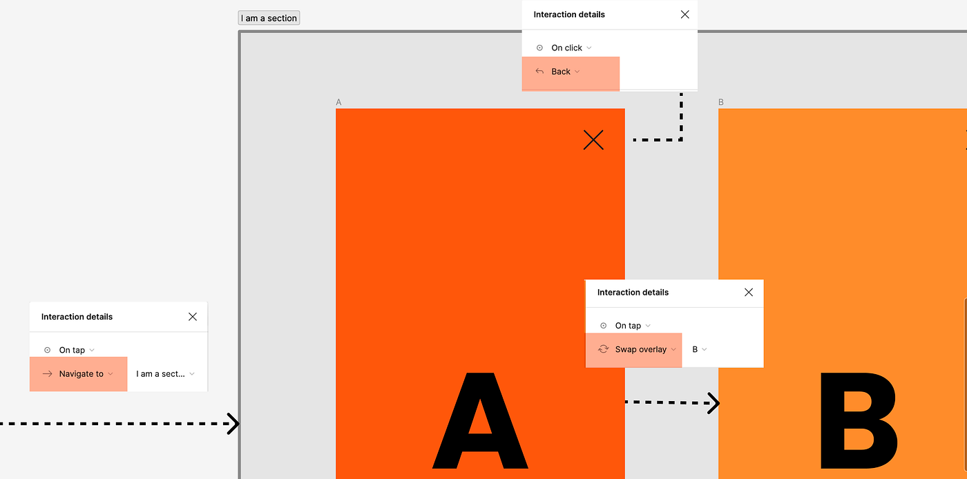
2. Stateful design with sections
Sections in Figma are a great way to organize our design better and create stateful design.
Without Sections:
So let’s say that our visitors enter a process, they already go through steps (frame) A and B and leave at C. With a standard setup in Figma, we would always jump back to A. In real life, this would be really annoying, e.g. adding all choices and personal details again. Also, our prototyping is getting very messy with lots of connectors. And note how we are forced to choose a screen to go back to when closing the process, but we would want to go back to where we came from, which might be a different page with the same CTA.
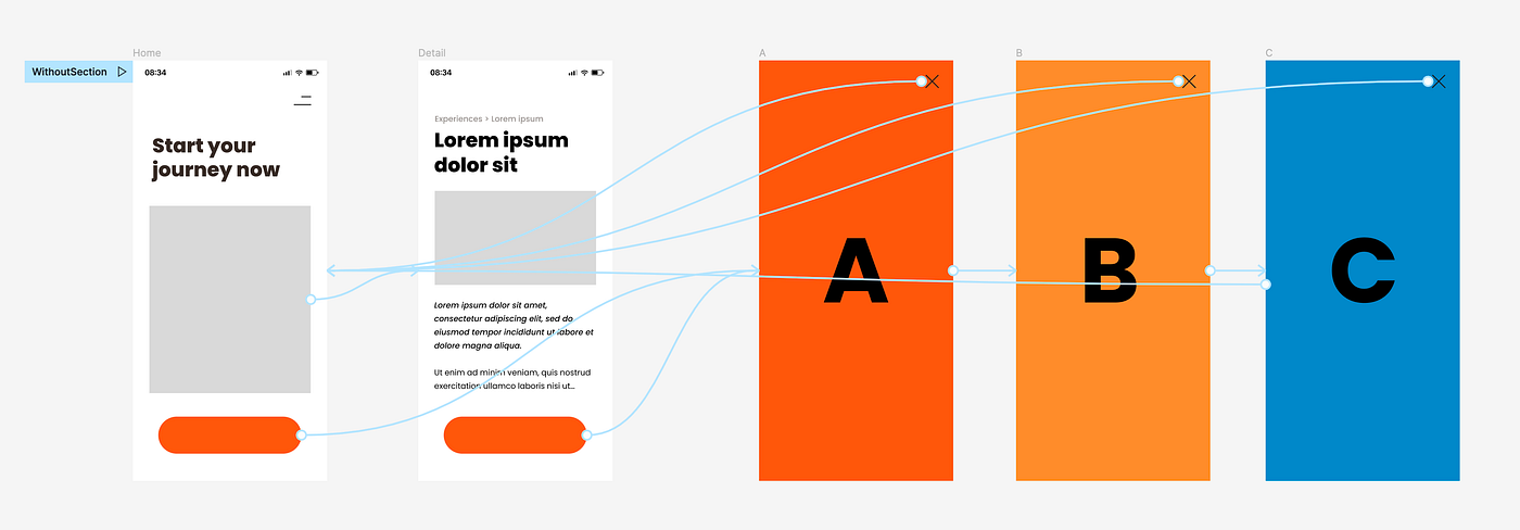
With Sections:
You find sections in frame menu or simply press Shift+S. I love using sections to keep my work organized because sections do not show up in presentation mode (unlike frames). When it comes to prototyping, they allow us to create stateful designs.

In this case, I drew a section around my process of steps A, B, and C. This is all I need to do for Figma to remember the frame last visited in this section when entering again from any (!!!) other points. A total lifesaver when it comes to testing signup and checkouts.

💥Tip: When working with sections, you need to enter the section via “navigate to” (open overlay will not work), but within the section, you can link the frames as if they were overlays. This has the advantage that now you can use the “back” action on the closing button, which enables you to jump back to the exact place from where you entered the section! I love this one!
3. Nest prototypes for presentations
Just like everything in Figma, prototyping is all about nesting frames. It’s very important to understand the concept that we add behaviour to single frames no matter where they are placed. This means that we can also nest the entire prototype in a presentation. We can link it just as any other prototype. This will surely impress at next meeting:
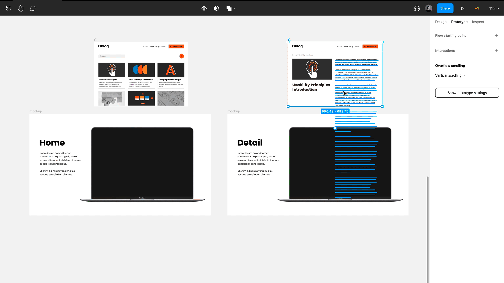
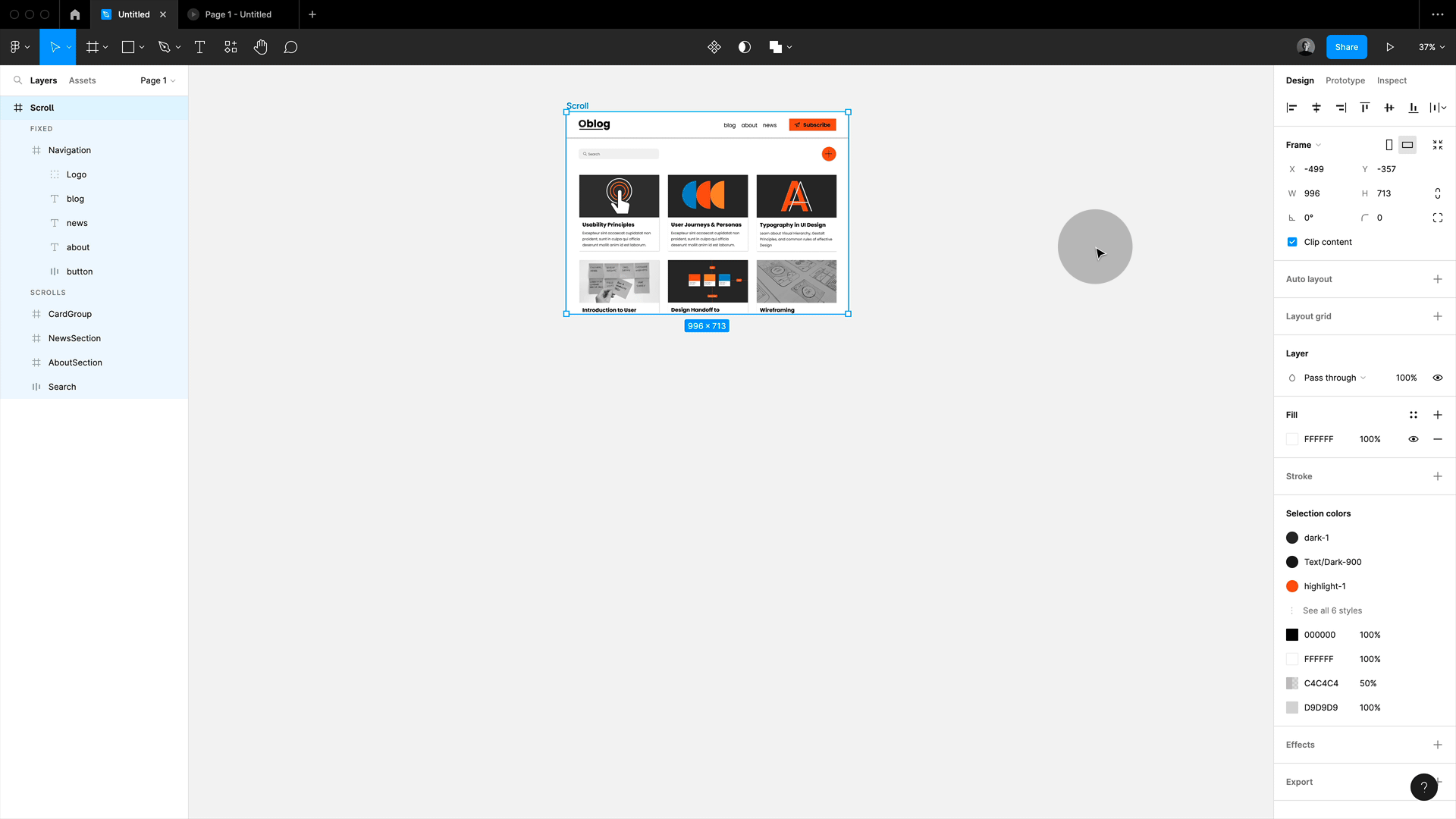
4. Scroll to! Horizontal, vertical and all the way
I love “Scroll to”, and it’s overlooked a lot! With “Scroll to”, you can set anchor points in different directions.
Vertical Scroll to: For navigation
Great for very simple animations like this one-pager menu. By the way, if you are wondering what the offset values are for, this is in case you have a sticky header or some space that needs to be considered in the scrolling position.
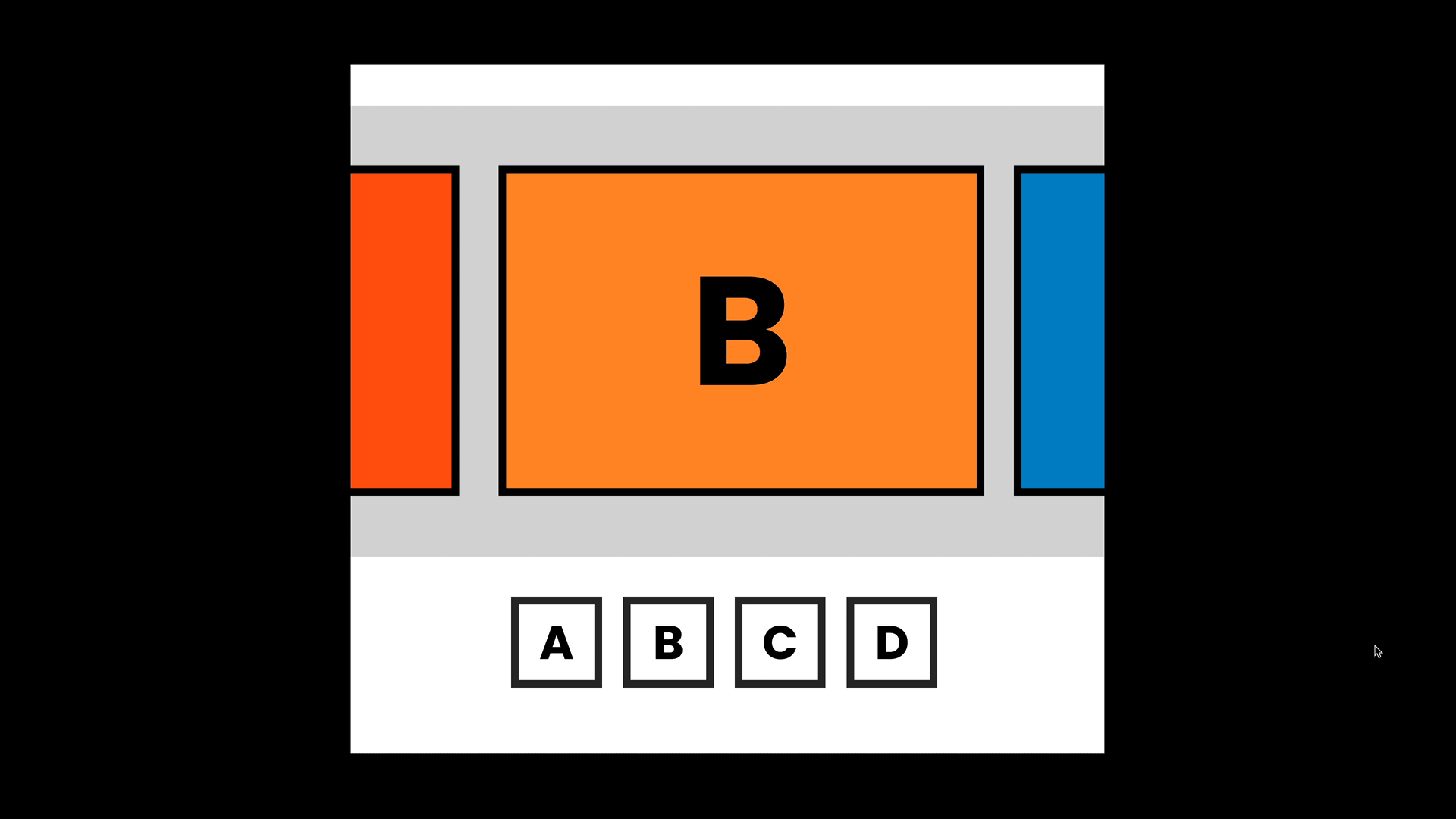
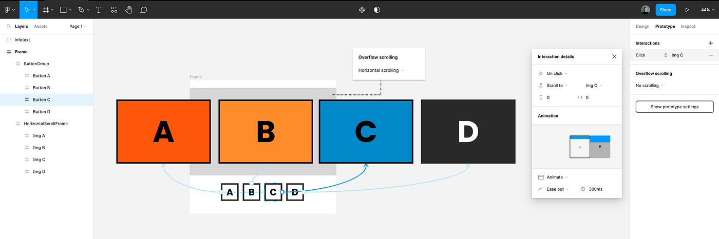
Horizontal Scroll to: For slide shows
but you can also push this further, creating horizontal slideshows. Simply set up images on a nested frame with overflow and then set this frame to horizontal scrolling. You can now link thumbnails that are outside of this frame to the images. Sweet, isn’t it!
Horizontal and vertical scroll to: For maps
And we can even use scroll to in both directions, vertically and horizontally. So all I am using here is a map placed on a nested frame with clipped content (important that the map is larger than the frame!) set to horizontal and vertical scrolling. Then I place my locations onto the map, some in the clipped area. Then I link my buttons via scrollto. that’s it!
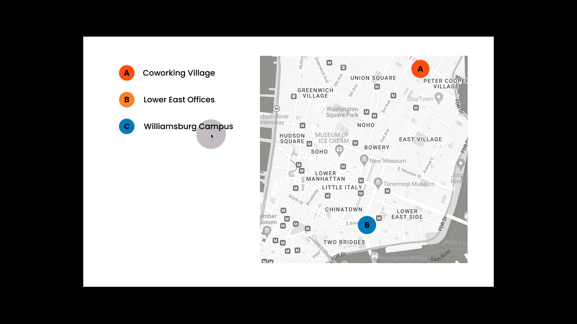
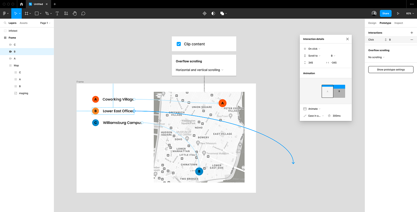
💥Tip: To position the pins in the middle of the map when scrolled to, I set the offset to half of the maps frame size (so -/+ 345as my map is 690 wide and high)
5. Combine smart animate and Figma moving animations
You can combine moving transitions and smart animate. This is a little hidden below the animation menu (only visible when a moving animation is selected!).
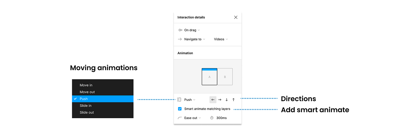
So let’s say you are pushing in a new frame, but you want the menu to smart animate still. In this case, just use the moving transition as main animation and make sure to tick the “smart animate matching layers” box. Now it will smart animate layers that are the same in name and hierarchy setup.
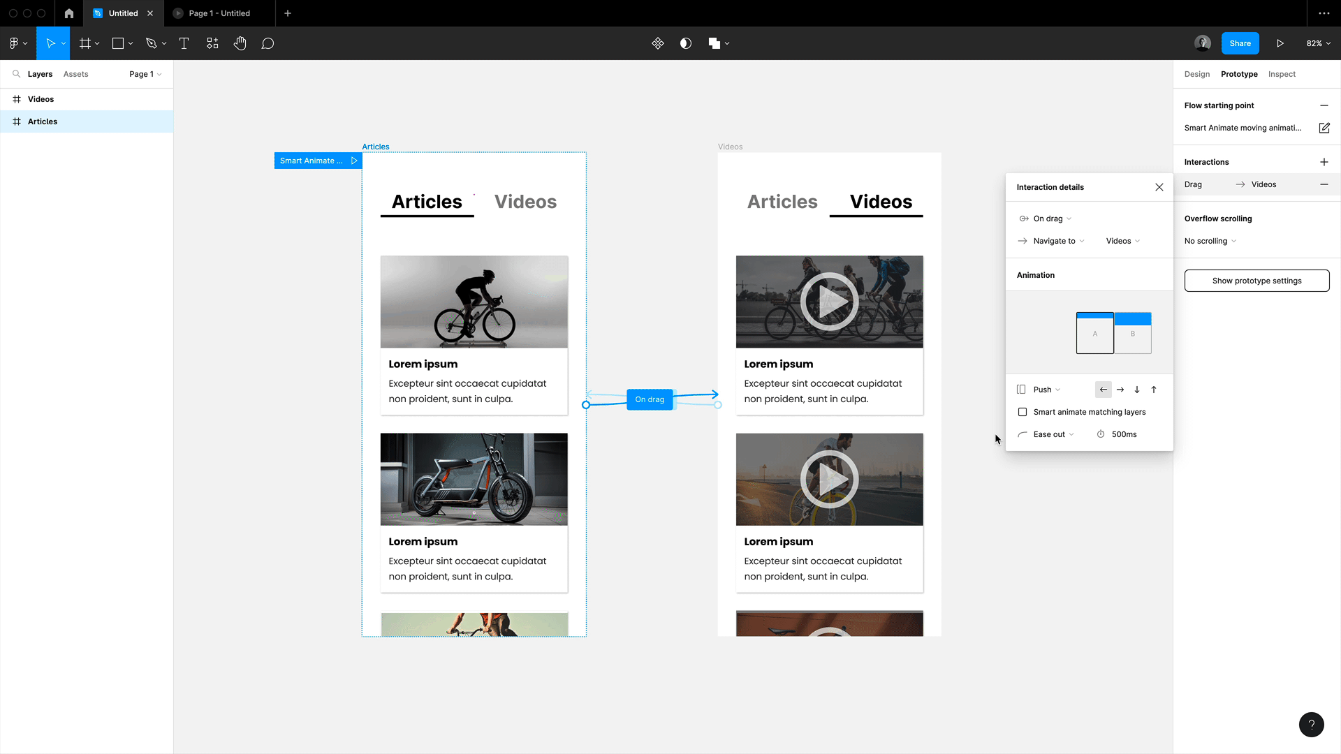
💥Tip: This will smart animate all layers of the same name and hierarchy if you just want some to be picked up (e.g. in this example the navigation and not the images), then make sure to rename the others (the group they are in is sufficient) and they will become part of the moving animation.
💥Yet another Tip: The background transition might cause you some trouble with strange transparency here. If that happens, just add an additional background shape to destination frame, which should fix it.
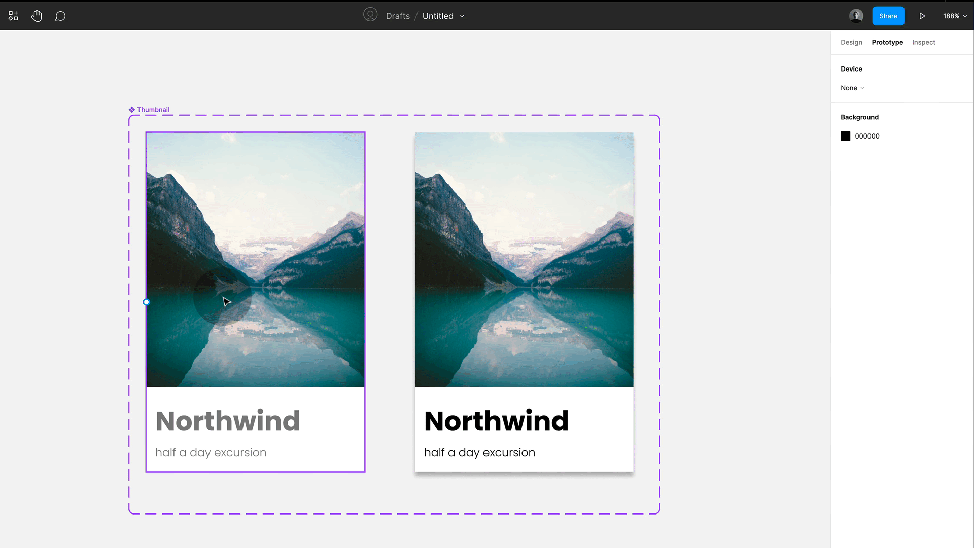
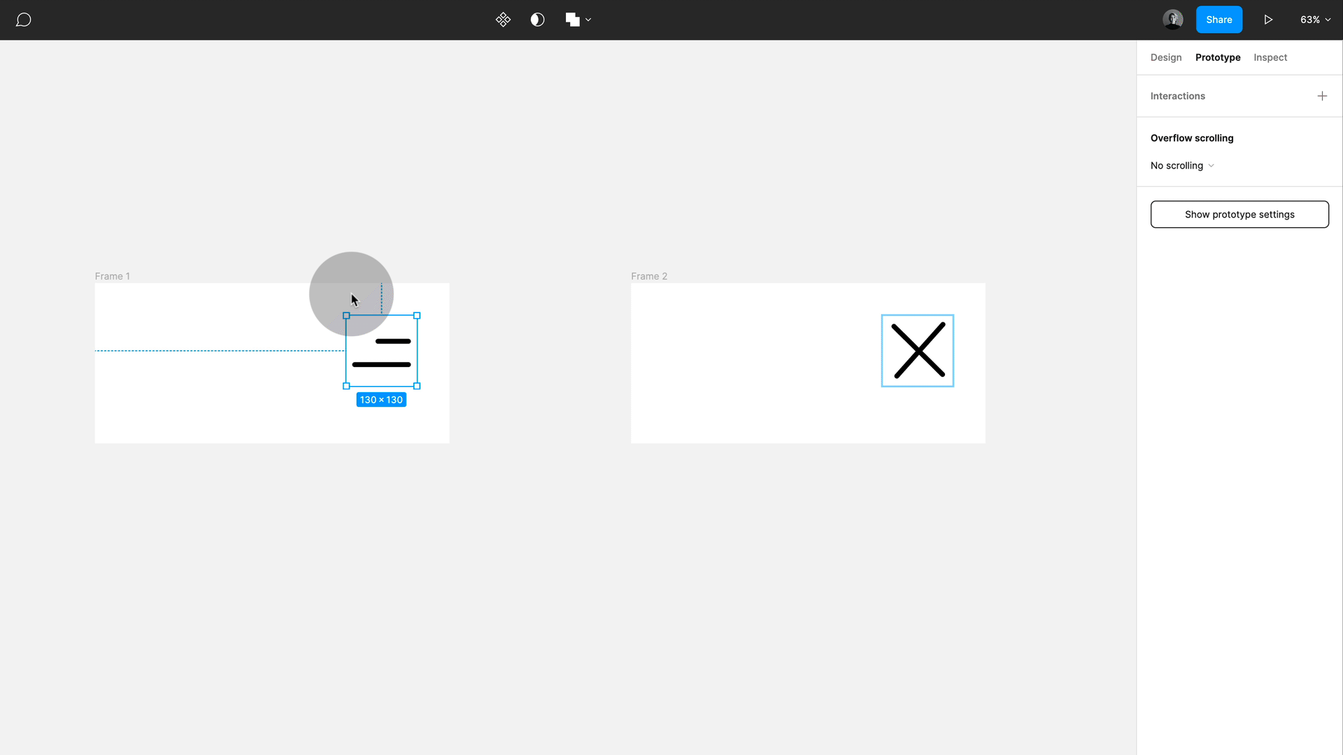
6. Animating circle to rectangle
You cannot smart animate between shapes in Figma, so you cannot go from a rectangle to a star. However, there is a little trick you can use if you want to animate a rectangle into a circle or the other way around. Just use round corners and you will get the effect. Only works for all four corners, sorry (yes, I tried to animate the Figma logo in Figma, but it is not working ,)

7. Interactive components, my big love!
Interactive components are amazing! For those who do not know, you can animate within a component set with variants, and all instances will inherit the set animation behaviour. This is very useful for things like buttons, switches and all micro-interactions.
So now let’s have a look at some more simple magic we can do:
8. Create a zoom hover with interactive components
You can also create other effects, such as a simple zoom, with this technique. Just enlarge the image in the destination frame and set a smart animate between them on hover. Use the instance across design and override text and images, done!
💥Tip: I recommend you use the scale tool. Just hit K and then use a scale factor. Note this down, so you can add the scaling factor for the CSS transform to documentation.
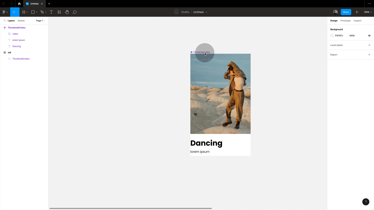
9. Video animation on hover
Interactive components also work great when combined with videos. Let’s set up a video on hover now.
First, set up the card with the video (only works on a paid Figma plan sorry!). Now make a copy of that card. We need to replace the video with a still image. An easy way to get this is to select the video press shift+cmd+C; this will copy a png to clipboard. Now simply paste this png to replace the video in starting frame. Make sure both frames are setup as variants in a component set, now simply connect with smart animate, the trigger being “while hovering”. Drag out an instance onto a frame and press play. Done!
10. Animate menus with smart animate
As usual, you add a bit of smart animate magic, and you can create nice little effects, such as this menu that opens and closes. This works as I am using the same lines with the same naming (!) and just repositioning them. As long as naming and hierarchy stay the same you can smart animate between positions.
Remember with smart animate we can animate color, position, rotation, transparency and size BUT we need to keep hierarchy and naming the same between the keyframes
11. Hover and enlarge
And remember adding auto layout to the mix adds this extra magic. So here I have a smart animated interactive component of different size, and then the instances are set up as an auto layout frame, so on hover, they will change to the larger size and push everything else out of the way.
12. Use external links to connect prototypes across different pages and files
You can also add any other external link to prototype. Besides connecting to external pages, this can also be used to link to other prototypes, for example, another screen width or designs on other pages and external files (have a look a little further down when I talk about flows), which is otherwise not possible.
13. Get rid of all connections
Can’t believe I did not know about his one for so long. Make sure you are in the prototyping tab, then simply right-click on the canvas and remove all connections. Ahhhhhh!

14. Embed prototypes
You can embed the link to prototype in many places, such as Notion, Medium, ZeroHeight etc. This is amazing because it allows you to showcase certain parts of prototype with additional documentation or explanation. And, of course, updates automatically. This is also pretty nice to document micro-interactions in external documentations. In this case, I just created a frame that has an instance of my card, which I uploaded to Zero-height as a prototype as part of the component documentation, this way my micro-interaction is visible to anyone looking at the component code and design information.

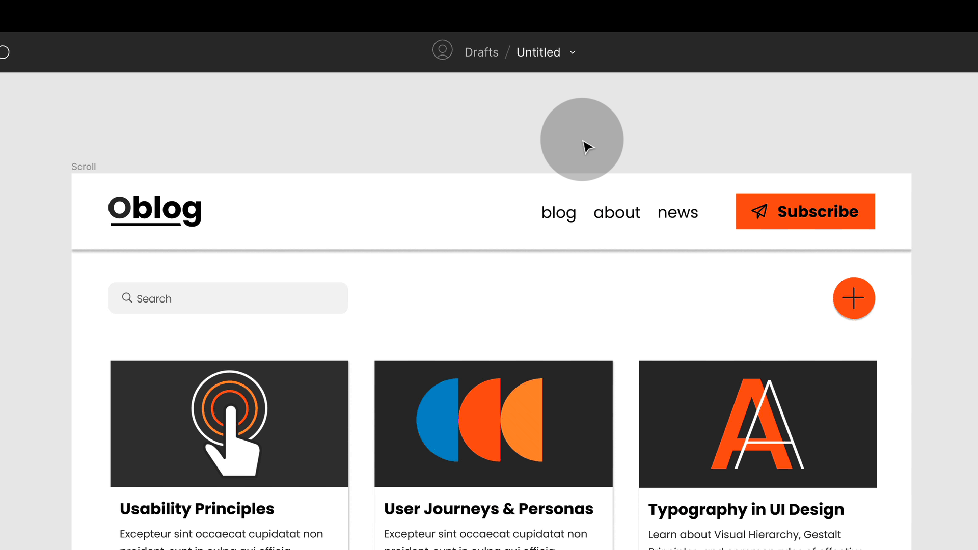
15. Packaged “funnel” components
You cannot link across different pages in Figma, so let’s say that you have navigation and you want it to link to the same places. Then you cannot do this if the component is stored in an external library or even another page within the same file (and you should store components in separate places!). A trick you can use is to take out an instance and then package this instance again as a component. So a bit like what we used to do with _base components in the old days (you no longer need them, but that’s another topic). Now you can set the connections from this new component and use instances as navigations. All connections will be inherited, but as we are essentially just using a packaged component, this will also follow all layout changes of the main component. Bit strange to get head around the fist time but its pretty simple:
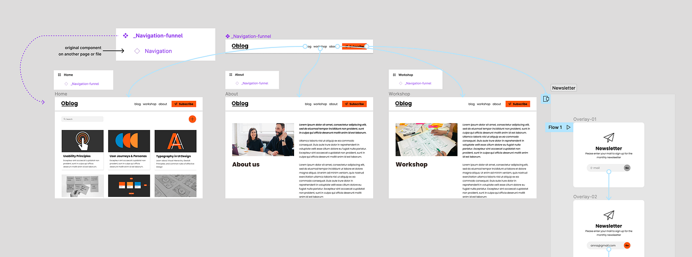

💥Tip: If you name a component with _name or .name, it will not be synced with component library. This makes sense as you would only want the main navigation component to be synced but not funnel, as it is only there to help you prototype.
Thank you to Ridd who tweeted about this technique a while ago (he might have called it differently)! I have used it a lot since!
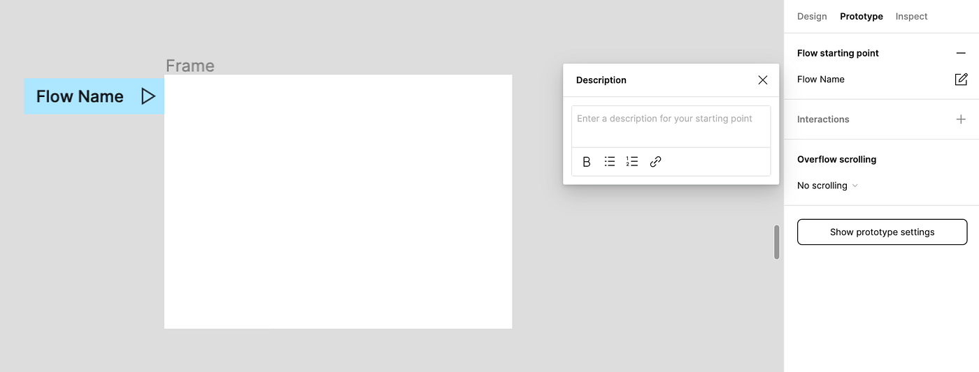
16. Use flows to guide
You can add flows to prototyping, and they’ll appear in the presentation mode. You see the flow as a little blue tag you can rename and move.
💥Tip: You can add descriptions to flows. They will show up in presentation mode. I like using this to guide testing.
Flow overview
If you click on the canvas while having the prototyping tab selected, you will get an overview of all flows. Yes, you can have as many as you want on a page (or none!). Note how you can copy links for individual flows!
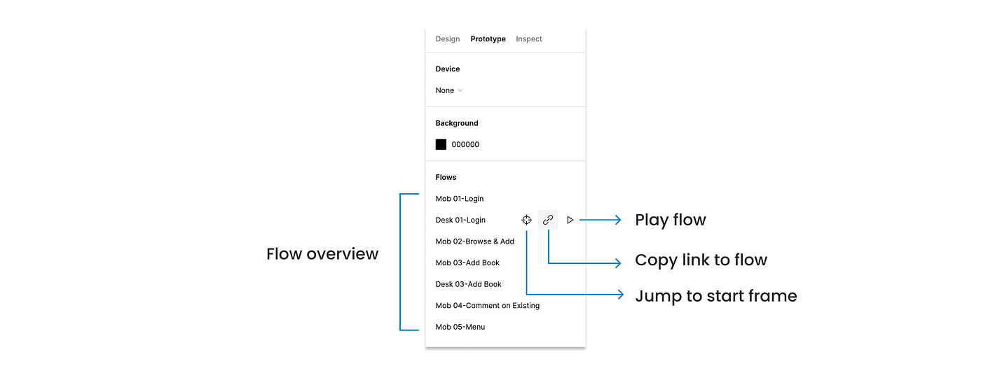
Flow overview
I like copying the link for my different flows and making an overview with clickable links in Figma. This overview is part of my file, so everyone entering knows the prototype and flows right away. I can also add this page as an opener for my testing or presentation. This has been of huge help.
17. Did you know that links remember prototype settings!?
When you share a link from prototyping view, it remembers all settings! So you can set the size to 100% or fit to screen, choose if you want flows visible or not and, of course, if you would like to set a device. It will then open just like this to anyone clicking on link.
💥Tip: If you set a device for the entire page, not just one frame! This is why I like to separate my mobile prototype from my desktop version.