Useful AI Skills And Workflows For Designers (https://lnkd.in/d4FRzEFW), a growing Notion hub with ready-made project structures, Claude skills, design tokens pipeline and AI design dictionary. Wonderful little helper, put together and updated by Carmen Rincon.
🔹 1. Useful AI Skills For Designers
Good design needs a good taste and a strong point of view. Designers below have put together their … Read the rest
Making AI Easy at Work
Upgrading Career to AI to Do the Grunt Work
Driving business transformation comes down to one thing: removing the noise so you can focus on the work that matters. But mid-career professionals often hit a wall. It’s rarely a lack of talent. It’s usually a lack of time.
Whether you are managing people services, leading operations, or running a large … Read the rest
AI tools for Designing
Every AI tool has a different superpower.🚀
Once I stopped comparing them and started combining them, my productivity and more importantly, the quality of my thinking improved dramatically.
Here’s the AI stack I’m currently exploring in my design workflow:
🧠 Claude → UX strategy, PRDs, user flows & design critique
💬 ChatGPT → Brainstorming, UX writing & creative exploration
🎨 … Read the rest
𝗔𝗜-𝗿𝗲𝗮𝗱𝘆 𝗱𝗲𝘀𝗶𝗴𝗻 𝘀𝘆𝘀𝘁𝗲𝗺
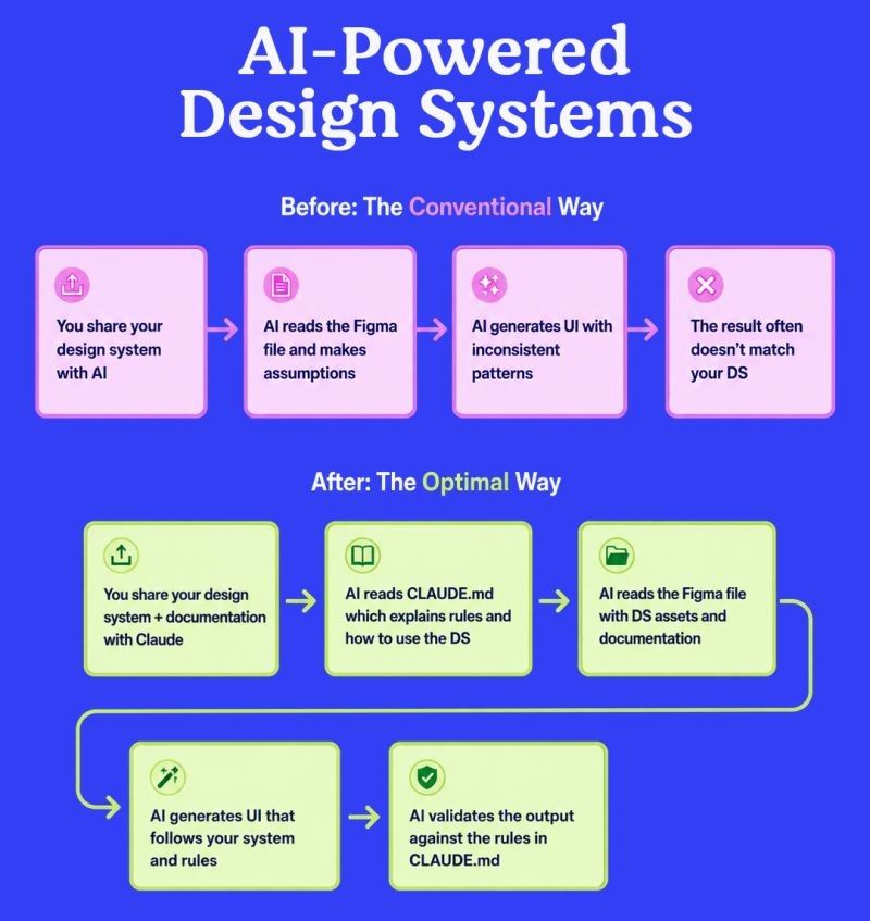
𝟱 𝘄𝗮𝘆𝘀 𝘁𝗼 𝗺𝗮𝗸𝗲 𝘆𝗼𝘂𝗿 𝗱𝗲𝘀𝗶𝗴𝗻 𝘀𝘆𝘀𝘁𝗲𝗺 𝗔𝗜-𝗿𝗲𝗮𝗱𝘆
AI can generate interfaces quickly, but the quality of the result depends on the quality of the design system behind it.
A structured, documented, and regularly maintained design system gives AI clear rules to follow instead of forcing it to make assumptions.
Here are five practical ways to prepare your Figma design … Read the rest
Design for human behavior

The biggest lie in UX?
“Our users will figure it out.”
No.
If users have to figure it out…
You’ve already lost.
Users don’t open your product to admire your UI.
They open it to complete a task.
And every second they spend thinking:
“Where do I click?”
“What does this mean?”
“Why isn’t this working?”
…is friction you created.… Read the rest
UX Skill Levels at Intercom
Explore competence areas and skills required for Product Designers.
Key areas:
1. Product leadership
2. Craft
3. Business literacy
4. Domain expertise
5. Autonomy and initiative
6. Communication
7. Growth mindset
UX Skill Levels:
https://lnkd.in/ge2MBfr9
More design resources:
https://lnkd.in/d4Pk3CQu
Imo while this matrix is a bit outdated, it is still one of the simplest yet most precise tools for defining … Read the rest
UX Designer & AI Behavior
UX Designers Must Shape AI Behavior

“𝗧𝗵𝗲 𝗳𝘂𝘁𝘂𝗿𝗲 𝗨𝗫 𝗗𝗲𝘀𝗶𝗴𝗻𝗲𝗿 𝘄𝗼𝗻’𝘁 𝗯𝗲 𝗵𝗶𝗿𝗲𝗱 𝗳𝗼𝗿 𝗱𝗲𝘀𝗶𝗴𝗻𝗶𝗻𝗴 𝘀𝗰𝗿𝗲𝗲𝗻𝘀. 𝗧𝗵𝗲𝘆’𝗹𝗹 𝗯𝗲 𝗵𝗶𝗿𝗲𝗱 𝗳𝗼𝗿 𝗱𝗲𝘀𝗶𝗴𝗻𝗶𝗻𝗴 𝗶𝗻𝘁𝗲𝗹𝗹𝗶𝗴𝗲𝗻𝗰𝗲.”
After reviewing recent senior design roles from 𝗚𝗼𝗼𝗴𝗹𝗲 𝗗𝗲𝗲𝗽𝗠𝗶𝗻𝗱 𝗮𝗻𝗱 𝗠𝗶𝗰𝗿𝗼𝘀𝗼𝗳𝘁 𝗔𝗜, one thing became very clear: the expectations for UX designers are changing faster than most of us realize.
These organizations aren’t just looking for experts in … Read the rest
UX Writing Principles
5 UX Writing Principles for Better User Experience
𝗧𝗵𝗲 𝗯𝗶𝗴𝗴𝗲𝘀𝘁 𝗨𝗫 𝗺𝗶𝘀𝘁𝗮𝗸𝗲 𝗶𝘀𝗻’𝘁 𝗽𝗼𝗼𝗿 𝗹𝗮𝘆𝗼𝘂𝘁𝘀.
𝗜𝘁’𝘀 𝗽𝗼𝗼𝗿 𝗰𝗼𝗻𝘃𝗲𝗿𝘀𝗮𝘁𝗶𝗼𝗻𝘀.
Every tap, error, confirmation, and notification is a conversation with your user.
And every word either builds confidence… or creates friction.
Great UX writing isn’t about sounding clever.
It’s about helping people move forward without having to stop and think.
A few … Read the rest
How To Make Teams Follow UX Guidelines?
Useful pointers to enforce design quality without a 4-pages-long UX checklist mandate ↓
🚫 Sprints are often 100% packed with tasks → no time for QA.
🚫 Following guidelines takes time that designers don’t have.
🚫 Some guidelines will always be missing or incomplete.
🚫 Checklists are often abandoned on remote fringes of Sharepoint.
✅ Guidelines work best when quietly … Read the rest
