Forms help users accomplish a wide range of goals including: creating a new account, completing a purchase, providing feedback, scheduling events, filling out taxes, or providing medical history. No matter the goal, every form should be thoughtfully designed so users can complete it quickly and without confusion. The key to a well designed form is its inputs. Inputs are one of the most important components in any designers library and should be designed and maintained with great care to ensure fast and accurate form completion rates.
Form Best Practices
Before we talk about input fields, let first go over some best practices for designing forms. When done right, a form should feel like a friendly conversation between the user and the app. The following best practices will help you improve designs and increase completion rates.
Number of Questions
Only ask questions needed for the purpose of the form to keep it as short as possible. If some optional questions must be asked, make sure they are clearly marked as optional.
Tip: Mark optional fields with the word “optional” rather than using an asterisk (*). Their meaning can be unclear, and they create visual noise when most fields are required.
Order of Questions
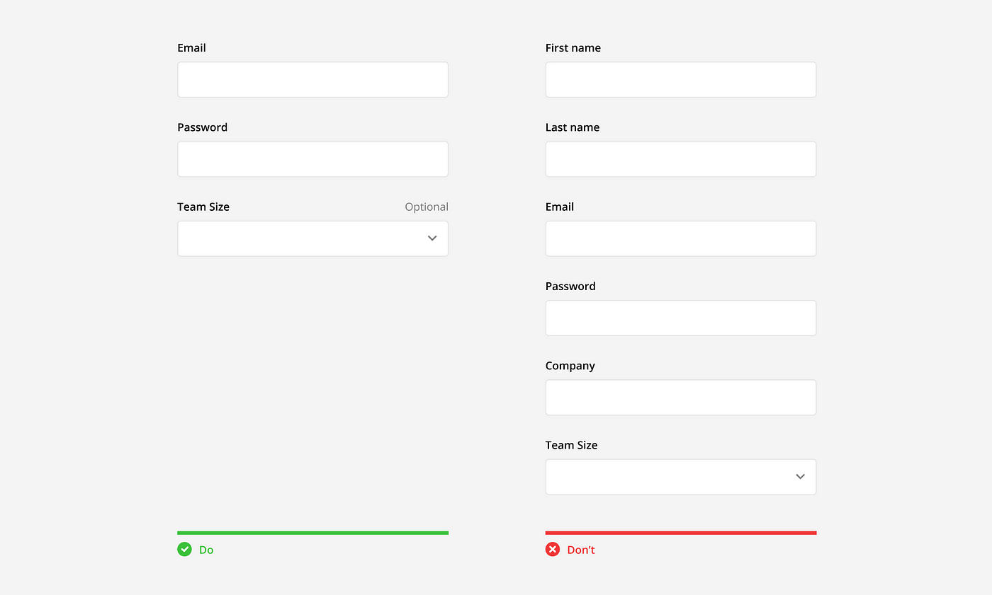
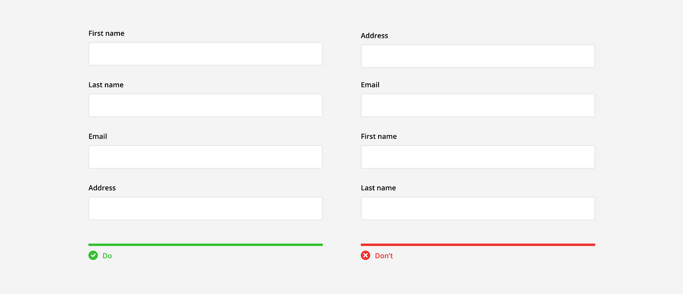
Questions should be asked in a logical, conversational order. This means, the form should start with an introduction, asking the user’s name and maybe some basic contact information, then move on to increasingly more difficult or sensitive questions. For example, it would be odd if someone asked for the address before asking the name.
Group Related Information
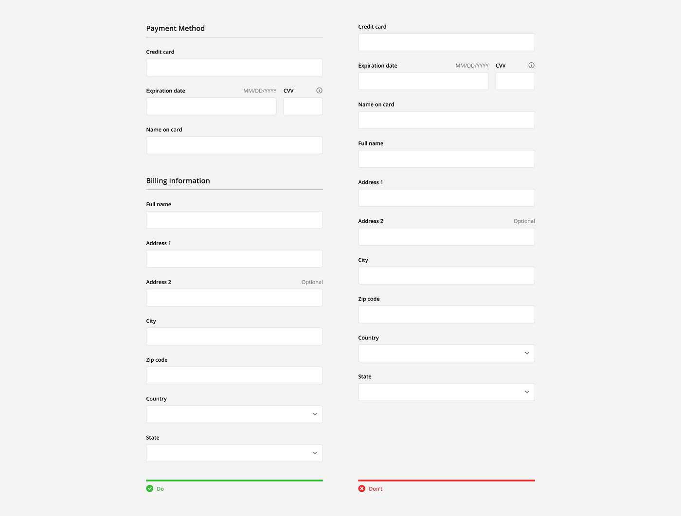
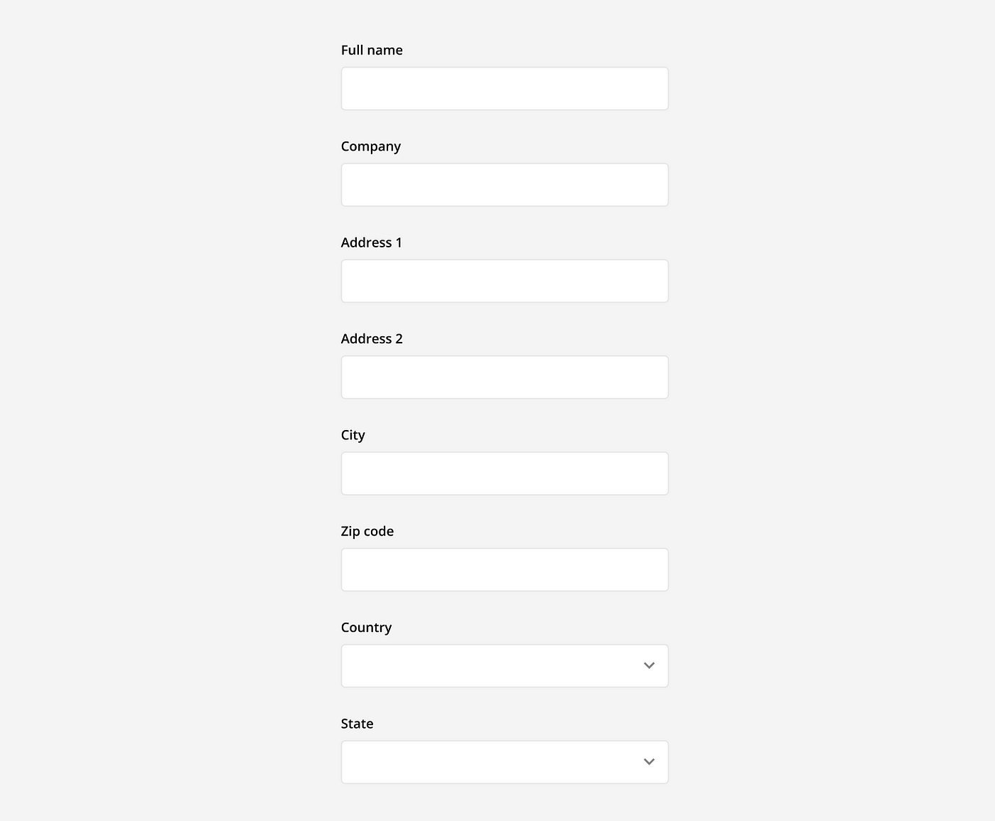
Group related information to help users compartmentalize and make sense of what they are being asked. This can be done by dividing a form into clearly labeled sections or into multiple pages.
Formatting
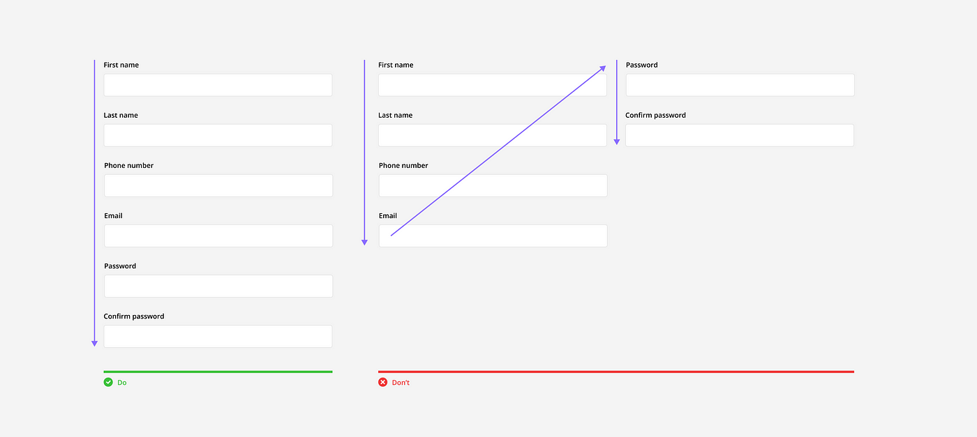
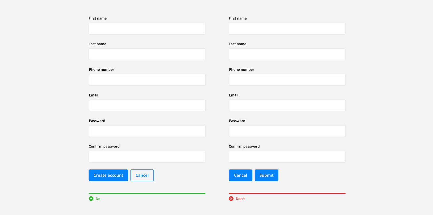
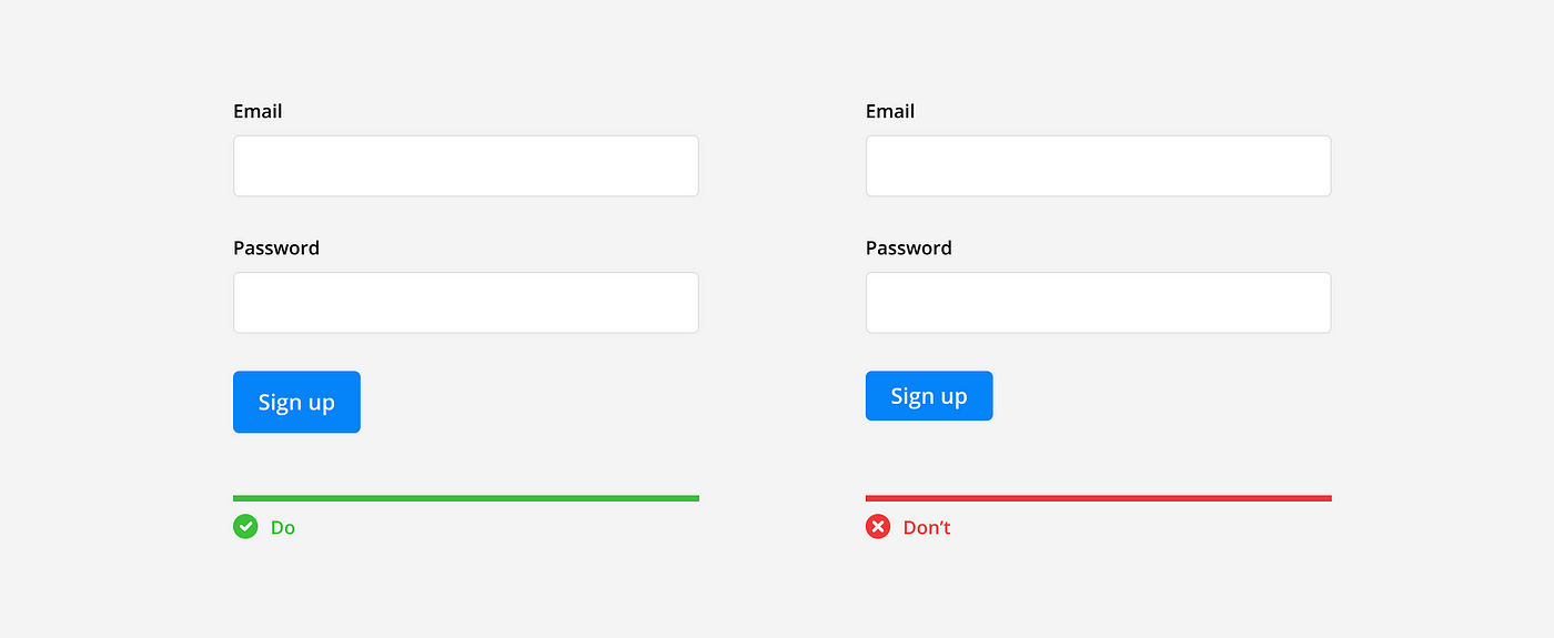
Inputs should be arranged into a single column so users can read the form in a straight line down the page. Multiple columns disrupt vertical momentum with a Z-shaped reading pattern and can cause users to incorrectly group fields together.
Action Buttons
Action buttons should have descriptive names and be placed at the bottom of the form, left aligned with the column. This follows the users line of sight as they reach the bottom of the form and are ready to take the next action. If a secondary button is necessary, make sure it’s visually distinct from the primary button and is placed second according to the alignment.
Progress
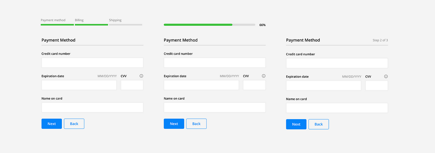
Longer forms that require multiple pages should indicate to the user where they are and how much more they have to do. This can be done in a variety of ways with progress bars, percentages, and steps counters.
Conditional Inputs
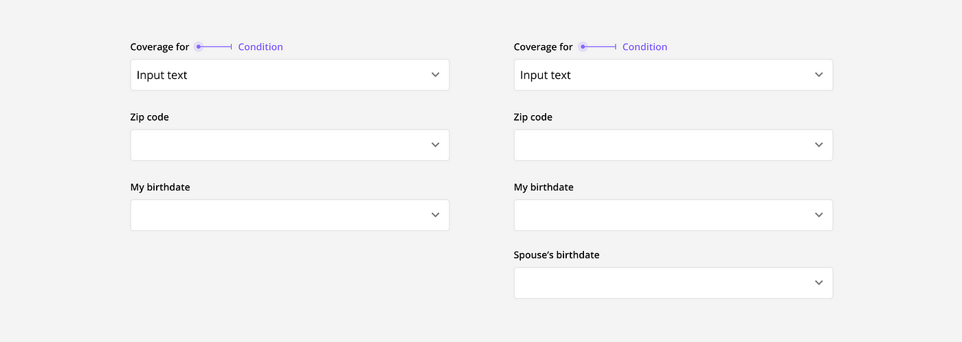
Forms can be tailored to individual users in real time by using conditional inputs. When certain requirements are met, custom inputs can appear to gather additional or more relevant data.
Input Best Practices
Inputs may seem simple at first glance, but styling, versatility, stateful behavior, and frequent use make them one of the most complex components in any design system. When well designed, they allow users to input data in a way that is quick, easy, and correct.
Common Input types
There are many different types of inputs that can be used to collect data. Pick the right one depending on the question, requirements, and expected answer.
Single-line text field: These are used for shorter written responses. They allow users to enter and edit one line of text. If the text becomes longer than the field, the input line automatically scrolls left.

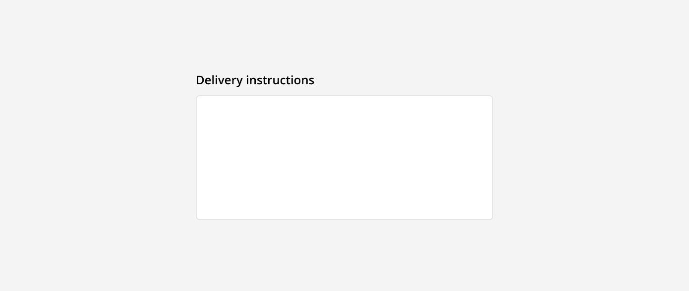
Text area: These are used for longer written responses. They are taller than text fields and allow users to add multiple lines of text by wrapping overflow onto a new line. Text areas have a fixed height and scroll vertically when the input becomes longer than the field.
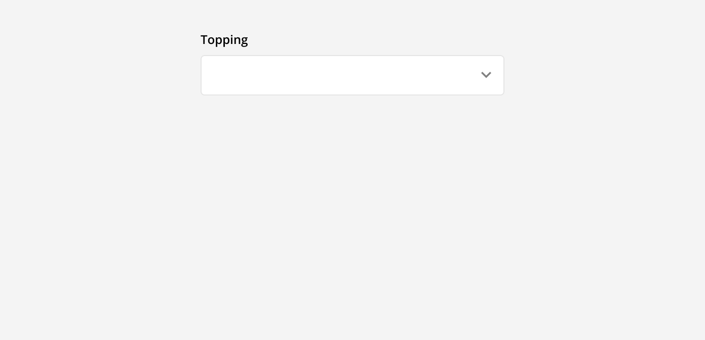
Drop-down menu: These are used when there are multiple predefined options a user can select from. These options are selected from a menu that appears when the field is clicked into. Once an option is selected, it can be seen in the input field. This is best used when there are 5 or more options to choose from.
Checkbox: These are used when there are one or multiple predefined options a user can select from. They allow users to make multiple selections in an exposed list. Checkboxes are best used when there are 4 or less options to choose form.

Radio buttons: These are used when there are one or multiple predefined options. They allow users to make a single selection in an exposed list. Radio buttons are best used when there are 4 or less options to choose form.

Tip: Always list checkbox and radio button options in a vertical line for easier scan-ability and selection accuracy.
Input Field Height
The height of the input should match the height of the primary button to maintain visual rhythm and hierarchy. For example, If the base unit is 8px, then the shared height for both the input field and button could be 32px or 40px. Learn more about sizing and spacing here.
Input Field Length
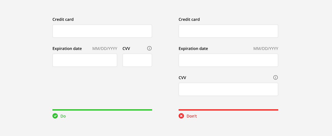
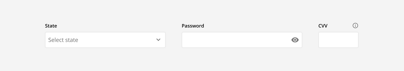
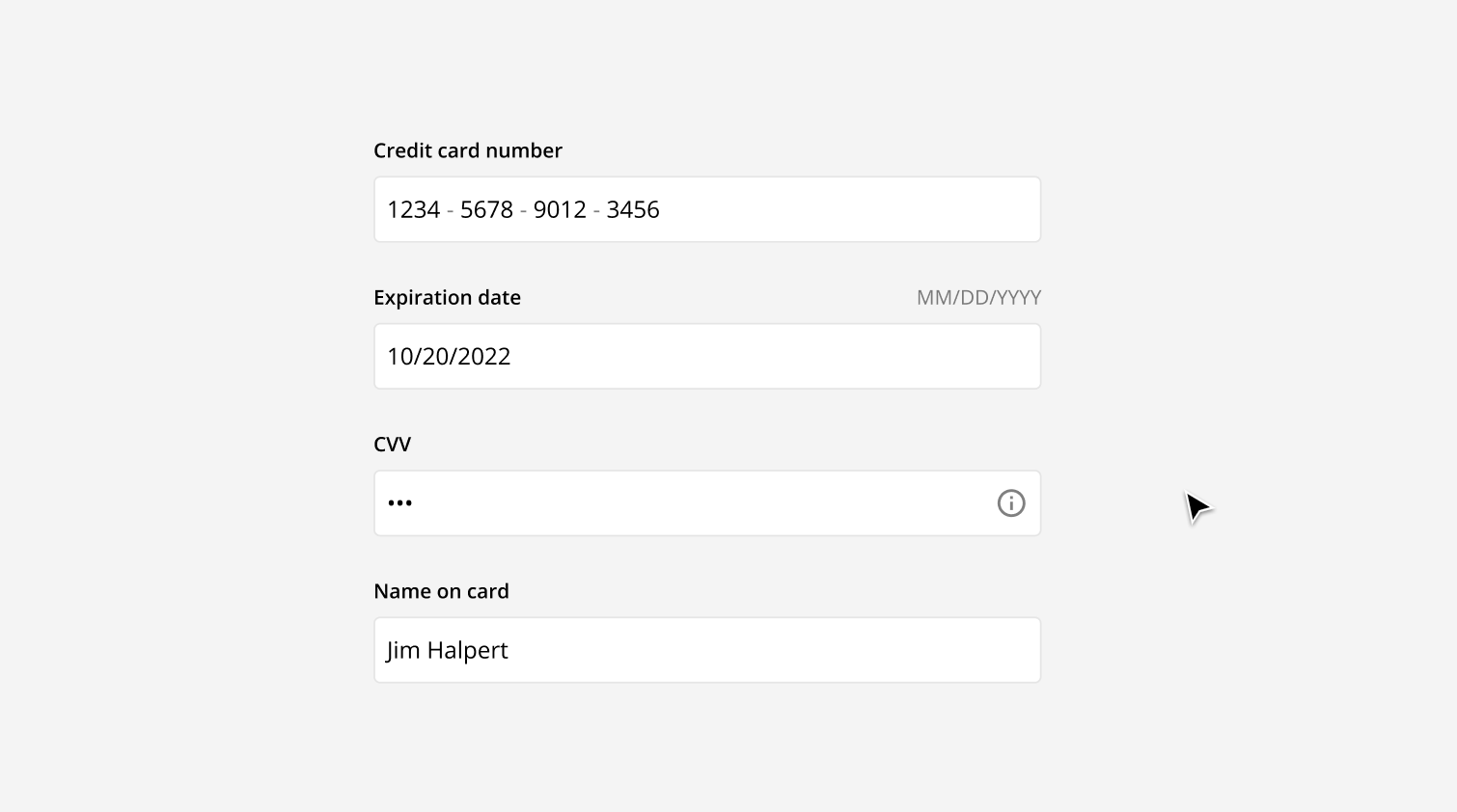
The length of the input field can vary depending on where and how it is being used. In general, all input fields in a form should be the same length. However, the lengths can also vary to afford what the length of the answer should be. For example, an input field for a credit card number should be long, while the input field for the CVV number should be short.
Labels
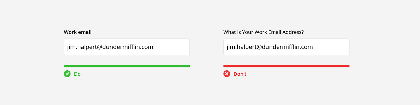
Labels should be short, clear, and easy to read. Each label should be no more than 1–2 words, plainly describing what is being asked. The words themselves should use a contrasting typography from the input text and sentence case (only first letter of first word is capitalized) for easier scanning and readability.
Alignment
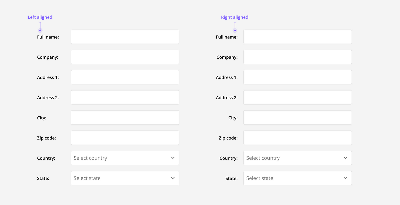
Input field labels can either be vertically aligned or horizontally aligned depending on the type and purpose of the form.
Vertically aligned: Vertical alignment is more common and recommended for most form use cases. It has the fastest completion rate because of the easy, top-to-bottom reading pattern, and is able to accommodate labels with varying lengths.
Horizontally aligned: This alignment is best used when a form is very long (ie. internal data base), or a slower completion rate is desired (ie. asking very sensitive data). It reduces vertical space and slows completion time because of the Z-shaped reading pattern. The major drawback to this alignment is that the connection between label and field can be difficult to see, especially with horizontal-left aligned labels.
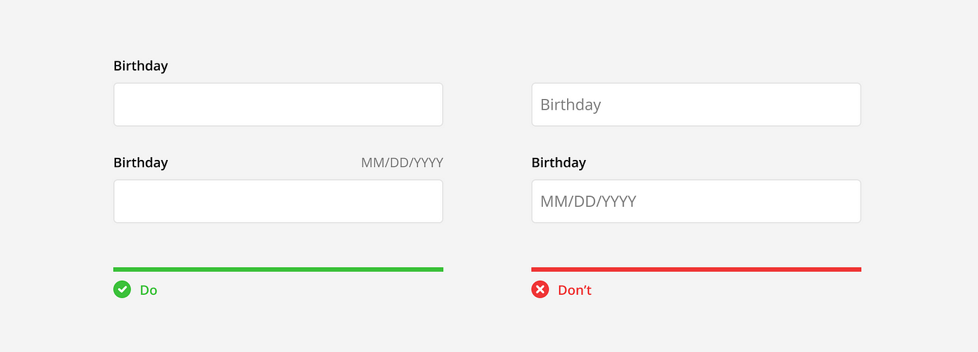
Placeholder text
Placeholder text is the text often seen inside of an input field in the default state. In general, it’s best not to use placeholder text at all. At its best it shows repetitive information, at its worst, it hides important information and reduces accessibility.
Due to the nature of being a placeholder, placeholder text is replaced by the user with input text. This is problematic when placeholder text is being used as the label or hint text. Once the field is filled in, the user can no longer see the information to help them complete or review their answer.
Placeholders can also hurt accessibility in forms. They can be confused with input text, be difficult to see due to the lighter color, are skipped by automatic translators, and are often undetected by assistive technology (ie. page readers). Learn more here.
Icons
Icons are commonly used in input fields but can have different meanings depending on the individual icon and its position.
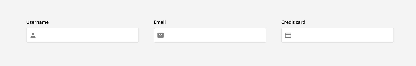
Aesthetic icons: Many icons are used purely for aesthetic reasons. They are a visual representation of the label and have no state or functionality associated with them. These can typically be found on the left side on the input, inline with the input text.
Actionable icons: Some icons are actionable and add functionality to the input. For example, chevron, clear, show, hide, info, or voice input all serve a purpose and change how users can interact with the input field. These are typically found on the right side of the input, either inline with the the input text or the label text.
Feedback icons: These icons indicate if an action was successful or not. Using feedback icons in addition to color is important for accessibility, as people with colorblindness may not be able to tell the different between red and green and will rely on the icons for feedback.

States
Inputs fields have different states to communicate to the user what is currently happening and what they should do next. These states are shown with various visual cues including text, icons, and color.
Default: The default state shows an empty input field using default styling to indicate it has not been answered and is ready to be interacted with.

Active: The input field becomes activated when clicked into. This is shown with a highlighted boarder and caret to indicate to the user they should start typing their answer.

Filled: An input field is filled once the answered has been added and the input field has been clicked out of. This is shown with the boarder returning to its default color and the answer appearing in dark text. This indicates that the input has been completed and the user can continue on to the next question.

Error: When an answer is incorrect or missing, the input field shows an error message. This message is communicated with color, icons, and descriptive text to flag the issue. This indicates to the user they should review their answer make a correction.

Success: When an answer is correct, the input field can show a success message. This message is communicated with color, icons, and sometime text. This indicates to the user they can continue to the next question or step.

Disabled: An input can be disabled due to certain requirements or restrictions. This is shown with an empty, grayed out input field, to indicate it can not be interacted with.

View only: An input can be view only due to certain requirements or restrictions. This is shown with a filled in, grayed out input field, to indicate it can not be interacted with.

Assistance
There are many way to provide additional assistance to help users fill out forms faster and more accurately. Below are a few common methods.
Hint text: Use hint text above or below the input field to provide users with helpful information. For example, how to format their answer.

Auto Format: Automatically format a user’s input as they type to help them add the correct values, review their answers, and avoid formatting errors. For example, a phone number.

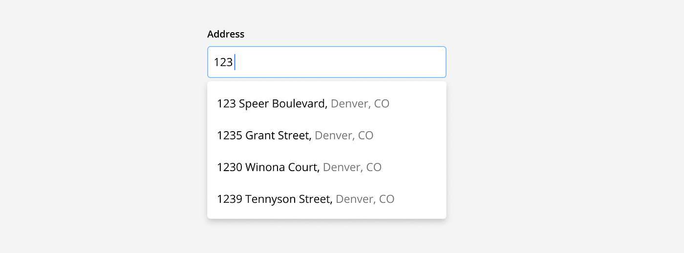
Auto complete: Suggest answers based on partial inputs as they are being typed to save users time and reduce formatting or spelling errors. For example, a street address.
Default values: Pre-fill text fields with the most likely answer when the input is expected to be the same for >90% of the users. For example, language based on geo-location data.

Advanced Input Functionality
Additional functionality can be added to inputs depending on the type and amount of information being collected. Below are a few examples of commonly used advanced functionality.
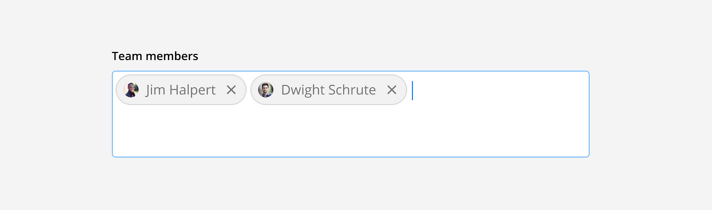
Multi-select text field: Multi-select text fields allow users to enter multiple, individual inputs. Once an input is entered it is displayed as a chip and the user can start typing their next input. For example, when adding multiple team members.
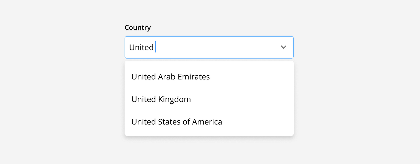
Drop-down search: Contextual search functionality should be added to a drop-down menu when there are more than 25 options. As a user types into the field, available options are filtered to show the search results. For example, when selecting from a long list of countries.
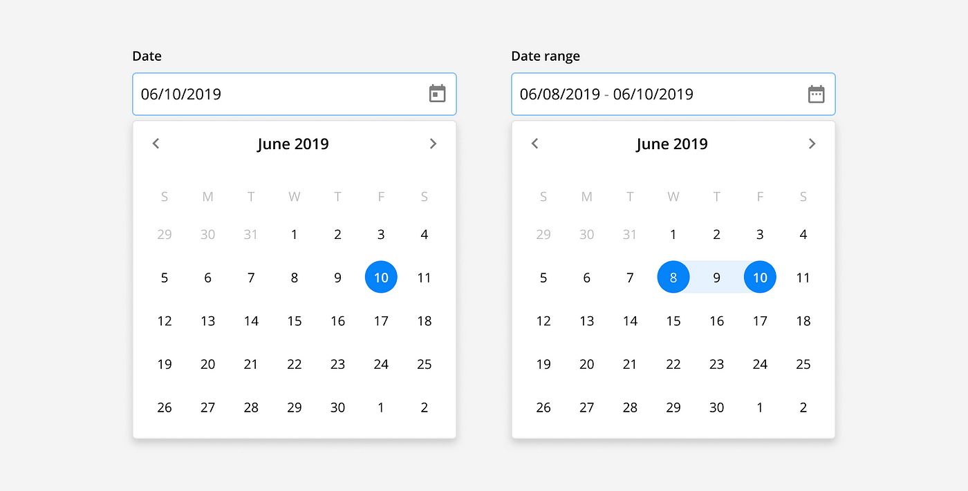
Date picker: Date pickers can allow users to select a single date, or date range from a calendar view. This view shows all available dates and allows the user to toggle between months. For example, when setting an event date(s).
5 Tips for Designing Inputs with Figma
Designing and maintaining input components is crucial for any UI project and can be a huge undertaking when starting from scratch. That’s why we created a free Figma Inputs UI kit to help you get started and learn more about how to design better inputs.
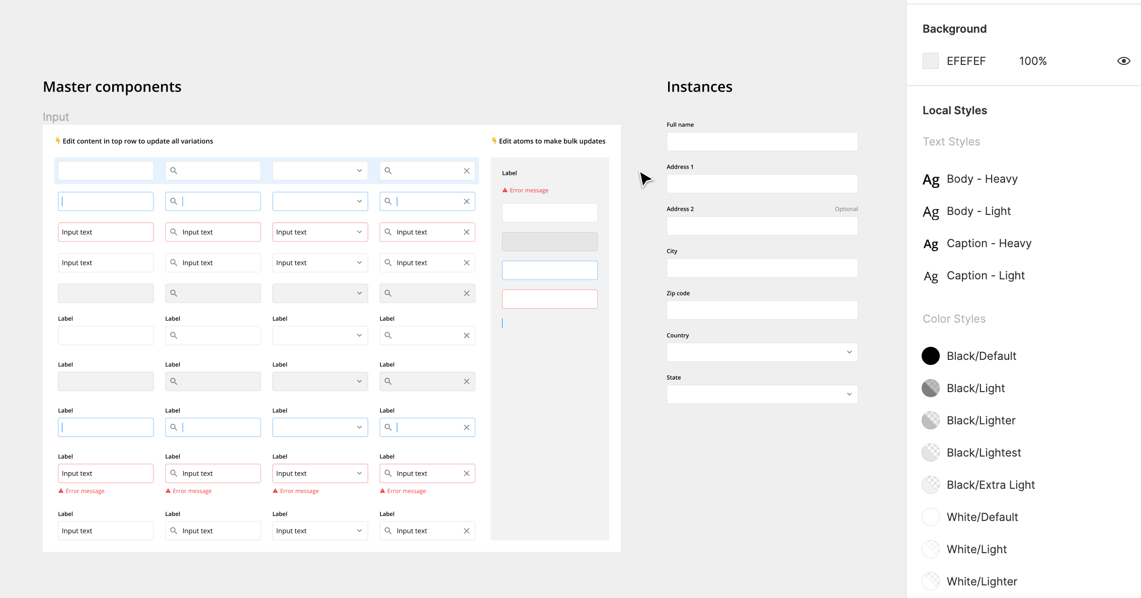
1. Use Master Components
Master components are UI elements that can be reused across the designs. Each time they are reused, the copy is called an “instance”. When the master component is updated, the changes are applied to all the instances. This makes complex, frequently used components like inputs much easier to manage.
For example, you can update the style of all input labels across the designs by editing the master components.
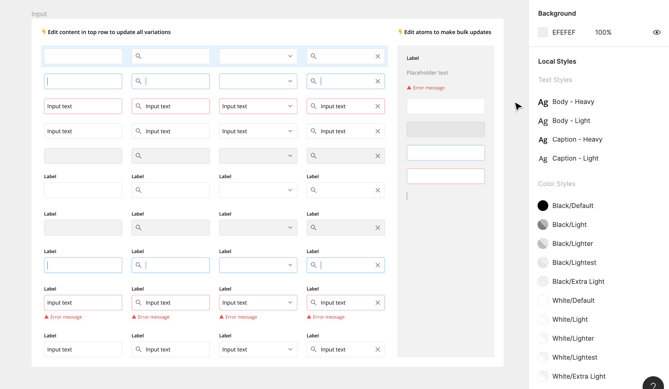
2. Build Inputs with Atomic Elements
Atomic elements are master components used as building blocks in other, more complex components. Using atomic elements is a game changer when it come to building, customizing, and maintaining components.
For example, you can update the corner radius of every text field across all the designs by editing the container atomic elements.
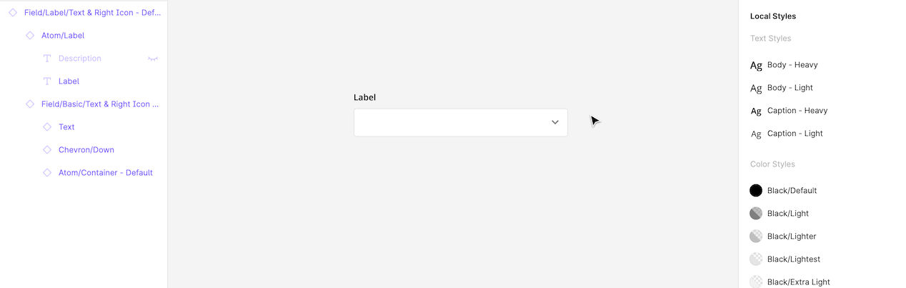
3. Override Instances
Overrides allow you to tweak and adapt instances depending on the context of the designs. You can change things like text, fill, stroke, elevation, and other properties while staying connected to the master component.
For example, you can you can override the label, description, and icon in an input field depending on the situation.
4. Create variants with themed instances
Themed instances are a clever way of managing component states and variations. They are created by taking an instance of a component, overriding its properties to create a new state, and then turning the altered instance into a master component of its own.
For example, you can edit the default state of an input field and have the changes apply to all other states and variations.
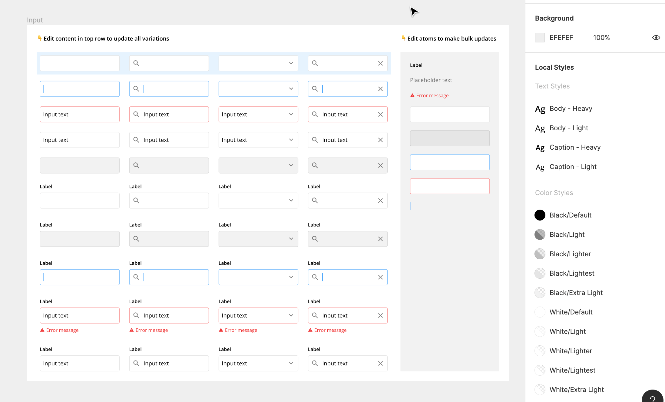
5. Use constraints
Constraints allow you to control the resizing behavior of any element in relation to their parent frame. They make resizing components for different situations and devise sizes quick and easy.
For example, you can adjust the length of the text field while maintaining the desired size and padding of all the elements.
Designing effective forms and inputs is an important skill for UI designers because it has such a large impact on the success of a product. A good form can turn an annoying or confusing task into a pleasant conversation that results in better completion rates and a stronger product