
Ootje Oxenaar – Dutch Gulden Designs
In this modern age where technology is rapidly developing and replacing traditional methods and products it’s interesting to see that despite the dominance of credit/debit/pin cards, paper bank notes are still around — but this is obvious. I can’t ever imagine a world, at least not in my lifetime, where physical money doesn’t exist — as much as we embrace technology it’s impossible to rely so heavily on digital devices and platforms when it comes to something so important as money. Tangible money is here to stay (I hope).
The similarity between postage stamps and paper money is that they are simply there to serve a day-to-day purpose and that isn’t really to admire it. You never usually keep hold of money, you receive it and you eventually give it away, it changes hands and during the time of you keeping hold of it you rarely admire it, only to see the value of each note; so is it strange that governments and designers put so much effort into the look of banknotes when we rarely really look at the design?
No, because to me banknotes can be seen as the identity for a country or even a continent (unfortunately), it’s one of the first things you experience about a country, before you’ve even landed there (if you get your exchanged money in advance).
Seeing this foreign money and looking at how fancy, modern, loud, expressive, detailed or boring it is.
Since the introduction of the Euro in 2002, where 18 countries in the European Union changed from their native currency to a Eurozone country; European money has become more boring, bland, general and universal with no imagination or individuality for the countries which use it. I was about 10 years old when the Euro currency was introduced so therefore I have no real re-collection of what it was like before the Euro, but via the internet it’s easy to see what each countries bank notes and money looked like pre-euro and marvel the incredible designs by great European designers.
Firstly, the man that inspired me to write this story and the previous currency of my current country of residence, the Dutch Guilder (Gulden). Ootje Oxenaar’s design of the Dutch currency for the Nederlandsche Bank is seen as his greatest work and is heralded for its bold and unique design with a strong communicative aspect. For me the allure of the Dutch currency is the variety that there is between the denominations, sure some of the notes have a certain theme or style but there is so much of the designer’s own style and expression in each of them, also that the two sides of each note are also diverse.
For example this series of the 5, 10 and 25 Guilder notes where the front features historical Dutch figures, the back is full of wonderful geometric and abstract pattern, tied in with a classically modern sans-serif font.
Of course these patterns not only look great but they add an inherently important security feature to prevent counterfeiting.

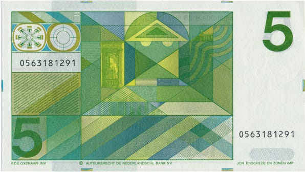
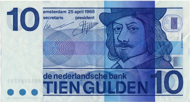
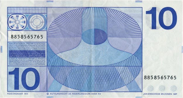
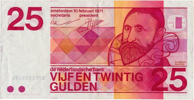

Some later designs by Oxenaar step away from the traditional idea of using historical figures on currency and instead use great illustrations of references of the Netherlands such as the lighthouse referencing the coast, or sunflowers indirectly referencing Vincent van Gogh this kind of design is more interesting to look at and also a lot of the time people don’t know who the random historical figures are on money or what they did. These more obvious images are easier to recognise instantly as they are a clear object not a portrait or a face.

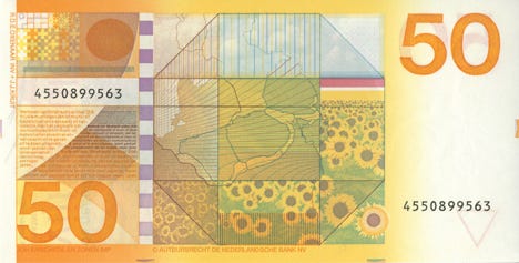

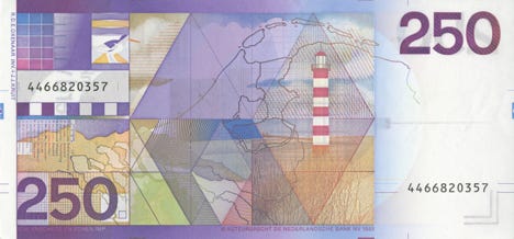
50 & 250 Notes https://www.creativereview.co.uk/the-money-maker/
Switzerland doesn’t use the Euro, instead they use Swiss Francs and of course the Swiss currency is going to be beautiful but it isn’t as modernist as one might expect judging from the countries illustrious design history with its designers developing the ‘international typographic style’ in the 1950’s. Although there are still modernist elements to the series.
The eight (current) series’ vertically designed notes feature the traditional idea of portraits of historical figures but instead of figures from hundreds of years ago, they are more relevant and relatable 20th century people — architects, artists, composers and writers.
Instead of a detailed illustration or crude drawing they look like detailed half-tone pattern photographs, the back design seemingly referencing the career and principles of the figure.
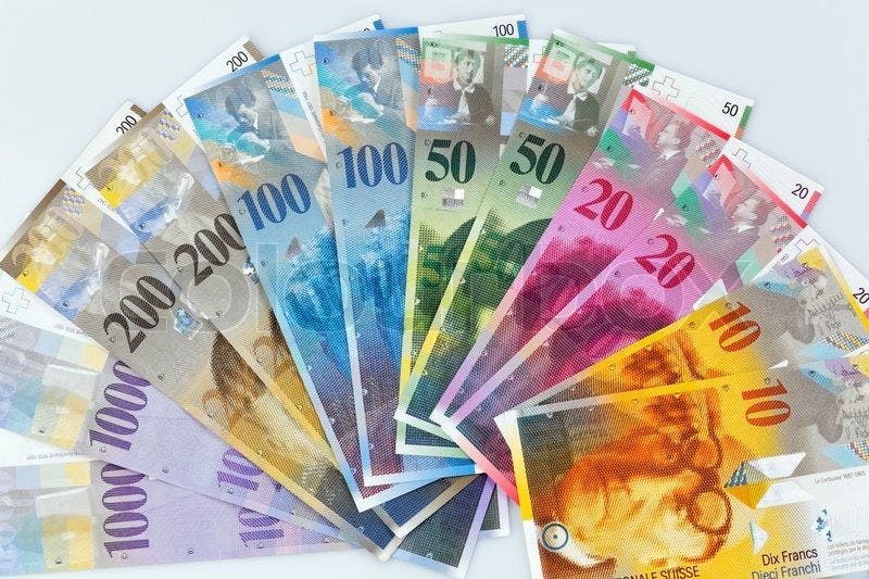
For example the 10 note has an image of legendary modernist architect Le Corbusier who’s design principles focused on human proportions and shape; the back of the note shows his concepts of residential design and idea of skeleton construction through the image of building plans — specifically of his design for the government district of Indian city of Chandigarh. Also a great detail which primarily acts as a method of preventing counterfeiting is the micro-lettering describing Le Corbusier’s career and listing his accomplishments.

The Swiss banknotes are also quadrilingual — displaying all information in the four national languages, French, German, Italian and Romansh. With all these languages and words they still look considered and clean. The newest series of Swiss banknotes that are being slowly introduced—I don’t think much of.
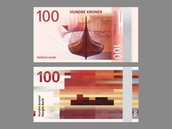
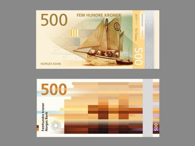
The Norwegian banknotes, a concept idea really, went somewhat viral in the design world a few years ago.
The concept by Norwegian studios Snøhetta and The Metric Systems is very beautiful, contemporary and modern, using imagery of the Norwegian coast but reducing and simplifying them down into pixelated strips of colour creating blocks of different shades. The minimal approach works really well and it’s something very different.
Although their proposal of using photographs of the coast and coastal life on the other side of the notes has been scrapped in favour of illustrations of traditional sailing boats and coastal/marine life, along with various typographic changes from the original Snøhetta proposals — I imagine this is to be able to improve the security of the notes.


The UK recently released their new £5 note and their vision of re-designing the subsequent £10, £20 and £50 notes. The new £5 or ‘fiver’ is nothing special design-wise; it looks similar to what it was before and in classic British fashion it’s very traditional and antiquated despite its new and advanced features.
It also received a huge backlash from vegans as the polymer note was found to contain small amounts of “tallow: rendered beef and mutton fat” which is still an ongoing battle and something the Bank of England is trying to address for the future notes.

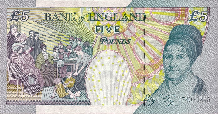
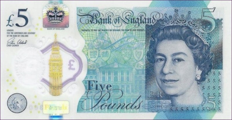
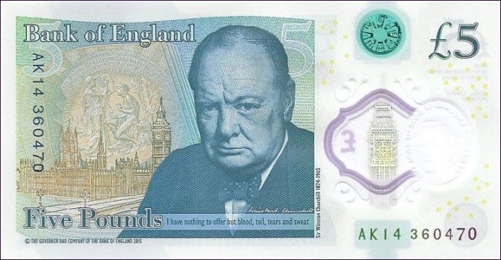
To be fair to the design though it is very advanced in methods to prevent counterfeiting it’s just that they could of done something a lot better instead of being so conservative and effectively boring.
However it is not as boring as the Euro notes; the most boring and unimaginative currency there is (probably). As I said earlier, banknotes and money are often seen as the identity of a country and they are unique to that country because of what they feature and say but with the Euro you can’t cover the European continent and what you’re left with is a lackluster attempt that tries to define the continent, badly.
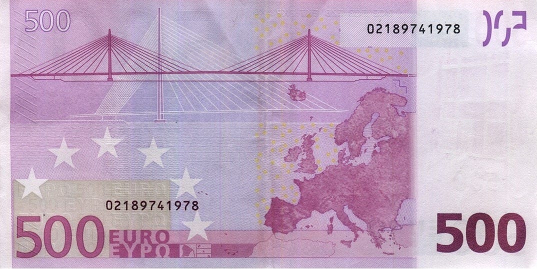
Both the first and second series are as bad as each other, designed by Austrian Robert Kalina, with the notes showing the vast range of styles of bridges, arches and gateways throughout the continent, the denominations representing different European ages; this is a good concept but just executed poorly design-wise and for one of the most important currencies globally they have no personality at all.
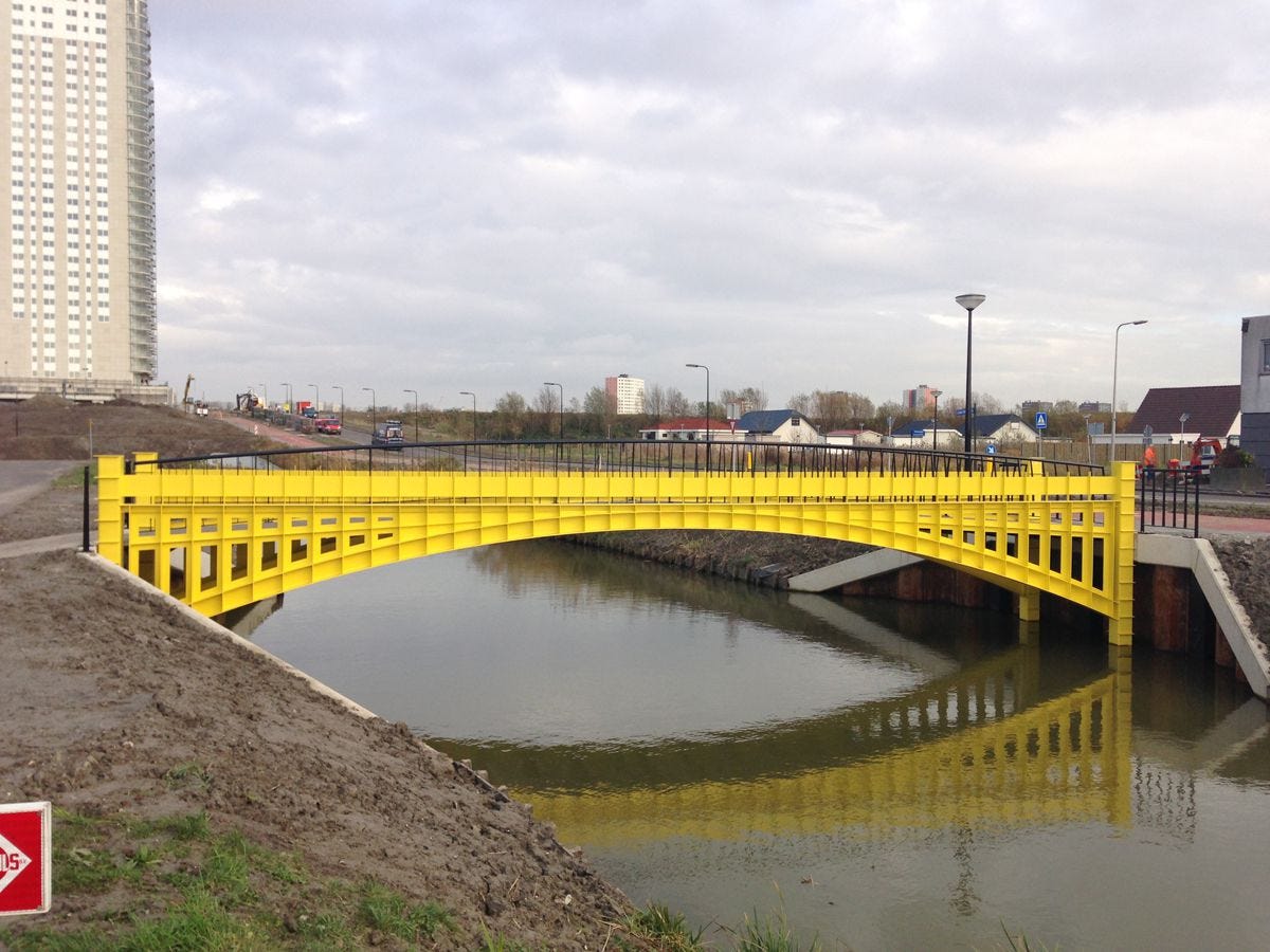
Although to end on a more positive note, a project I found recently which is quite humorous is that by Dutch designer, Robin Stam. Here he took the images of the European bridges from the Euro banknotes and made them a reality. Constructing them as real foot-bridges for a housing project in South Holland. ‘The Bridges of Europe/De Bruggen van Europa’ have been constructed exactly like the paper money sketches using the appropriate colours and scale. Genius.



58