Using hypothesis driven design and user research to validate design decisions in a digital service
Designing a new service by being data driven.
Hypothesis driven design is to make a conscious decision to design something in a specific way based on a belief or understanding, more often than not, an assumption. This is then validated through user research.
It is important for me that these hypothesis are written down so that there is a view of, and consensus that what is being designed, meets user needs.
I think that [x] is true and if we do [y] then [x] will happen
If the hypothesis can be measured, then even better. I have experience in Lean Six Sigma, so if data can be used to measure a change, then even better.
I think that [x] is true and if we do [y] then [x] will happen. I will know that this is [true or false] when [this data] changes
In the design stage for the in-scope project, I used hypothesis to determine a layout of a ‘hub’ for a new service. While the changes aren’t very big or significant, the principles remain.
Problem
There is a lot of information, services and process that a user must be aware of or carry out while they hold a licence. We want to make this available in such a way that it is easy to understand and users are encouraged to use the service when necessary.
The hypotheses
- If we design the service which puts the most important features first, users will spend less time navigating the site to do what they need to.
- If we design the service in a way which logically groups features together, users will understand the different features better.
These design decisions can be attributed to the Gestalt principles of common region and proximity.
Design decisions
First of all, it should be understood that none of the information displayed in any screenshot is of real user data.
The first iteration of the design introduced the concept of licence actions and personal detail actions as two groups.
We also have the concept of a time sensitive renewal process which is triggered every 5 years. I chose for this to be within the licence section and also distinct in its design.

Other features include actions for each of the card items. For example, “Report a new event” or “Update your address”.
The design was also tested for accessibility and I needed to adjust the grey to provide better contrast for users. The design, usability and functionality was tested by the Digital Accessibility Centre and apart from one inactive link and the contrast ratio of the card colour, it passed the test.
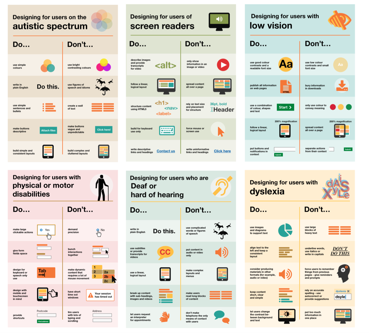
I always like to refer to these posters when designing new functionality as they are a really effective visual for understanding how to design for different aspects of accessibility.

Having the actions relative to the feature using cards means the user doesn’t have to scan the page as much or be overloaded with too much text. This helps to reduce cognitive strain.

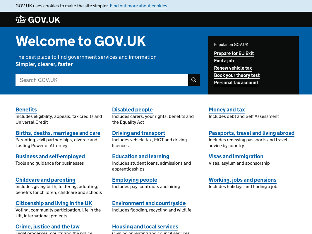
The GOV.UK homepage is effectively a hub for users to navigate all the services and information provided through the site. However, it doesn’t lend itself to supporting account information and actions for those features.
I did an initial test with a small group of users and some cross-government design and content people. The feedback was overwhelmingly positive however, it was suggested that there was still quite a lot going on and could it be condensed.
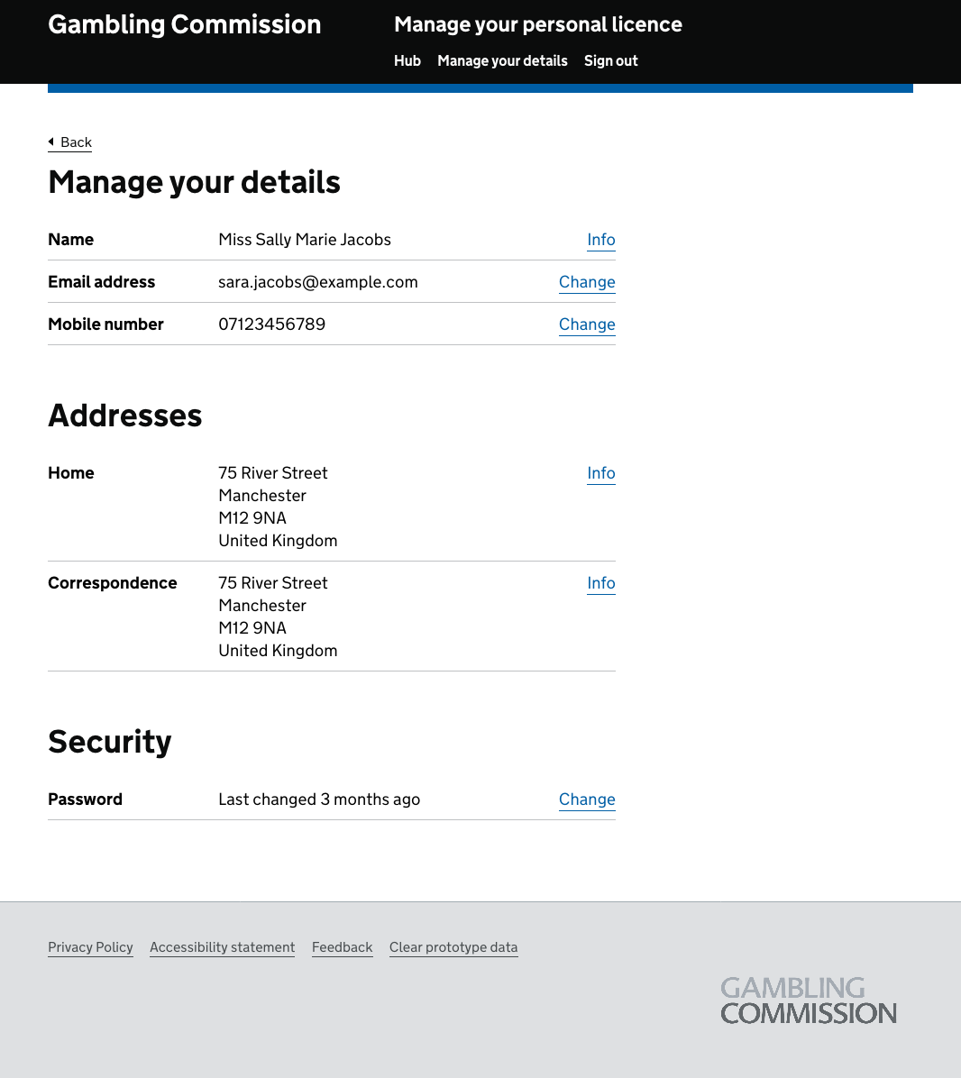
I took this feedback on board and looked at other GOV.UK services about how they managed profiles and account information. GOV.UK Notify does this effortlessly and so I decided to put the personal detail management into a new menu item. This would take the user to a single page with all their personal details available to change.


With a new profile page, this enabled me to revise the design of the hub. I took the notification pattern we had adopted in a recent service as this is consistent with a revised design pattern to an existing GOV Component used in confirmation pages, and keeps things consistent with the error summary styling too.
Instead of a red border for errors, and green border which indicates a successful action, the blue border indicates that this is for information. It should draw the users to it immediately that something requires their attention.

This design went through a couple of weeks of user research with a number of participants both face to face and remotely.
We found that participants liked the design of both the hub and the profile page. We had a lot of comments that it was easy to understand, it was clear the renewal was due and the overall aesthetic was pleasing.
A couple of participants suggested that they would be more likely to raise an event than do any other action.
I had taken the decision to put the licence details first as that seemed the most logical thing to do, you hold a licence, you’d want to be able to download it or manage it.
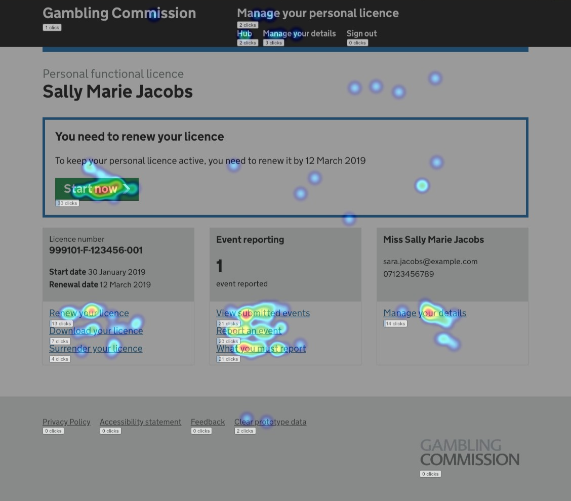
When we do user research, I use a tool called Mouseflow which tracks actions on a page, such as mouse movement, user attention and clicks. You can replay what the user did at a later time so, if during research a user is going back and forth or stuck in a process, you can play it back and work with that information along with feedback from the session.
The mouseflow heatmap data seemed to show that the most common actions we renewing your licence as we expected, but also that event reporting was more relevant than the licence section.

With this insight, I reordered the hub cards and we went back out to user research with a different set of participants.

With this change, we found that users were still going for the renew your licence action as we would expect, and require them to do. However, they were also going through the event reporting options quicker than previously.
users this time also said that they would be more likely to report an event than download or surrender their licence. The renew process is separated out and is only applicable every 5 years so was good that it was called out as a separate action.
The heatmap data from Mouseflow also appeared to support the changes and feedback.

Outcome
I always work on the basis that during user research, users will do what they expect you or think they should do. When instead a lot of the learnings come once a service is being used by users in a live environment.
For as long as I am able to, I will capture feedback regarding the account hub and understand how users interact with the service and seek to make improvements where necessary.
What I learnt
All designers have an inherent nature to make assumptions around design, it’s just human nature. However, writing down the assumptions and understanding how they have driven a design decision and understanding the impact is something else.
I never used to write design decisions down and now, when I’m prototyping I have a Google doc open where I take screenshots and make comments about the design process and crucially, write out hypothesis.
There are a few reasons for this:
- my memory is pretty awful so having things written down helps me remember why I did something the way I did
- it helps others who are new, outside the design process or just curious, understand why something looks the way it does
- it often helps to answer stakeholders questions before they get to the designer
- it helps future projects, it can make it quicker to get to a collective decision so if we need to have a pattern in a service, we can refer to what has been done previously and why.
The design document can act as a bit of a design system, especially when you are adapting existing patterns.
What I would do differently
In an ideal world, I would be pushing prototypes out earlier to more users and getting feedback sooner through specific A/B testing. I will also be looking to ask direct questions about which patterns work better for the user, rather than just observing what they do.
I would like to build a design system which extends on the patterns used from the Gov Design System, but are specific to our organisation. In the event I am no longer in my current role, someone else can come along, pick up the code for a pattern and run with a design rather than trawl through prototypes and documentation.