Overview
Link: https://uxdesign.cc/leadership-through-application-design-8f82471cb207
Last year, I was brought in to oversee the design and execution of a healthcare themed web-application. Originally, the application was to be divided into 6 teams with 4–5 developers working on separate parts of the application. However, we ended up reworking the application with a team of two–myself working the front-end and my colleague Christain on the backend.
The project scope was to create a home page marketing an imaginary healthcare company (which we dubbed Care+), a register/login page, and a dashboard for healthcare providers and patients that would show various information based on the security level of the user. It was primarily to be used as a marketing tool to show off to potential customers. Because I was designing a product for a brand that didn’t actually exist, I had a great deal of creative freedom and even ended up impressing some potential clients. But in the end, I learned that rampant creativity at the expense of your team is not really a win at all. I am hoping through this article that you can learn from my mistakes and learn how involving others in the creative process can help inspire a better work environment, relationships, and product.
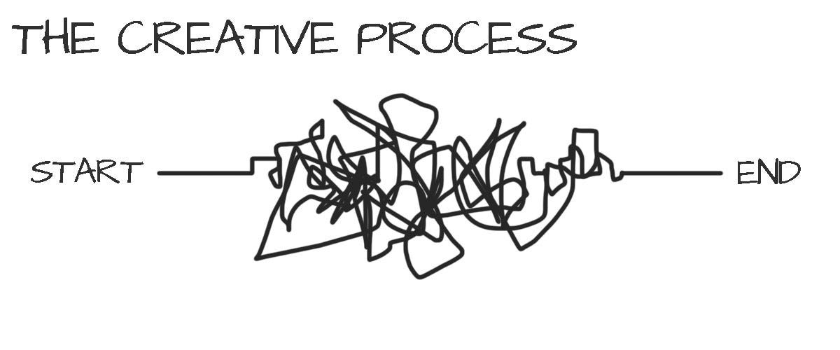
Organizing a Behemoth
Very similar to my ‘Airline Application’ project (in which I tried to remedy a lot of the mistakes I made during this one), I was put in charge of overseeing several large teams of trainees with little to no web development experience. In my naivety, I believed that my role was just to create detailed wireframes and hand them over to the teams, expecting them to execute them flawlessly (you can read how I came up with a vastly different approach when working with large teams). After being given my assignment (which was a few paragraphs of a loosely written project scope and some clarifying conversations with my manager), I set right into designing.
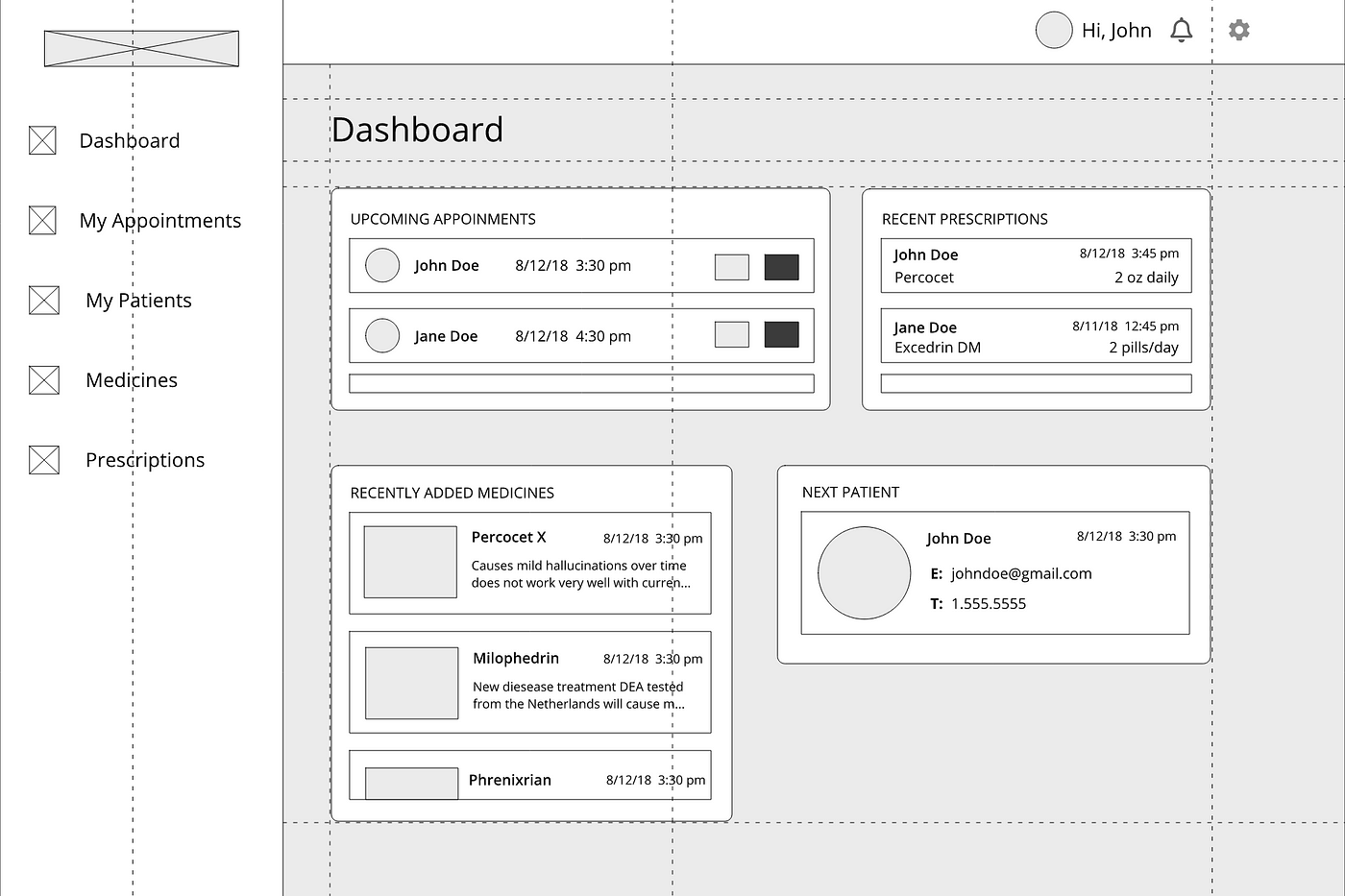
During week one of the projects, I carefully curated enough design inspo to fill a small book (or a large file folder on my desktop in this case), sketched designs like a maniac. After showing some ideas to my manager, who was more than a little ambivalent to the process, I went straight into creating wireframes/lo-fi prototypes with Figma, my low-budget design tool of choice. Honestly, I was having the time of my life. I was like an unbridled horse: for once I had total creative control on a project. I got into work early and left late and just genuinely excited to spend hours alone at my cubicle creating my magnum opus. All the while my team of developers was left twiddling their thumbs waiting on all of these designs to be able to start work.
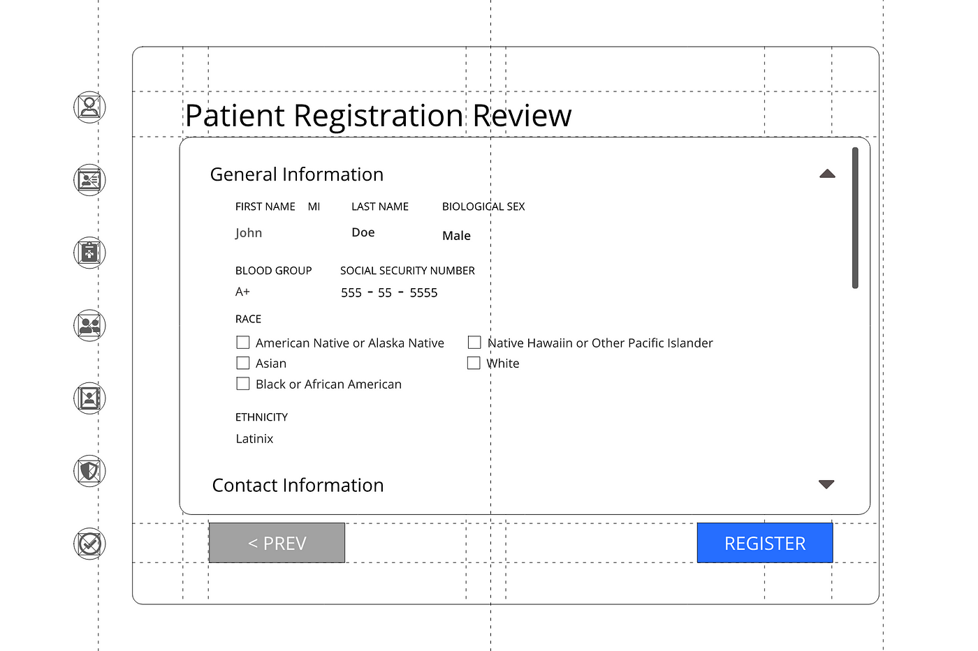
Needless to say, when these designs were delivered to an incredibly bored group of developers there wasn’t a lot of enthusiasm. In fact, many of them seemed pretty confused and even somewhat miffed that they had to enact this stranger’s vision without any input on the creative process themselves. When I worked as a developer at my first job in Lexington, KY, I was handed designs from the marketing manager and obediently matched them exactly to the design house’s specification. I imagined I could do the same with my trainees. However, I forgot what it was like to just create someone else’s thing without any say in the matter. In fact, it was part of the reason I worked so hard to become a designer myself. Maybe, if you are dealing with apathetic workers, it’s because they are sorely missing out on one of the greatest parts of working: creating. Not that all developers are interested or qualified to create large scale designs–that’s what designers are for, after all–but without that communication element, it becomes hard to care about something you aren’t really a part of. You work with human beings, not machines.
So this was lesson number one for me. Don’t work in a bubble. Even if you aren’t able to involve everyone in every part of the design process, you can still have the team play a valuable part in picking favorite designs, rating solutions, and testing prototypes. In one of my all-time favorite design books: ‘UX Team of One’, the author, Leah Bruley, gives some excellent suggestions on ways to involve your team in the UX process. One that would be exemplary in this case is the ‘Black Hat Critique’ method where you print out your wireframes and hang on the wall like a gallery and arm your teammates with sticky notes encouraging them to let their inner critic fly. You can leave the room and let everyone anonymously (unless you are some strange handwriting detective) write their notes on each design. While this method requires some thicker skin, it’s incredibly useful for you as a designer to get honest feedback from your team as well as gives everyone to vent out their concerns. When working closely with developers, this is paramount. Nothing destroys a team faster than passive aggression between the designers and developers. I really wish I had done this with my team in the first place. It would have saved so much time and countless headaches down the road.
Execution: Take One
All things considered, the end product after round one really wasn’t that bad looking back. This was many people’s first run-in with CSS/SASS, which if you have never worked with it, is a literal hell on earth. For total newbies, what the separate teams came up with was honestly pretty impressive, but not up the standards of the client at all. It didn’t help that the difficulty was compounded by many of my designs being overly complicated. I reasoned at the time that if I could create them myself, everyone else should — without really considering the skill level of my team.
The next few weeks were really hard on everyone. I was beyond stressed trying to create more detailed designs to ‘help’ the developers understand my vision while groups of 5–6 people came to my cubicle about every 20 minutes to ask me to help them with a coding issue. All the teams were so focused trying to make something just work at all that many just ignored the design standards I set up (font styles, colors, button sizes) and started doing their own thing. Virtually none of the teams communicated with each other and while I was busy trying to keep up with everyone’s needs (as well as teach some of the basics of styling), the silos between the teams widened. When it came time to merge everyone’s code together (they had to work on this without Git due to some issues with licensing–I have no idea how they did it, honestly), the pages were so different it looked like each part came from a totally different set of standards. Everyone was so stressed out getting the thing to work that all of the designs I spent night and day working on were virtually ignored.
Honestly, I think when I saw the final product I went to the bathroom and cried. How could something I worked so hard on turn out so completely wrong? When I was asked to make a design quality assurance write up I barely knew where to start without sounding bitter and condescending. I was livid. Although I came over to a lot of people’s desks and helped them work on bits and pieces (mostly answering questions about how the ‘position’ property works and when to use margin and when to use padding), I was completely surprised at how it turned out in the end.
Some people might’ve said, “Hey, you did your job. It’s not your fault everyone else couldn’t keep up.” That sure was my attitude at first. But, when I really started to analyze my feelings, I realized that I wasn’t so upset that my work didn’t get shown the way I wanted to–I was upset because I felt like I let everyone down. It is not your job as a teammate to create something so spectacular that your peers are in a panic to do their part. Your job as a designer is to make something that meets the needs of the stakeholders, the users, and the developers who actually make the product.
When I just started out as a developer, I was expected to be able to make anything that the designers came up with. And me, being the manic people-pleaser that I am, spent weekends and late-nights learning all the tricks to pull it off. But really, is that a healthy way to work? How much company and personal time would be saved if we sat down and discussed with the rest of the team what is realistic? If I could have swallowed my pride, I would have realized that the flashiest design means nothing if it can’t be created in a reasonable timeframe. I would have realized that maybe keeping things simple with and sticking more or less to the predefined templates like PrimeNg or Ionic offers would have been more efficient. If you are a new designer, I would really want to invite you to think about the feasibility of implementing every cool animation you see on Dribbble before handing it to developers to make. By no means am I asking you to limit your creativity. In fact, I believe you’ll really be surprised by what amazing things you can make in the confines of a given template or how you can really make something unique even with just the barest amount of additional styling.
“Creativity loves constraint” — Marissa Mayer, VP of Search Products & User Experience at Google
After some discussion with my manager, and the complete repulsion of some of the developers at the notion to ever touch ‘Care+’ again, it was decided that Christian (someone who I worked with on a previous project that produced excellent results) and I would redo as much of the app as we could before the sales team showed off the app to our customer.
Execution: Take Two
Large teams work, in theory, the way computers with many threads for processing work. If you aren’t a comp sci buff, basically the more threads you have, the more parallel processing power you have. This is why quad-core and i7 core processors were such a big deal a few years ago, the more processors you have, the more processes you can run at once. Supposedly, with more workers, you can get much more done. However, many managers seem to forget to factor in that people rarely work the same way computers do. You can’t just throw a bunch of workers at a problem and expect it to get down quicker, in fact usually the opposite effect happens. Without factoring the abilities/experience of each worker as well as the time spent getting the entire team to understand what their role is, when it should be done by, and how their part connects to the whole, you will be sorely disappointed with the end results. When you are manager as well as a single designer trying to communicate detailed diagrams for every page in an app that has well over 30 individual pages–you are likely to have as much progress as a mom trying to clean with a toddler in the house (if you have never experienced this, I would highly recommend babysitting for a friend, and then I would recommend hugging your mother for an extended amount of time). In retrospect, of course, the original plan was doomed to fail, but as a young designer really trying to prove herself, I still went on anyway. I really wish now I had followed my gut and brought this up to my manager. Maybe we would have saved a lot of headaches down the line.
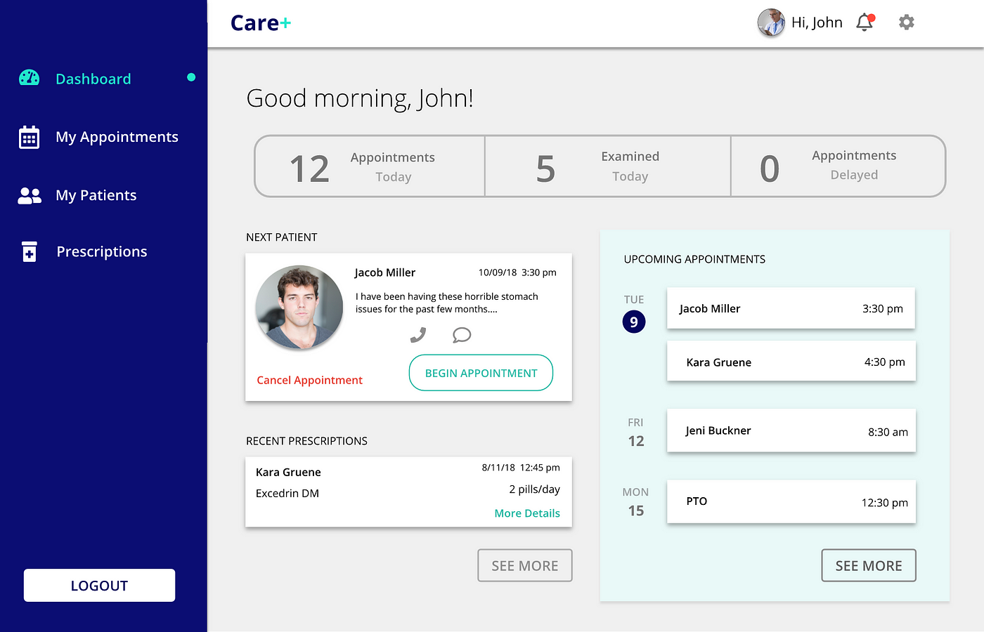
Regardless of the snafu caused by the original plan, the latter half ended up going rather smoothly. It still surprises me how quickly Christain and I were able to move through recreating the app. In about two weeks, we made the same amount of progress as the previous team made in about a month. We were more experienced, a little more invested (I was going to make this thing great come hell or high water), and really could work as a team.
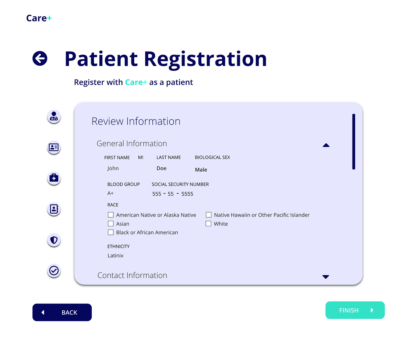
It was also worth noting how knowing each other can really help with making things work. Having worked with Christain before (and me being naturally chatty, being cubemates we made quick friends), it was so much easier to make things quickly. We had already built up trust with each other. I knew that he was reliable to make things work with the databases already being familiar with his skill set, and he trusted me to make designs that would be cool enough to impress the client and would be easy to merge into with his code. Additionally, everything I designed I knew how to replicate in code. I was able to add some animations between pages and try out some new techniques I had read about (surprise, surprise here on Medium). Whereas before I was on the other side of the room away from my first team, Christain sat right behind me so it was easy to discuss any issues that arose or to show him designs for quick feedback. Maybe if I personally knew everyone I was going to be working with before (even just grabbing a quick cup of coffee with each team), they would have been able to trust me more and vice-versa. Working in silos is never good for the creative process.
Outcome
In the end, we pulled it off and really helped the company impress our client. I got a lot of pats on the back that day, but I still couldn’t shake the feeling that I failed somehow. I was incredibly proud of what Christian and I were able to create. In fact, I think this ended up being one of my very favorite projects. But, I knew I hadn’t done the best I could for my team. I could have blamed my manager, I could have blamed my team for not having the right skill set, but in the end, I knew it was my responsibility as a designer to create with others. In this case, we didn’t have a specific user group to test with, it was just to demo. So where I had originally seen an opportunity to show off my skills, I should have seen this as an opportunity to teach, learn about my teammates, and help showcase the team’s skills.
I would suggest to new designers to involve your whole team from day one of your project. Learn what they want to get out of this experience and anything they want to try out; you might be surprised by how enthusiastic and creative your team can be even if they aren’t from a design background. When you’re working with a large team like I was, it’s better to start out with a design system (an atomic approach would be a great way to start if you’ve never worked with design systems before). That way, instead of working to create endless wireframes, you have a template that is flexible and bitesize which is much less overwhelming for developers to replicate.
Save all the cutting edge, new stuff for small, specialized teams like Christian and I. It is easier to get everyone on the same page and experiment when working with just a few people. Most importantly, I would suggest to always be humble. Design, especially UX design, isn’t about who can make the flashiest page, it’s about communication. If you can’t communicate with those who work with you, how are you going to communicate effectively to your users?