Two of the most popular patterns of getting data inputs from users on the web (but also in applications) are represented by forms and wizards.
While the electronic form mimics the paper form (a page with empty fields that can be filled by the user with the needed information), wizards are actual micro-applications that guide the user through a sequence of forms.
What is a wizard?
As the definition states, a wizard is “a step-by-step process that allows user to input information in a prescribed order and in which subsequent steps may depend on information entered in previous ones”. (NNGroup)
This pattern can be used to simplify complex processes that are less performed, making it easier for every user no matter the skill level.
Wizard pages are much simpler than their counterpart of standard full-page forms. They achieve this by splitting the complex content into multiple steps, each one focusing on a specific type of information, thus creating a much more focused and intuitive experience.
_____________________________________________________________________
General Recommendations
- Keep the wizard short (ideally between 3 and 8 steps). Less than 3 means there’s no need for a wizard and more than 8 (even 10) means that you need to work on compacting certain steps.
- Enforce a clear sequential order of the steps. Allowing users to pick any step they want throughout the wizard will be damaging to the experience. A clear order of steps minimises decision-making and consequently, cognitive load.
- Create self-sufficient steps. Each step of the wizard should display all the necessary information for the user to complete it successfully.
- Lastly, allow alternatives to using the wizard. There is the cost of “dumbing down” the task as users perform it without fully understanding it and being aware of the underlying decisions. This hinders the possibility for the more expert users to fine-tune their choices and get the best outcome. A wizard shouldn’t be the one and only way for users to complete a task, but merely an alternative to another, more complex method for doing the same thing
_____________________________________________________________________
Prerequisites for designing the wizard
Learn about the users
The first step in the process of designing wizards is to understand the needs of the users. An excellent way to do this is through surveys, user testing and interviews. This will get you a critical understanding of their pain points which will better inform your design decisions and help address their needs.
Map out the flow
After correctly identifying the user needs, you as a designer are equipped with the necessary knowledge to map out all the branching points and steps that the wizard needs.
Shortest path
Depending on circumstances, some users will have an easier way through the process, while for others it will be more tedious. If the wizard is forked based on user input, and the users are aware of it, they don’t need to bother with the information that is not relevant to them. By doing this, in a well-crafted wizard, users will only see the steps and the relevant information for their specific situation.
🧙♂️With all of these things in mind, implementing a wizard is not a “magical” solution without flaws.
Disadvantages
Although wizards are great and powerful tools that break down complex or infrequent processes, they have some shortcomings.
- Higher interaction cost — this means more clicks than other input alternatives. In cases where you need to go through a wizard repeatedly or frequently, this could result in nullifying the advantages of splitting the process into smaller sections.
- No easy transfer or comparison between steps — It can be challenging for users to move information between steps or to refer to information entered or presented during a prior step when they only see one step at a time.
- No graceful interruptions — Users who abandon the process risk losing their work and having to repeat the previous stages by clicking again. It can be challenging for users to recall what they were doing and regain their context and the mental model of the process, even when the wizard enables preserving the state and continuing the procedure at a later time. (When it comes to this problem, forms aren’t better either, they face the same problem)
- May block access to other parts of the app — this is especially frustrating if the user needs to get access in order to complete the wizard. If the wizard is displayed in a modal window, that might block the information in the background that could be relevant to the wizard process.
- Limit control and creativity — wizards are great for amateur or novice users. They benefit greatly from the guidance and help provided throughout the process. This could be very limiting and, thus, frustrating for a professional user who wants to make finer changes and it’s unable due to the limiting nature of the wizard.
🧙♂️When learning how to design wizards, it’s best to look at some great examples in order to understand the patterns.
Examples of great wizard design
Airbnb — creating a new housing listing
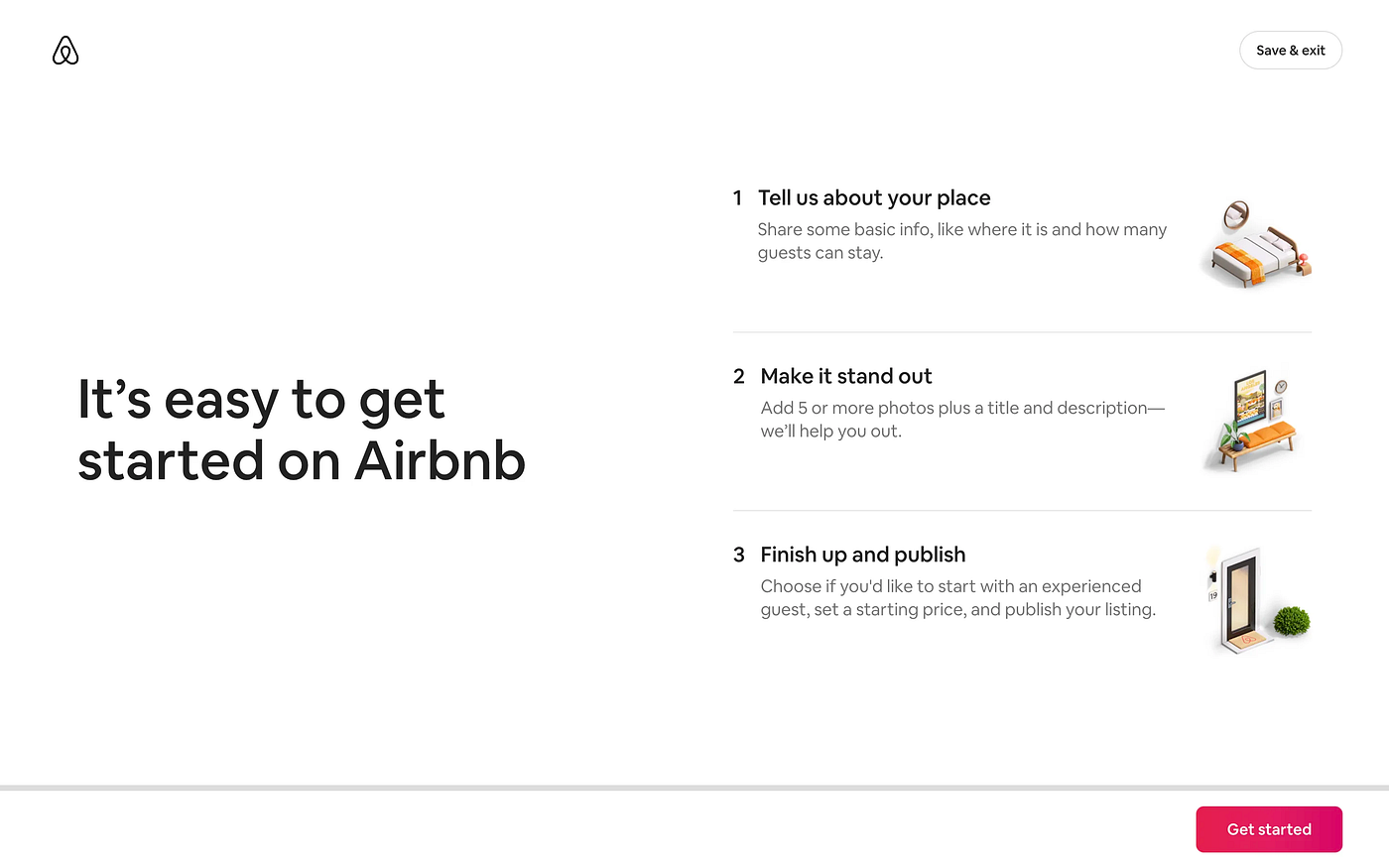
- This is the first page of the wizard which allows the user to upload a new house listing.
- The information is nicely placed on the screen, with everything fitting above the fold, so the user doesn’t have to scroll down the page.
- It informs the user about the process, communicating the mental modal which in turn helps the user to orient themselves in the flow
- The main button is clear and visible, with the right label “Get Started” . There is also a button to quit the flow, again with a high information scent in the label “Save & exit”.
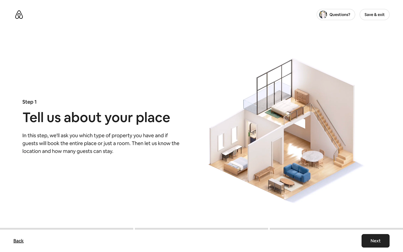
- Moving to the next page, we see a progress bar on the bottom with 3 segments.
- This is a filler page, meaning the user doesn’t have to enter any info, its role is to give more information about the content of this first step.
- The main action buttons are clear, additionally, there is a “Back” button on the bottom row now and also a “Questions?” button on the top section. Both the position and the weight of these buttons are ideal.
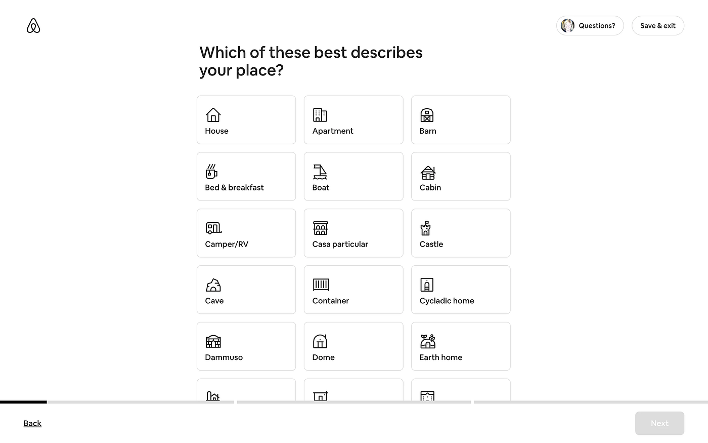
- Another excellent example in this case is the fact that the “Next” button is deactivated. Unless the user makes a selection from the options displayed, the flow cannot be continued.
- Even though there are 3 main steps, we can see that for each main step, there are multiple micro steps. This is indicated by the progress bar.
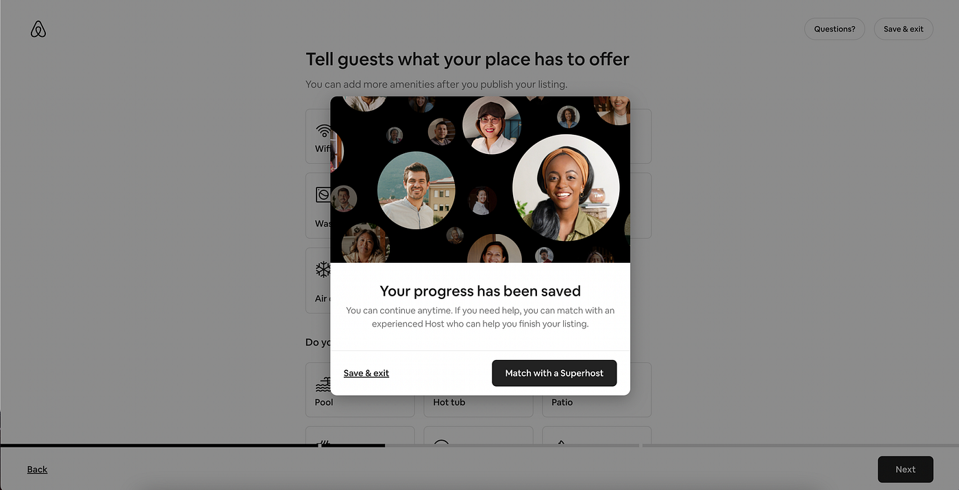
- Here, the pop-up window that appears when the user attempts to exit the flow, is highlighted The prompt clearly lets the user know what happens with the current process and how to access additional information and help.
- Here we see that additional information such as helpers is displayed as a modal window that covers the main content. This is not ideal, as this information could have been displayed on the same page next to the main content, without being too distracting.
- This is the last step of the wizard. The outcome of the wizard is communicated to the user in order to dispel any possible confusion.
- When it comes to the “Publish” button, this is another example of high information scent, having that label as opposed to something like “Finish” which wouldn’t give the user the same amount of information.
🧙♂️Now that we’ve seen the Airbnb wizard, here are a few tips (with examples) in order to better understand this type of design process.
Tips for designing a great wizard
There are many ways a wizard can fail, a few ways in which it can actually be useful and even fewer ways in which it can constitute an actual quality user experience.
This section aims to summarise the best practices that designers should take into consideration when designing wizards. Taking these tips into consideration can make a wizard great in terms of UX.
Tip no. 1 — Keep it simple
Simplicity triumphs in UX. One of the main advantages of using a wizard instead of a lengthy form is that it simplifies the process. So, in order to live up to that statement, the pages should not bear unnecessary complexities. Ideally, the designer should be able to fit everything above the fold (but this is not always possible).
Airbnb — Accommodation listing
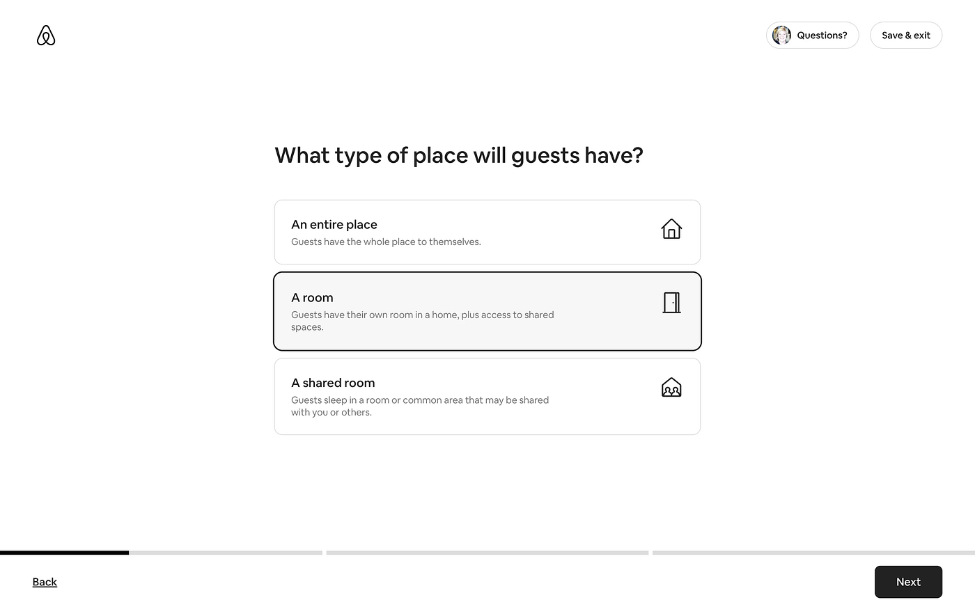
Simplified steps mean more screen real estate. If done right, the users might not even have to scroll through the page to complete the step. Having additional real estate means that if an explanation is required, it can be displayed next to the relevant fields. This increases the quality of the UX significantly by presenting the user with well-designed, bite-sized information that is easily processed.
Bumble — Account creation
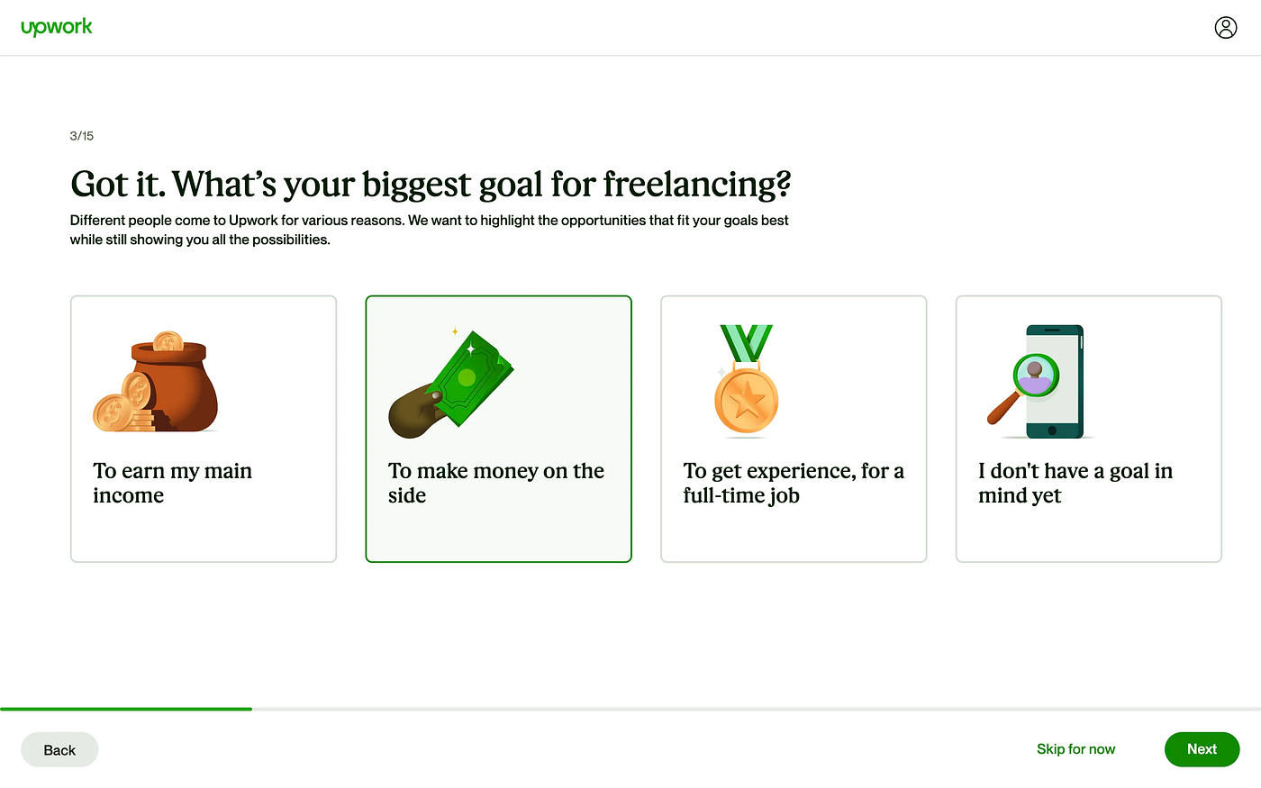
Upwork — Building a profile
Tip no. 2 — Take a break
Interruptions should not be ruled out, for some users it’s inevitable. Knowing this, it is great to offer users the chance to exit and save their progress from the wizard flow.
Airbnb — Accommodation listing
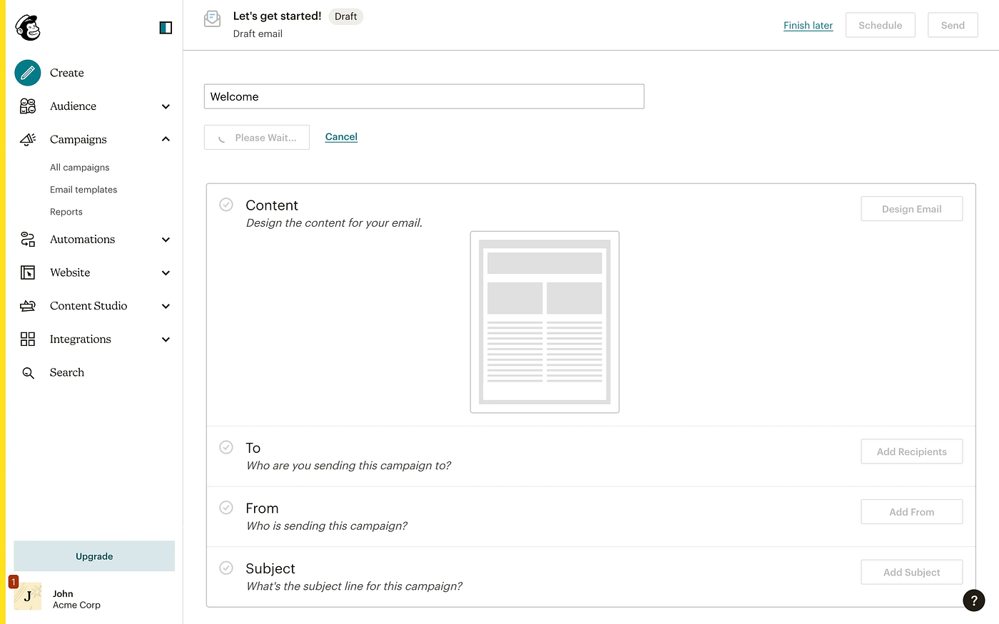
Mailchimp — Creating an email campaign
Tip no. 3 — Great by default
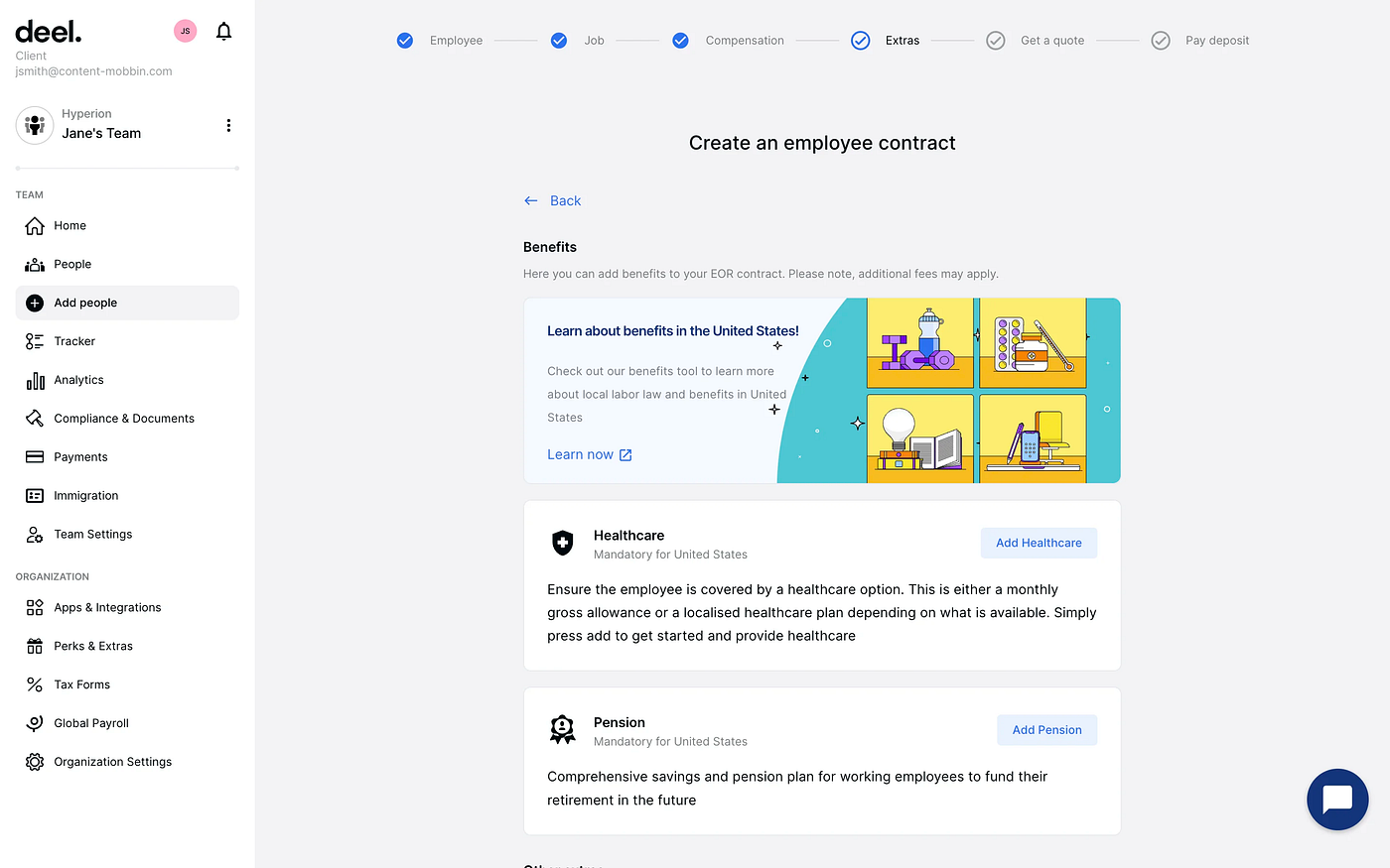
Consider reusing the user’s selections from previous use as defaults for the next time they use the wizard. As with many tasks, users benefit significantly if the system remembers their input and selections from one use to the next. For first-time use, you as the designer should choose appropriate default values, and in some cases, those standard values should always be the default.
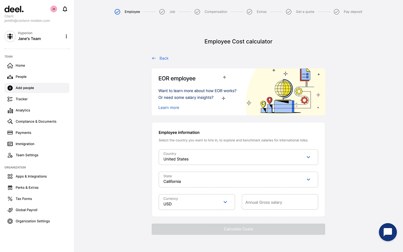
Deel — Adding an Employee
Asana — Onboarding

Tip no.4 — Intermission
In some cases, it’s a great idea to implement an intermission screen. These are pages that do not require any sort of user input and they only serve as informational.
Airbnb — Accommodation listing
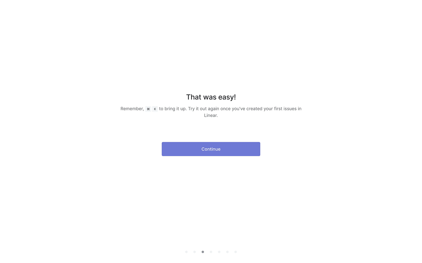
Linear — Onboarding
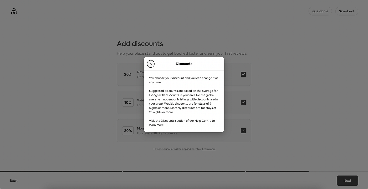
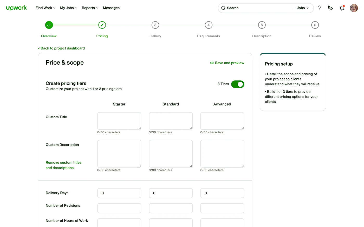
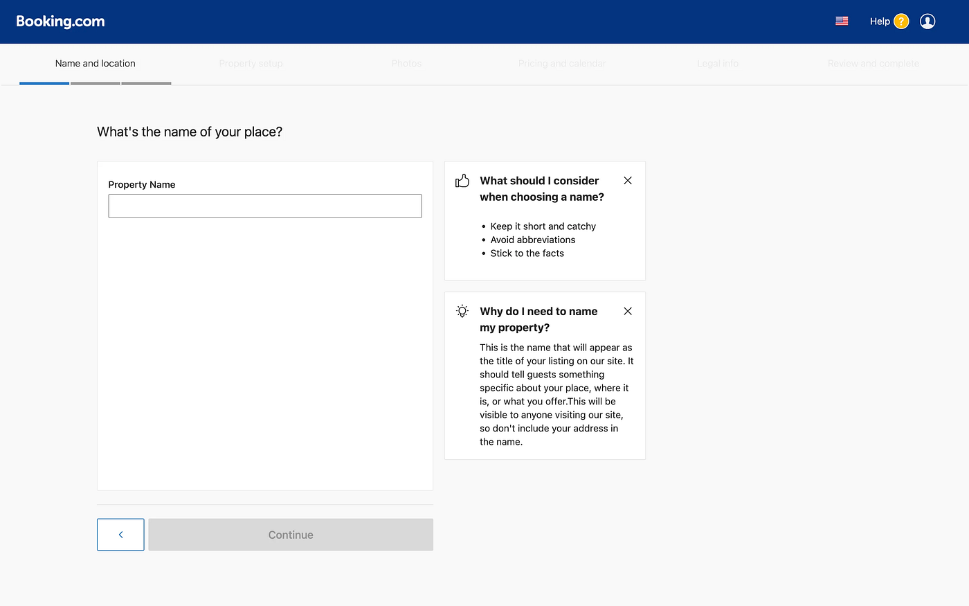
Tip no. 5 — Provide useful information
Helpful information should appear next to the wizard without covering or obstructing anything. By being provided with this type of additional insight, the user will be able to go through the wizard more intuitively.
Customer.io — Creating a campaign
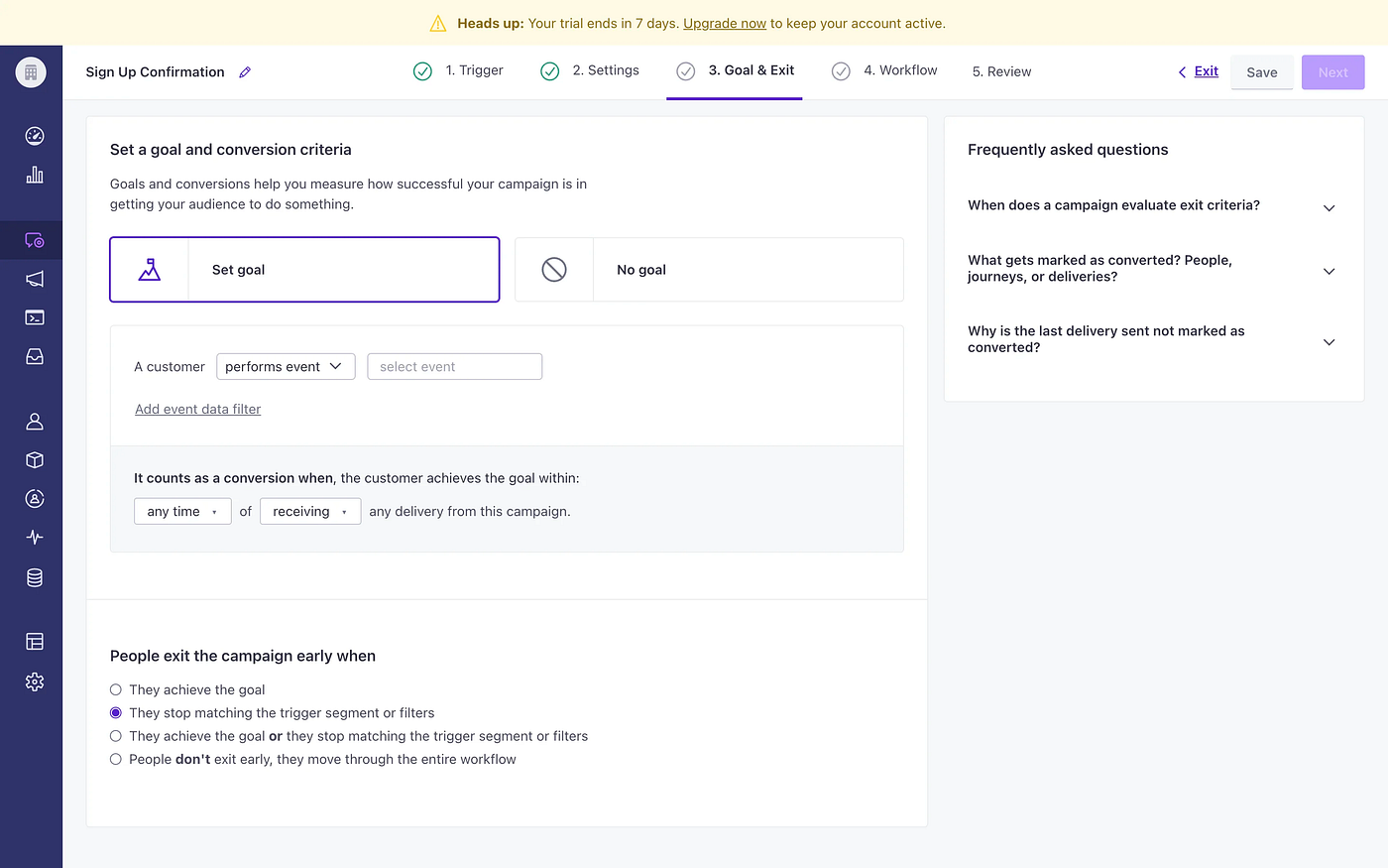
Upwork — Creating a project
Booking — Listing a property
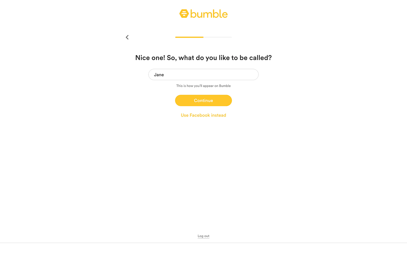
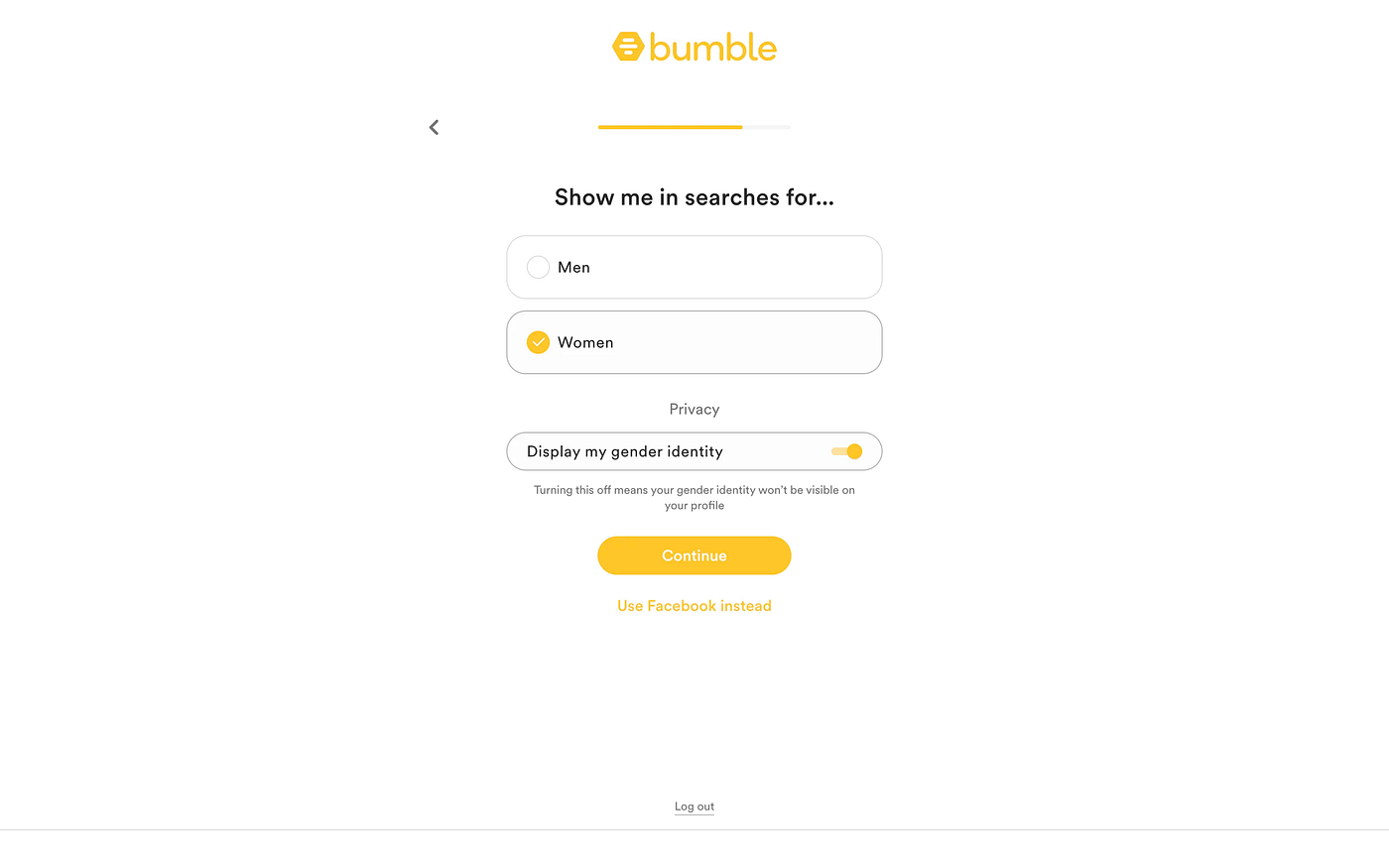
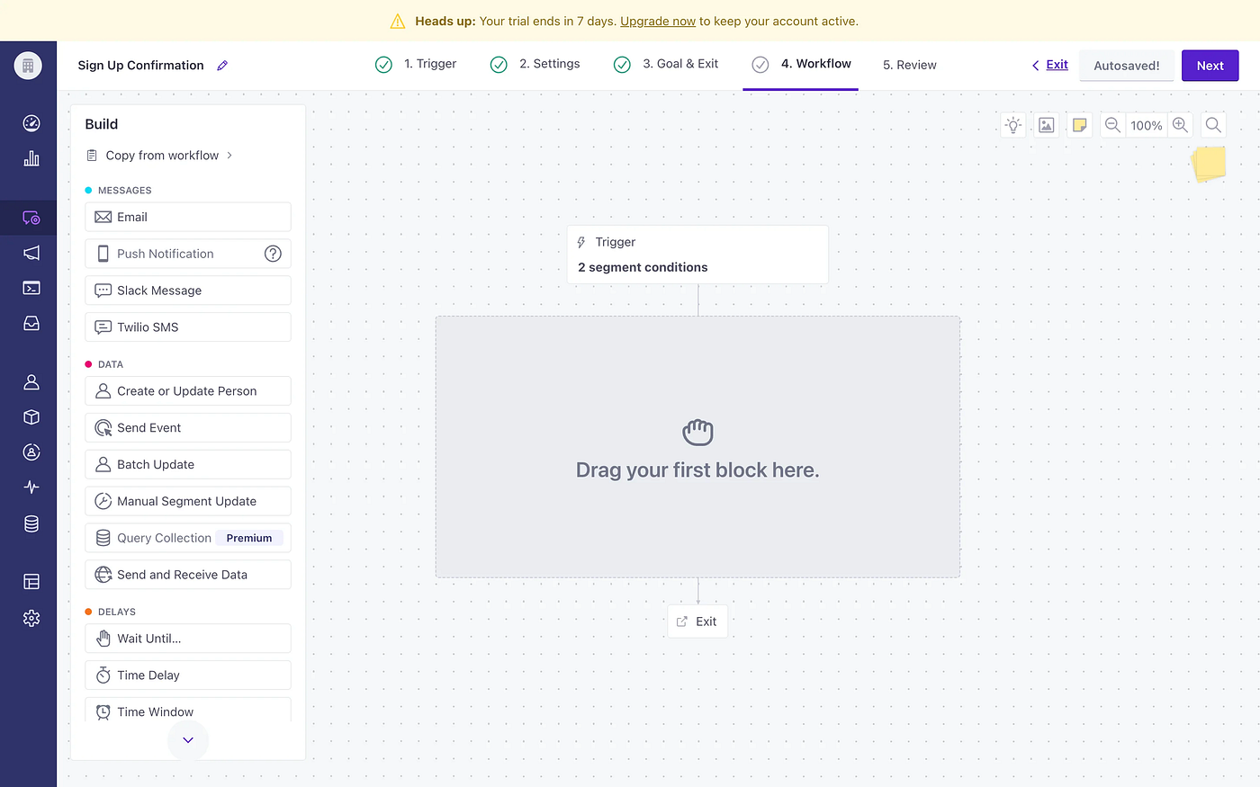
Tip no. 6 — Are we there yet?
Progression bars/diagrams provide a clear indication of how deep in the flow the user is at a particular time. This sort of information helps the user orient themselves in the wizard, making for a much better (less confusing) user experience.
Airbnb — Accommodation listing
Airbnb’s progress bar is simple and great. The bar is separated into three segments that represent the 3 big steps (these are then further divided into smaller portions — with shorter user input required).
Bumble — Account creation
Customer.io — Creating a campaign
Deel — Adding an employee
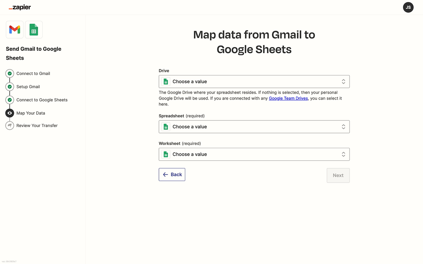
Zapier — Create a new transfer
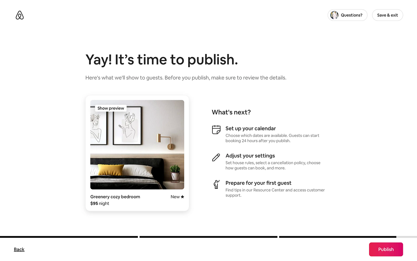
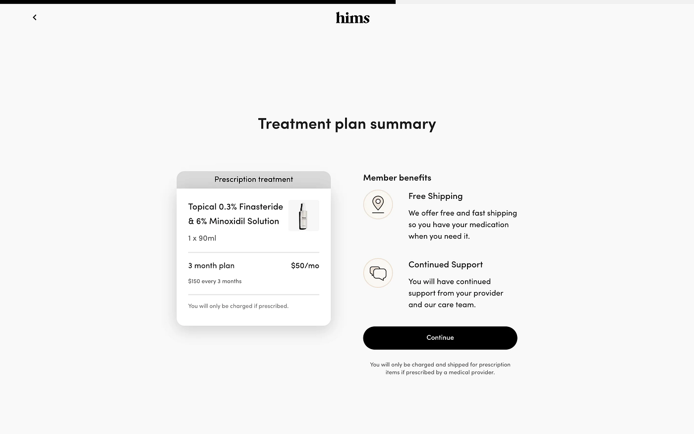
Tip no. 7 — The Summary
If possible, it’s a good practice to present the user with a summary of the choices they made throughout the wizard. This should be done near the end of the process. This sort of approach helps by allowing the user to review and double-check their input before finishing the wizard. In case they choose to alter a response from a previous step, they can do so through quick navigation options present in this part (this addition improves the intuitiveness and usability of the wizard).
Airbnb — Accommodation listing
- Airbnb offers a preview of the listing made by the user before the actual publishing. The example given above showcases a great simple way to deliver a summary of the user choices.
Hims — Hair treatment assessment
Stripe — Quick edit
- Stripe is a bit different when providing the summary for the user. Instead of only showcasing the information that has been entered throughout the steps of the wizard, Stripe allows users to quickly edit their information.
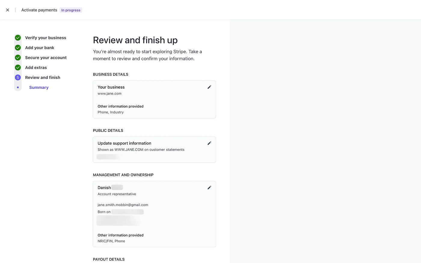
- This is extremely convenient from a user’s standpoint as the chance of error is reduced greatly when provided with this type of summary.