Adopting a Consistent, Clear, and Comprehensive Approach to UX that Aligns to Software Development
UX DESIGNERS HAVE A PROBLEM
Unlike with software development, where engineering approaches are generally well-defined and understood after 30+ years of the Internet at scale, UX design is still looked upon as a mysterious black box, or (worse) a brief step involving “prettying” up UI code with component, color, and font flourishes. A quick review of historical and current software development frameworks shows UX and product design usually aren’t mentioned at all, or only in passing (“design” in these contexts usually means system architecture). It’s taken 20+ years for UX to finally be included in Agile & SAFe 6.0, but still only in passing. Design is hardly taught in engineering programs, and usually only as an elective. Overall, this has resulted in very little understanding of design and UX processes within software and engineering.
DESIGNERS ARE PART OF THE PROBLEM
The problem isn’t solely with developers: even design schools take widely different approaches to training designers in good UX processes. When I went to design grad school (20 years ago), the UX process wasn’t taught at all. Designers, being creatives, also tend to like “getting creative” with the process, and they really don’t like feeling unduly constrained. Consequently, there is generally little consistency in individual UX designers’ approaches, given that their experiences and education have varied so widely.
CONSTANTLY PLAYING DEFENSE
What this means is that there simply is no well-recognized single industry standard for UX and UX processes. And the impact of that is that in nearly every company and every sector, UX designers and design leaders must constantly explain to nearly every stakeholder what they do, what they produce, what value they provide, AND how they work. Constantly being on “defense” about your existence and work process is demoralizing for veteran designers, and intimidating for junior designers.
ONE PROCESS TO END THE FRUSTRATION AND CONFUSION
When I first took on enterprise design leadership, I realized that a shared UX process standard could address many of these issues. A holistic, simple, and flexible process, including team roles and outputs, framed in plain language, and aligned to the software development lifecycle, could address so many UX designers’ day-day frustrations, improve UX quality and efficiency, and reduce inter-team friction — if it was well-documented, embraced and consistently implemented. That’s the promise of the UX 8-Steps framework.
This blog post will describe the UX 8-steps, its history and differentiating features, and how VMware began to adopt it. I believe the 8-Steps can provide enormous value for any UX designer, enterprise UX team or software organization. Read on to see for yourself!
CONTEXT
ADDRESSING UX TEAM CHALLENGES: 8-Steps was introduced at VMware to alleviate common designer challenges that were shared during my first 100 days. Top UX team complaints included:
- Lack of clear product requirements or product roadmap
- Insufficient UX staffing/ resources in comparison to product and engineering team sizes; unrealistic expectations of designers
- Lack of understanding of the user/ persona who would use the product/ feature and their needs and goals
- Insufficient time, resources, access to users, and knowledge to conduct sufficient UX research and testing
- Exclusion of designers during planning and strategy; designers brought in only to ‘execute’ a feature, or fix a bad UI that had already been developed by engineers
- Lack of “design thinking” and cross-functional ideation or co-creation conception activities, like design sprints as part of the planning and release process to spur more innovation and collaboration
- Tendency to jump into designing one solution rather than designing or considering multiple approaches and then validating with users which is the best
- Lack of adherence to or knowledge of Clarity, VMware’s enterprise design system
- Lack of consideration of accessibility needs, or accessibility best practices
- Insufficient time and ability to address defects or design inconsistencies in the product before shipping; de-prioritization of UX in the backlog
- No metrics, telemetry, or analytics data on product/ feature usage that would be valuable to UXers
This is not an exhaustive list; I chose these challenges because these same concerns are voiced by UX teams in many enterprise tech companies. 8-Steps makes designers’ needs clear and addresses these and other concerns.
ANNUAL GOAL-SETTING: To address the team challenges and prioritize change, we introduced 8-Steps into the UX team’s annual goals. 8-Steps got a further boost from our CTO Kit Colbert, who was enthusiastic about adopting a consistent process that could improve quality, efficiency, and morale. 8-Steps was then codified into our CTO’s and our design team’s OKRs, with quarterly milestones for introduction and enterprise rollout, via this annual objective: “Introduce and Adopt the Standardized UX 8-Stesp SDLC Framework within Design, which maximizes efficiency and ensures customer centricity across VMware businesses” (see my Medium post on The Enterprise UX Design Playbook for more on our UX goals).
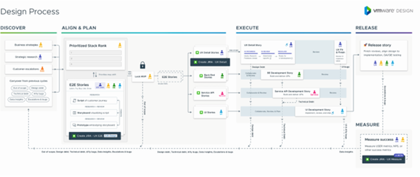
THE PRIOR VMWARE DESIGN FRAMEWORK: 8-Steps was not the first framework for the VMware UX team. A robust framework from 2018 existed on the old VMware Design website, and many on the team had contributed to defining it. One challenge with the prior framework was that it was not being widely used or referenced. It was just an artifact. This framework also did not address the common pain points designers experience in their day-to-day work, such as how to “convince” product leaders that they need time and resources to do UX research. 8-Steps makes these elements explicit. My UX leadership did a side-by-side comparison of the previous framework and 8-Steps and determined that there was nothing lost or omitted by converting.

OTHER WELL-RECOGNIZED UX AND DESIGN FRAMEWORKS
8-Steps is not the first, only, or even the best UX process framework. Many exist, and each has its strengths. Here are a few of the most commonly cited ones:
IDEO AND STANFORD’S D-SCHOOL IDEO’s classic hexagon framework represents the foundation of user-centered design. The beauty of this framework is broad industry awareness of it, and its simplicity. The challenge (in my view) is its lack of specificity or alignment to software development and release processes. The process appears to exist in a vacuum, which leads to confusion on exactly what’s expected of both designers and other stakeholders.

DOUBLE DIAMOND The “Double Diamond” is another classic. I love Double Diamond, as it elegantly summarizes UX’s enterprise value and general approach: UX helps to Build the right thing and Build the thing Right. To do that, you need to go broad and diverge with multiple concepts, before narrowing and converging on a single solution. The challenge of Double Diamond (my view) is like the hexagon framework: how to reconcile this with the software development process and enterprise operations? UX Research and other process steps aren’t explicitly referenced either.

OTHER UX FRAMEWORKS. There are many other UX frameworks, and the Interaction Design Foundation provides a great overview of many of them, I’ve shown two more diagrams and models below as additional examples. All provide value and are well-considered. Some are intentionally high-level, while others are more prescriptive. Yet I consistently found there remained a gap to clearly define what designers and other teams and functions should do, expect, and generate at each step… hence the need for 8-Steps.


SO WHY ADOPT 8-STEPS?
8-STEPS EMPOWER UX TO BE SUCCESSFUL: The primary goal of 8-Steps is to support UX designers by ensuring they have what they need and are positioned to maximally influence the product strategy and execution. 8- Steps:
- Clarifies for Product/ Engineering/ PMs what UX Needs, what UX Does, What UX Delivers & When
- Refines UX Sub-Discipline Roles, Responsibilities, and Expectations within UX Teams
- Standardizes UX Process & Approaches Across Teams to achieve greater consistency and interoperability
- Uses clear language, without undue design jargon, to assist in process adoption by Product & Engineering
- Focuses on User-Centered Design by Embedding UX Research and User Testing into the full lifecycle
- Explicitly Integrates Accessibility and Design System Conformance into the Process.
- Sets Clear Expectations for Sufficient Staffing, Planning, & advanced product / Feature Requirements Definition in Phase 1 as necessary precursors, and Makes it clear that UX best practice requires exploring multiple solutions before executing any.
8-STEPS OVERVIEW: LET’S DIG IN!
This next section will go into detail describing the framework.
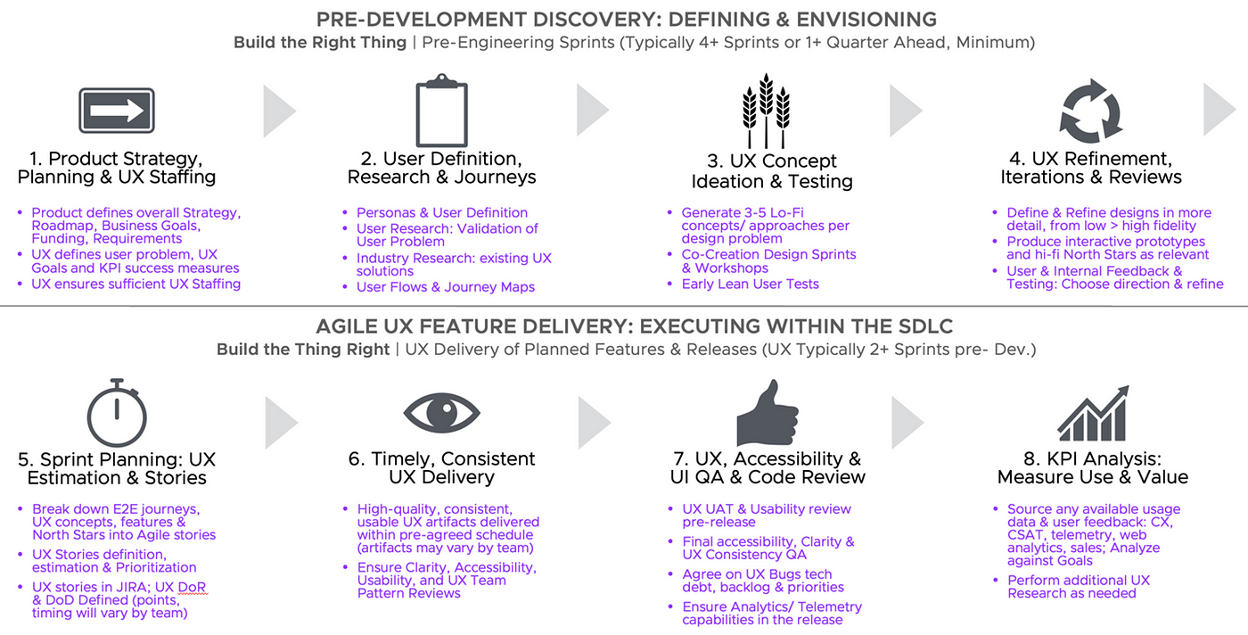
OVERVIEW: Like Double Diamond, 8-Steps distinguishes discovery from implementation. The first four steps are about defining the problem, understanding the user, and creating and evaluating several concepts. Here, UX’s primary stakeholder is Product Management. Steps 5–8 are about implementing the chosen UX solution within the SDLC and how to work with primary engineering on software delivery.
- Pre-Development Discovery: 1. Initiate > 2. Identify > 3. Concept > 4. Refine >
- Agile UX Feature Delivery: 5. Plan > 6. Execute > 7. Review > 8. Measure.
Steps 1–4 are most relevant when first concepting or planning a new product, while steps 5–8 happen at the feature level. So, there can be a 1:many relationship between the two sections.

SUMMARY OF EACH STEP
Let’s look at the purpose of each step as a starting point:
- STEP 1- INITIATE: Product Strategy, Planning & UX Staffing. This first step is focused on ensuring the precursors for good UX work are in place: clear product strategy, requirements, and planning, and sufficient UX staffing on the project.
- STEP 2- IDENTIFY: User Definition, Research & Journeys. Step two focuses on user-centered design: defining the user and ensuring current user journeys, challenges, and contexts are well understood.
- STEP 3- CONCEPT: UX Concept Ideation & Testing. Step three starts low-fidelity ideation to solve the identified user problems from step two, ideally by using cross-functional co-creation and design thinking methods.
- STEP 4- REFINE: UX Refinement, Iterations & Reviews. Step four evaluates, iterates, and refines the ideas from step three with the early user and internal feedback to determine which solution to move forward with.
- STEP 5- PLAN: Sprint Planning: UX Estimation & Stories. Step five begins UX execution in the context of engineering: sprints, user stories, and agile. It ensures UX has a role in planning our own team’s delivery expectations.
- STEP 6- EXECUTE: Timely, Consistent UX Delivery. Step six is when UX delivers our artifacts.
- STEP 7- REVIEW: UX, Accessibility & UI QA & Code Review. Step seven ensures UX has an opportunity to QA and review what Engineering delivers for quality and accuracy before the code is released.
- STEP 8- MEASURE: KPI Analysis: Measure Use & Value. Step eight ensures UX will obtain the appropriate telemetry and usage data post-release to evaluate the efficacy of the UX solution with users and further refine it.
WHO DOES WHAT?
CLEARLY DEFINED ROLES & RESPONSIBILITIES. One of the principal benefits of 8-steps is it makes it clear to UX leads what they should do at each step, and also defines the role of Product, Engineering, and other teams like Accessibility and Research. This ensures more consistency and clarity on what is expected.

WHAT ARE THE OUTPUTS?
WHERE ARE THE WIREFRAMES? 8-Steps also help clarify what tasks are performed and the relevant UX artifacts and outputs that might be delivered at each phase. Summary: we’re more than boxes and arrows!

WHAT ARE THE BENEFITS?
WHY SHOULD I USE THIS FRAMEWORK? Since 8-Steps requires adoption and buy-in not just by the UX team, but also by Product and engineering, it’s essential to articulate the “What’s In It For Me” value proposition for changing processes to support each of the steps. For example: teams are often asked to cut back on research or skip early explorations and validation. The Benefits diagram helps refute some of these common team challenges by explaining why each step is valuable and necessary.

WHAT CHALLENGES ARE ADDRESSED?
ONE FRAMEWORK TO SOLVE ALL PROBLEMS! The beauty of 8-Steps is its specificity by step. 8-Steps can systematically address many of the team issues that were raised during my onboarding. 8-Steps can then be referenced as justification for UX leads to advocate for their needs and why these actions are necessary.

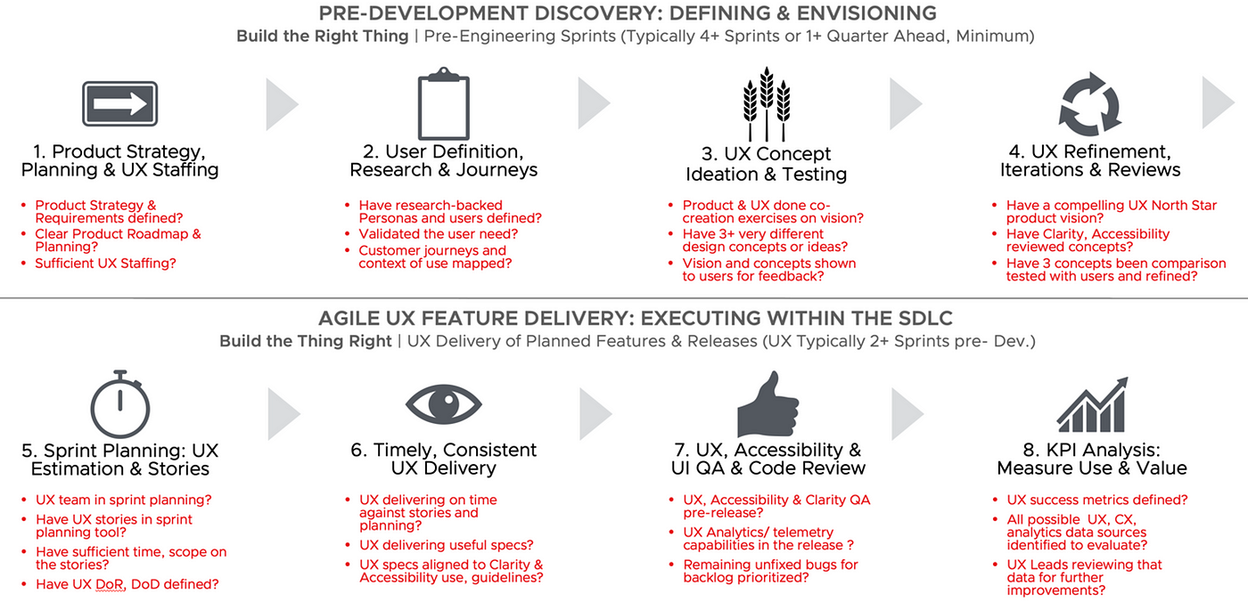
FINALLY, DRIVING COMPLIANCE: A CHECKLIST
A CHECKLIST IS ESSENTIAL! Of all the diagrams and details shown here, the checklist gets to the heart of how to execute 8-Steps. UX and cross-functional teams can utilize the checklist in post-mortems and sprint retrospectives to determine how fully they have been able to adhere to the process. Conformance to 8-Steps by team could even become its own enterprise UX dashboard, with evaluative scoring metrics by step that roughly align with industry scorecard evaluations of “UX Maturity” (we attempted this at GE in 2019).

THE ORIGINS OF 8-STEPS: YOU NEED TO CUSTOMIZE!
8-Steps was born out of the need to codify the design process to address recurring enterprise challenges designers were having across different teams. The benefits of any UX framework are 1. to support designers in addressing their chief process and enterprise pain points, 2. to define and clarify the design and UX research process for designers and others, and 3. To ensure all designers are trained in, and adopting, the fundamentals of research-backed user-centered design with some consistency in their approaches. Beyond that, the details can and should vary.
FROM 6, TO 10, TO 8-STEPS For example, 8-Steps wasn’t always 8-Steps. It began as 6 Steps, then 7, then grew to 10 Steps at GE, and then was reduced to 8-Steps at Allstate. There are differences in software processes and team challenges at different companies that impact how many steps are necessary.
At GE, for example, there were specific steps aligned to UX staffing and budgeting (a perennial challenge!), as well as required adoption of our enterprise design system with design system creative director sign-off on usage, and a specific step aligned to global UX usability testing before release (GE Healthcare operates in 150+ countries where the context of use for healthcare can vary widely and software rollouts for medical devices can take years, so up-front research is essential). At Allstate, the chief team concerns were different and focused on role definition within the UX team- who does what across design ops, visual design, interaction design, content, UX managers and UX leads? At VMware, concerns were mainly raised about how to align 8-Steps to some cross-functional teams’ sprint planning and story/feature definition processes within engineering-led stakeholder teams.
In summary, a framework must be adapted to the context of use and the specific challenges of the organization to reap any benefit from it. This may require adding or removing steps, or changing the focus and degree of specificity of some steps. A framework should be a tool to support designers and for advocacy — not an onerous set of rules.
HOW WE INTRODUCED 8-STEPS AT VMWARE
TEAM INTRODUCTION, ADAPTATION & CUSTOMIZATION Introducing 8-steps took much of the year, as it was important to get comprehensive buy-in and quell any concern via widespread team education. Individual designers and managers were going to be the ones to implement 8-Steps and evangelize it to their peers, so ensuring everyone was aligned was important. Here is what we did:
- We began in January and February by sharing with my UX senior leadership how I’d used 8-Steps at GE and Allstate. We looked at the current process and compared it to 8-Steps, and determined that 8-Steps covered all aspects of the current and added more details.
- We then added 8-Steps to our annual goals and OKRs.
- We shared a refined version with extended UX leadership of about 30+ senior UX practitioners and managers through two half-day workshops to deep-dive into what 8-Steps is and to gain input on semantics and likely challenges to adoption. Many aspects of 8-Steps were modified and customized for VMware based on this group’s valuable feedback.
- From there, in April (VMware’s Q1), we held an all-UX multi-hour virtual workshop where the refined 8-Steps were presented, with additional sections on the outputs and benefits resulting from each step and a FAQ added to the presentation.
- Fast forward a few months to July (our Q2), where we held another all-UX virtual workshop in which managers led their teams in team breakouts to “try on” adopting 8-Steps by mapping their current process to the proposed 8-Steps process. This led to the identification of many gaps and opportunities for improvement within each team.
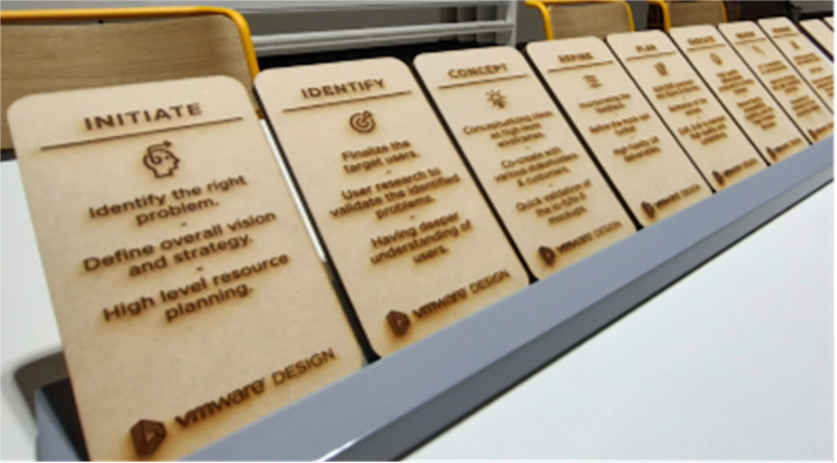
- Some teams got very excited by 8-Steps and started to adopt it. Our LUMA design thinking leader mapped 8-Steps to LUMA design thinking frameworks and tools. The UX research team mapped 8-Steps to various research methods. Our India UX team even created an 8-Steps game for the VMware Design India Expo in August, with wooden 8-Steps game pieces!
- October was set to be the next workshop to discuss how each team could beta-test addressing their identified process gaps, as well as to begin an enterprise-wide educational rollout at the senior leadership level with product and engineering leaders. Given the acquisition, this was postponed.


8-STEPS IMPLEMENTATION CHALLENGES
PROS & CONS 8-Steps is not without its limitations. The most obvious concern is the same that could be said for any process- that it’s too restrictive or formulaic, or doesn’t cover special scenario XYZ. After 6 years of defining and refining 8-Steps, I am confident it is sufficiently flexible and elastic for nearly any user-centric context and DOES cover most scenarios designers might face, but there may be special cases where designers need to skip a specific step for a specific reason.
Another critique: is that it’s too linear/ “waterfall”. Although 8-Steps are laid out in a linear prescribed sequence, it’s up to design leads to determine when steps can be ‘skipped’ or don’t apply, and it is assumed there will be extensive iteration at several of the steps and that some steps will run concurrently. For example, if the user persona is already well-defined on a product, it clearly would not be necessary to conduct additional persona research for every feature; instead, prior research validating the feature’s needs might suffice. Or perhaps a product has no visual UI; therefore, adherence to Clarity’s UI code would not have any relevance. Finally, typically major products operate on multiple tracks; steps 1–4 might help drive the overall roadmap and vision, while steps 5–8 represent the feature releases. That doesn’t negate the value of 8-Steps; it shows its flexibility.
PROPONENTS & DETRACTORS This leads to the 8-Steps lovers and haters. Lovers like the consistency 8-Steps offers, as well as its detail, clarity, and flexibility. They understand it’s just a framework that represents the basics of research-backed user-centered design. Haters, broadly, don’t like to be penned into any process, or they think there are too many steps or too much detail, or they prefer a different framework based on their experience. I welcome any adaptations that can reduce steps! So far, I haven’t figured out how to reduce further without meaningfully detracting from the outcome.
TIMING & ADOPTION CHALLENGES No process works in a vacuum. 8-Steps is just a framework, so the benefit comes from implementing the framework from within the UX team and across the organization. At VMware, we couldn’t achieve the planned enterprise rollout and executive education around 8-Steps beyond the design team due to the rollout timing right at the point of the Broadcom acquisition. My hope and wish is that the UX teams will carry 8-Steps forward within Broadcom post-close.
WHAT COMES NEXT?
TRY 8-STEPS YOURSELF! Curious about using 8-Steps? Feel free to adopt it for your team or company’s needs. At a bare minimum, try comparing your current process to the 8-Steps recommended process by using the Checklist. This will reveal the key areas of opportunity to ensure you are maximally user-centric in your design approach.
APPENDIX: 8-STEPS FAQ
Below is a supplemental FAQ we created about 8-Steps that covers many Frequently Asked Questions from UXers.
Q: Why do we need a new UX process when we already have one? How is 8-Steps any better?
- A: 8-Steps is equally designed for Product, Engineering & Design — not just UX. It sets clear expectations on who does what, when, how, and why. 8-Steps makes it clear when UX is not getting sufficient support as a problem to be addressed: insufficient staffing, no time for research, no testing, no clear UX DoR or DoD, etc. 8-Steps also has a proven track record in evolving “UX Maturity”. 8-Steps can turn into an enterprise UX dashboard for evaluation of conformance by step. 8-Steps can then be rolled into other PMO standardization and compliance initiatives.
Q: We create these ideal processes on paper, but what people do Is very different. How do we solve this, and are there any consequences for not using it?
- A: 8-Steps clearly sets the baseline for the UX team’s baseline expectations. Change takes time. 8-Steps and related OKRs are to be used as justification for needed improvements, with the entire org. referring to the same standardized 8-Steps presentations and reference documentation and training materials
Q: Where do North Stars, journeys, and larger, cross-enterprise initiatives and flows fit in?
- A: They fit into Steps 2–4. Once features are ready to be developed by engineers and translated into sprint tasks that are handed off to engineering, they map to steps 5–8. HOWEVER, You might still have Jira / Rally tasks (step 5) showing work allocation for designers who are busy working on design steps 1–4 within your engineering sprint planning tool.
Q: I don’t have a UX researcher on my team. What do I do for UX research and testing?
- A: The UX Lead is responsible for ensuring the right level of research is done- whether conducted by UX, in partnership with researchers, outsourcing/contracting, via other sources like CX, etc. If you don’t have the skills/ training/ time, consult the research team to guide you.
Q: How much time is needed for each step?
- A: It’s up to the UX lead to decide, and it will vary widely by product and feature. Some teams follow 2-week sprints; others are longer/ shorter. Some have 1-year release cycles; others release continuously. Some initiatives are huge multi-year initiatives; others are small enhancements.
Q: I’m Concerned 8-Steps will be seen as a “Waterfall”, “Too Many Steps”, “Too Complicated” or Contribute to the idea “UX is Too Slow/ Takes Too Long”
- A: 8-Steps is no more waterfall than any other engineering process with quality checks, tests, and planning. 8-Steps is iterative. That’s the crux of steps 3–4 and Steps 5–8 as part of Agile. UX 8 -teps should ultimately speed up delivery and product-market fit because the UX team will get what they need to execute and evaluate options earlier in the process.
Q: Do I have to always follow all 8-Steps for every design, feature, or initiative? What outputs or artifacts are “required” for each step? And why call it “8-Steps” if the UX Lead can choose to skip steps?
- A: UX 8-Steps defines the baseline expectation of what is needed to do proper end-end user-centered design. Having the steps there still sets an expectation for research, conception, etc. We shouldn’t be regularly skipping steps for any product, but per release/ feature, and in some circumstances, a step may not make sense. Given this, the UX Lead is empowered to skip steps. Example: you may already have requirements and staffing (step 1), personas and audience knowledge (2), North Star designs and concepts vetted (3–4), which means focusing on individual features at the sprint level (5+). The UX Lead also decides which artifacts will be most valuable to produce for handoff, based on that specific team’s expectations. For some products, UX might deliver workflows; others, pixel-perfect designs; others, Figma files; others, UI code; others, written specs… It’s entirely up to the leader to decide.