VMT – A vision, mission, and target represent different levels of organizational planning and strategic direction. Vision describes the desired future state, a long-term aspiration. Mission defines the organization’s purpose and how it will achieve its vision. Target (or goal/objective) is a specific, measurable, achievable, relevant, and time-bound (SMART) outcome that contributes to the mission and vision… Read the rest
Category: DESIGN
Main category
Design Patterns For AI Chat Interfaces.
Design Patterns For AI Chat Interfaces. With practical guidelines on how to designing more useful, and less annoying AI chat ↓
🚫 Nothing erodes trust more than disguised AI.
🤔 Often users dismiss AI chats almost instinctively.
✅ Users expect an option to “speak to human”.
✅ Be transparent about who users speak to.
✅ Wait for users to end … Read the rest
Usability Testing Guide
Usability testing is a critical part of the user experience (UX) design process. It helps identify how easy and user-friendly a product or service is for its target audience. Usability testing is an essential practice that helps ensure your product is user-friendly and effective. By following these steps—defining goals, selecting participants, creating tasks, analyzing results, and implementing improvements—you can ensure … Read the rest
User journey maps
User journey maps are an effective way to visualize user’s experience for the entire team. Instead of pointing to documents scattered across remote fringes of Sharepoint, we bring key insights together — in one single place. The downside is that journey maps are often too linear, too predictable, too neat — which is often exactly the opposite of what users … Read the rest
Measure And Show UX Impact
Great UX goes unnoticed simply because we don’t speak the language of business. Time to turn intuition into measurable value
How To Measure And Show UX Impact. With practical guidelines on how to track and articulate business impact of design work ↓
To visualize UX impact, we often use design KPI trees or design KPI graphs (see above). Both are … Read the rest
Design checklist
Checklist Design is a collection of the best UX practices paired with UI you need to provide a complete, honest and rewarding experience for your users.
With the knowledge of not just what to put on your screen but why it should be there, Checklist aims to build the understanding between the two as a relationship that’s integral to the … Read the rest
UX team structure
The 3 types of UX team structures
A UX team structure clearly defines the roles and responsibilities of each team member, to whom they should report, and how they’ll work with other teams. How you organize your UX team depends on many factors, including product needs, resources, UX work needed, and company culture. To help you choose what team structure … Read the rest
UX and IA designs.
Navigating the intersection of User Experience (UX) and Information Architecture (IA) can be akin to solving a complex puzzle. While IA focuses on organizing and structuring information to optimize findability and comprehension, UX Design takes a broader approach, considering overall user satisfaction and usability.
… Read the restUX design focuses on the overall feel and interaction with the product, while IA is concerned
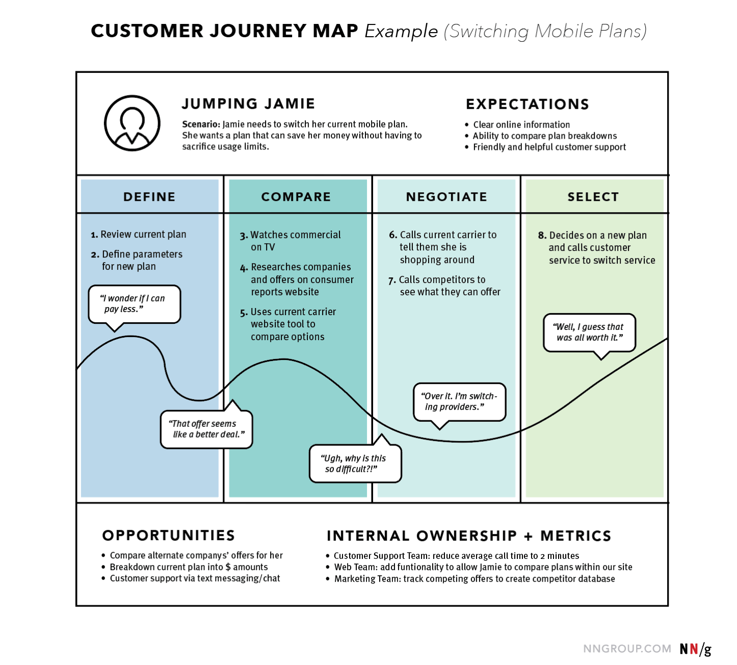
User Journey Map Examples
Example 1: NN/group

Source: NN/group
We chose NN/group’s user journey map as the first example for one reason. It’s very simple and easy to recreate and can serve as the most basic template with all the crucial components inside. In this particular case, we’re looking at the user journey map of the Jumping Jamie, who is looking to switch … Read the rest
Measuring UX
Measuring UX is an essential and must-have stage in your design process that with a reasonable effort, can give you an objective assessment of your product in a matter of days.
Measuring UX can also be used for:
- Comparing previous and new versions of the product
- Comparing your product with competitors
- Getting industry evaluation standards (NPS, SUS, SEQ…)
I invite … Read the rest