Design Patterns For Effective Dashboards. Practical guidelines for designing better dashboards and UX patterns to keep in mind ↓
🚫 Don’t destroy user value by oversimplification.
✅ Oftentimes life is complex and tools must match life.
✅ Dashboard value is measured by useful actions it prompts.
✅ Aim to create understanding, rather than showing raw data.
✅ Start by studying audience, tasks and decisions to make.
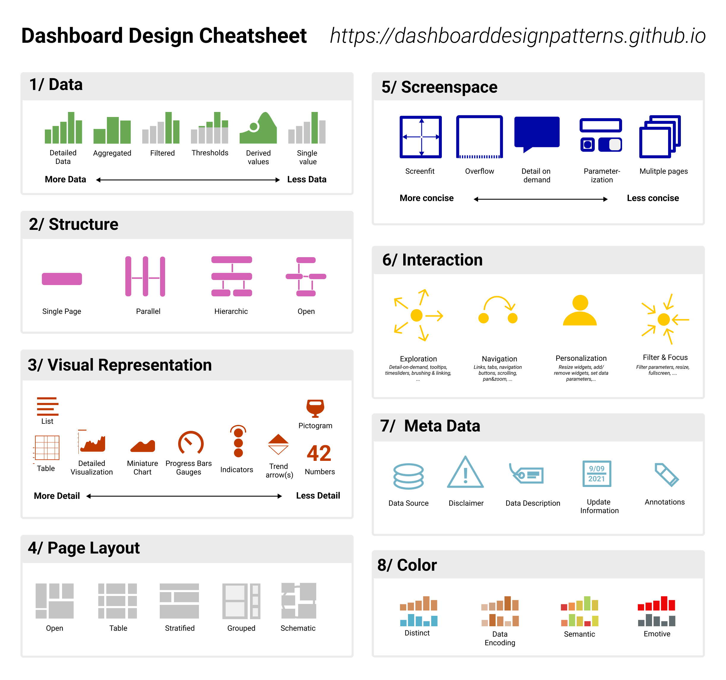
✅ Choose what data is important for a user in each task.
✅ Choose a structure: single page, parallel pages, drill-downs.
✅ Select charts depending on data + level of detail to show.
✅ Then set layout density: open, table, grouped or schematic.
✅ Design interactions for exploration, filters, personalization.
✅ More data → more filters/views, less data → single values.
✅ Design for interface expertise levels: low, medium, high.
✅ Low: large text size, progressive disclosure, extra spacing.
✅ Medium: regular size/spacing, more data cards, shortcuts.
✅ High: small text size, heavy data, customization, filters.
✅ Support user’s transition between levels of proficiency.
Dashboards are often seen as a way to organize and display data at a glance. And as such, too often it shows a lot of data without being actionable or meaningful. Yet the main task of a dashboard isn’t that — it’s to explain trends and communicate insights.
Start by studying levels of user’s expertise. Segment the audience and explore what data they need to make decisions. Think carefully what charts would be both accurate and meaningful — rather than being an oversimplification or guide to misleading interpretations.
Review defaults, presets and templates. Allow users to re-arrange and customize data density and widgets. Explore where a data table might help draw better conclusions. Most importantly: test your charts and dashboards meticulously.
We don’t need to reveal all raw data at once, to everyone, and at the same scale and pace. But we need to support pathways for people to face complexity when they must, and discover only a set of actionable insights when they need.
✤ Useful Resources
Dashboard Design Patterns & Workflow, by Benjamin Bach
https://lnkd.in/ed6Rr_sC
Practical Guide For Dashboard UX, by Taras Bakusevych
https://lnkd.in/e5gMMgXv
FT Visual Vocabulary (PDF), via Stéphanie Walter
https://lnkd.in/ezu2w8Vr
How To Design A Dashboard (free book), by Matt David
https://lnkd.in/enU-CxwU
UX Efficiency Frontier, by Morgane Peng
https://lnkd.in/ezbyuMBT
Data Dashboards UX Benchmarking, by Creative Navy
https://lnkd.in/eticxU-N
You Might Not Need A Dashboard, by Irina Wagner, PhD
https://lnkd.in/eBSEkCyb
#ux #design Link
Just in case you are looking for a high-resolution version of the attached image — it’s been kindly shared by Benjamin Bach, along with useful pointers on design process:
Full image: https://raw.githubusercontent.com/dashboarddesignpatterns/dashboarddesignpatterns.github.io/main/docs/assets/Cheatsheet-compact.png
Full design process: https://dashboarddesignpatterns.github.io/processguidelines.html