Explore the traditional associations of different colors and learn how to use them in the right contexts
Although we can make general assumptions about how colors affect moods and their symbolic meanings, our memories, cultures, religions, and environment have a substantial impact on how we perceive individual colors. For example, while in most Western cultures, brides wear white dresses as a symbol of purity and innocence, in many Eastern cultures, white is linked to death, mourning rituals, and sadness.
The right color selection gives users context, directs their eyes in the right direction, and helps them make decisions. Knowing the traditional associations of color and understanding the thin line between color meanings in different cultures helps designers select color palettes for product branding and marketing campaigns more intentionally.
Red
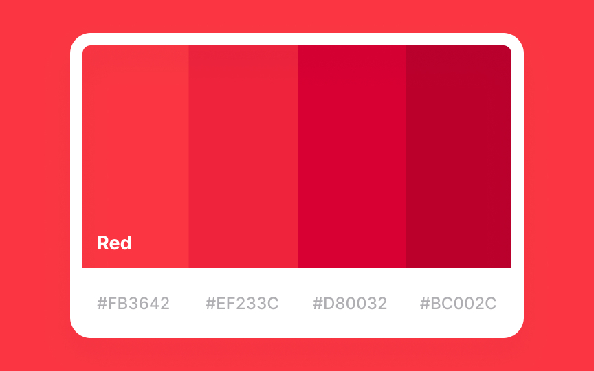
Red is the most powerful and also contradictory of the colors. On the one hand, color context stands for love, passion, desire, and health. On the other hand, it conveys danger, anger, violence, and fear.
Above all, red is hard to ignore, and that’s why red traffic lights and stop signs utilize red for warning and getting people’s attention fast. For similar reasons, people who wear red tend to stand out from the crowd. Roughly 64% of the cones in the human eye are sensitive to red light wavelengths, which is why the color is so noticeable.[2]
In many cultures, red symbolizes vital energy, fertility, and good health. For example, Chinese brides wear red gowns and walk on red carpets. In Greece, Albania, and Armenia, too, brides still wear red veils.[3]
Orange
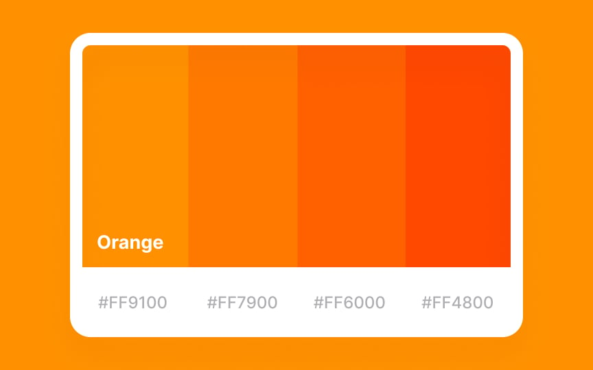
The binary nature of orange makes it as energetic and powerful as red and as happy and friendly as yellow. In general, people associate orange with many positive things in life.
Like red, orange is intensely visible and used for spacesuits and traffic cones to draw attention and give a warning. Some cultures attribute orange to wealth, such as the Netherlands, which uses orange as a nod to the Dutch Royal Family.[4]
Yellow
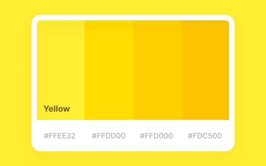
Yellow is energetic and warm. No wonder it’s the color of positive characters such as Spongebob Squarepants, the Simpsons, Lego people, Pikachu, emojis, and, of course, the Minions. In most cultures, yellow represents warmth, sunshine, and joy. It’s often used in situations when you need to lift spirits and create an atmosphere of brightness, light, and optimism.
However, dull or dirty yellow may be associated with cowardice, deceit, sickness, and jealousy. Certain shades of yellow can be abrasive and even make people feel irritated or angry in a room. Some studies suggest that babies feel more unsettled and cry more in yellow rooms.[5]
Green
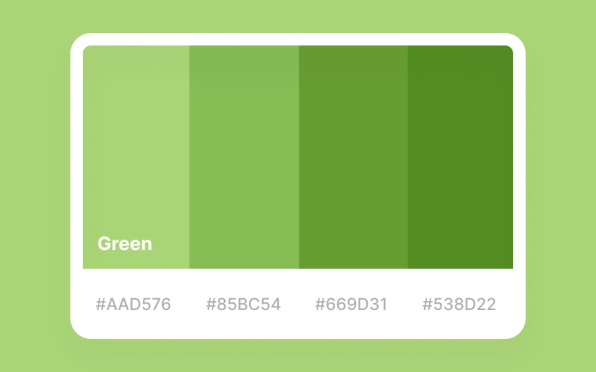
Green is found abundantly in nature and has strong associations with calmness and harmony. Simply spending time in a park or forest or looking at pictures of lush, green trees and grass tends to have a healing and soothing effect on the human body and mind. Moreover, green is known to promote concentration, improve focus, and reduce anxiety.
The color also stands for growth, youth, and hope in many cultures due to its associations with the spring season and the rebirth of the earth’s fertility. The other side of the green is linked to ambitions, financial stability, and success, as well as greed and jealousy.
Blue
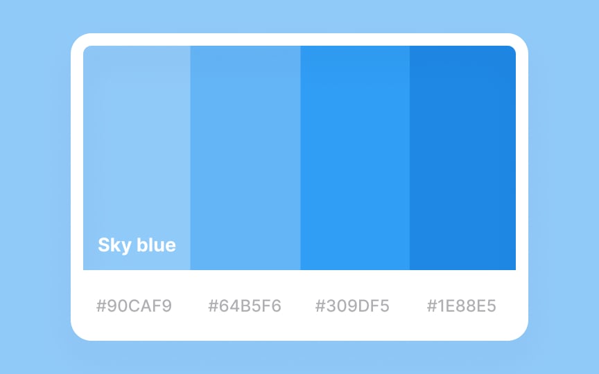
When you think of blue, you probably imagine large expanses of water and endless skies. Naturally, the color evokes feelings of freedom, reflection, and spirituality.
Blue is also a highly corporate color and is often associated with intelligence, stability, reliability, and conservatism. For this reason, blue is the color of police uniforms in many countries. Many bank institutions and insurance agencies use blue in their branding and marketing to promote a sense of security and trust.
Due to its calming and tranquil properties, blue is one of the most likable colors globally.
Tip! It is better to avoid distant and cold dark or dull blue in designs that are meant to inspire positive feelings.
Purple
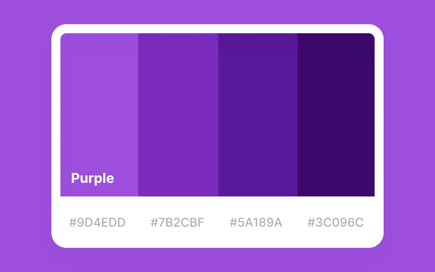
Rarely seen in nature, purple creates associations with the supernatural, spirituality, and mystery. It’s often described as creative and inspiring, which explains the meaning of the expression “purple prose” — overly ornate, imaginative, hyperbolic writing that draws attention to itself.
Historically, purple has also been a symbol of royalty and luxury. This connection goes back to when purple dye used for coloring fabrics was extremely expensive and only a royal family and people of authority or high rank could afford such items.
Pink
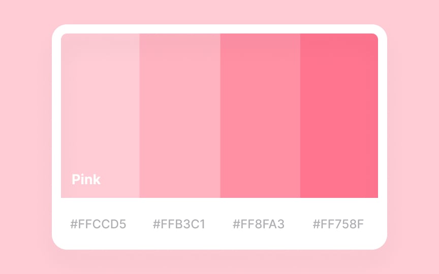
People often describe pink with qualities like softness, compassion, nurturance, and kindness. For this reason, the pink ribbon became an international symbol of breast cancer awareness.
Some shades of pink represent youth and innocence and may appear childish, euphoric, or lighthearted. Conversely, highly saturated pink can look playful, flamboyant, and exotic.
Even though both red and pink symbolize love, red represents passion and desire, whereas pink has more tender and romantic connotations.
Gray
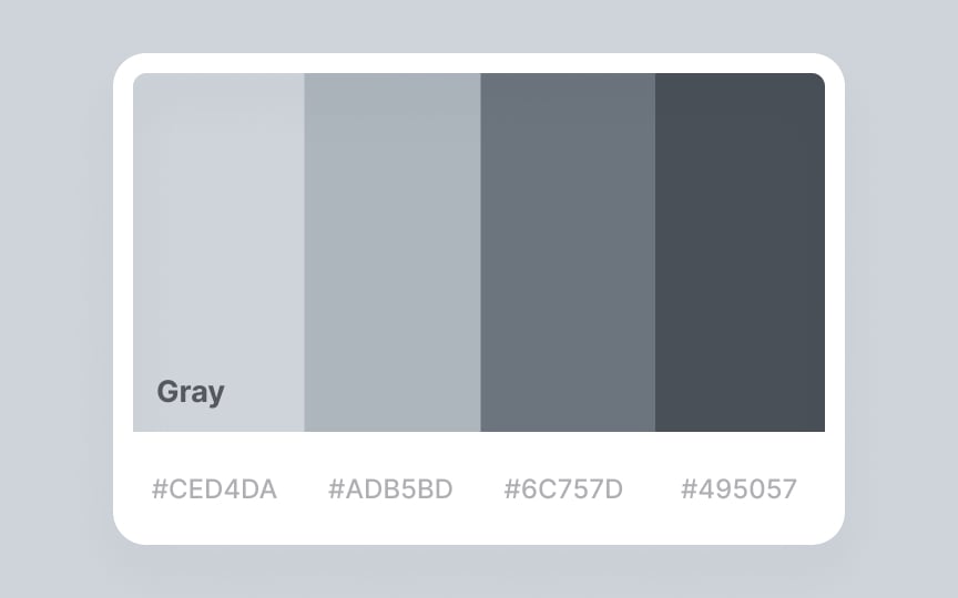
Carrying the attributes of two colors that constitute it, gray can be associated with the calmness and neutrality of white and the elegance and intelligence of black. Being conservative and diplomatic, gray is often the color of business suits, offices, and practical, down-to-earth approaches.
While soft gray appears calm and nonchalant, too much gray can come across as ice-cold, depressing, or even authoritarian.
Black

On a positive note, people tend to associate black with elegance, sophistication, luxury goods, high ranks, and nobility. In many countries, people like judges, police officers, and priests wear black to represent security, power, and authority.
Conversely, in many cultures, black is tied to negative things like death, sorrow, evil, fear, depression, and anger. These associations explain the origin of expressions like “black mark,” “black sheep,” “blackmail,” “black market,” etc.
White

For many individuals, white symbolizes new beginnings, exciting ideas, and a fresh start. It is known to help people clear their minds and calm down by promoting feelings of peace, honesty, and simplicity.
In many Western cultures, white represents purity, faith, and the heavens and is often linked to angels and weddings. In fact, a bride’s white dress symbolizes purity and innocence.
People also often link white with medical centers, sterility, safety, and cleanliness. If used incorrectly, the color may appear cold, distant, and dispassionate.
Tip! Too much white in design can create a sense of emptiness.
Brown
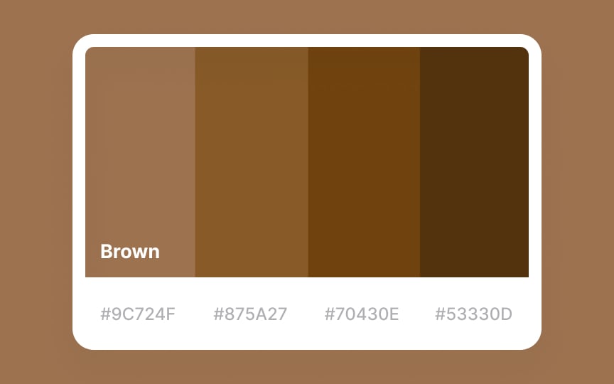
Brown is often seen as grounded, rugged, and solid, just like the earth. It’s often used in marketing and branding to inspire confidence, support, and comfort in users toward a product. Examples include Hershey’s, Nescafe, M&M’s, and Gloria Jean’s Coffee.
Despite positive associations with brown, like all dark colors, it still can evoke negative associations with outdated things, poverty, plainness, and even isolation. In fact, studies have revealed that it’s one of the least favorite colors for all genders.
Beige
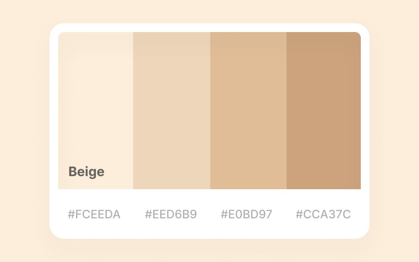
Beige is a contradictory combination of warm brown and crisp, cold white. Some people find beige calming, elegant, and flexible, while others think it’s boring and conservative.
Variations of beige like ivory, taupe, pearl, off-white, or opaline create a perfect base color for modern and luxury goods, house decorations, and interior designs