What are Wireframes?
Wireframes are like architectural blueprints for the digital product. They visually represent the overall structure, hierarchy, navigation patterns, and rules for displaying information on the interface. They are a useful tool for drafting an interface before creating a polished prototype, and for documenting functionality details for teammates and clients. Below are our 10 best practices for creating wireframes.
PS. Keep an eye out for the free annotation UI Kit! 👀
1. Set Clear Expectations
Explain to the client or team members the purpose of the wireframes, what level of fidelity they will be, and the type of feedback you’re looking for. This will ensure expectations are met and productive feedback will be given.
2. Consider Device Support
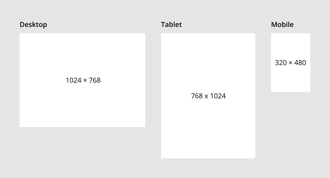
When creating wireframes it’s important to know what device types and sizes need to be supported and how their functionality will be prioritized. For some products it makes sense to use a mobile first design strategy to optimize mobile usability while still having good functionality on desktop.
Start by working with the smallest screen sizes for each devise type.
- Desktop: 1024 × 768
- Tablet: 768 x 1024
- Mobile: 320 × 480
3. Start Designing in Low Fidelity
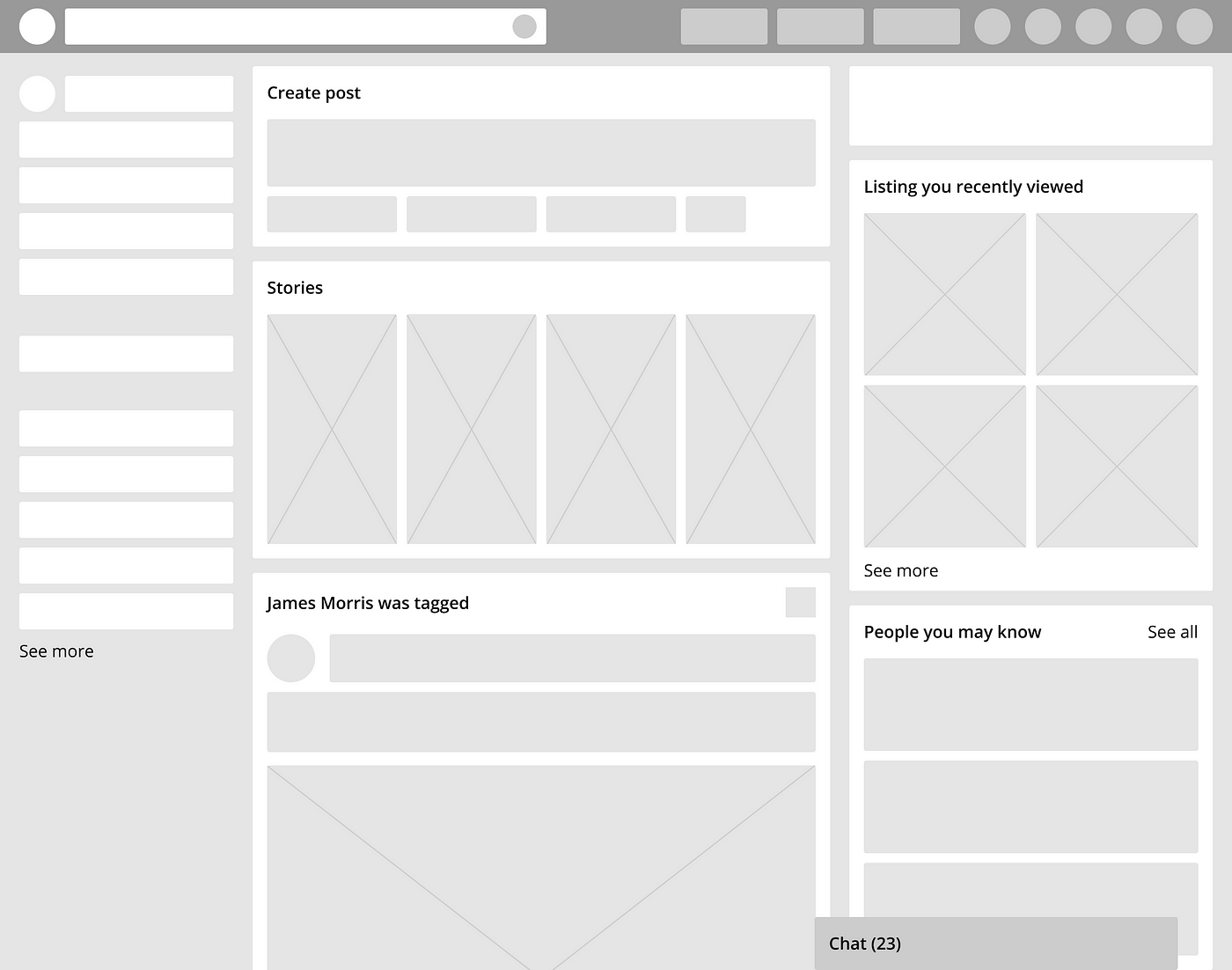
Keep wireframes simple and bare bones to start. This keeps the focus on high level concepts and allows you to make fast iterations.
Low fidelity:
- Grayscale color palette (ie. black, dark gray, light gray, white)
- Sparse, generic font with only a few variations (ie. size, weight)
- Represent all content with gray blocks (ie. copy, images, videos, charts)
For example, this is how the Facebook home page would look in low fidelity.
4. Create Navigation Patterns
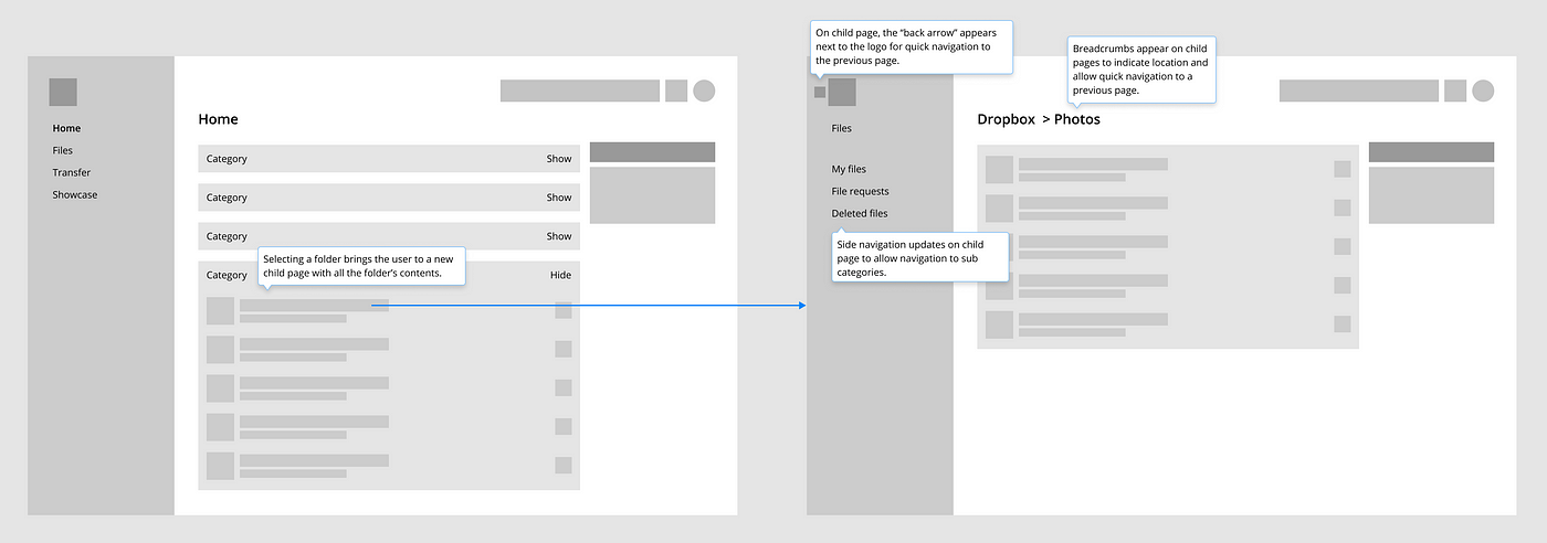
Start wireframing by determining how a user will navigate through the product. Navigation can have a large impact on the UX of the product and is important to get right before moving on to higher fidelity wireframes.
Some questions to consider:
- How many steps are involved to accomplish a task?
- When will the user need this information?
- How easy is it to find this information?
- How can a user return to a previous state or screen?
For example, when opening a specific folder in Dropbox there are many things to consider in terms of navigation.
5. Show Hierarchy of Information & Functions
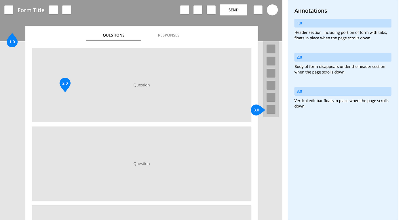
Show how information and interactive elements such as action buttons, input fields and hyperlinks will be prioritized on each screen. Consider how this layout serves the purpose of the page and the overall goals of the user flow.
For example, key actions in Google Forms “float” on the top of the screen so they are always accessible.
6. Define Feature Requirements
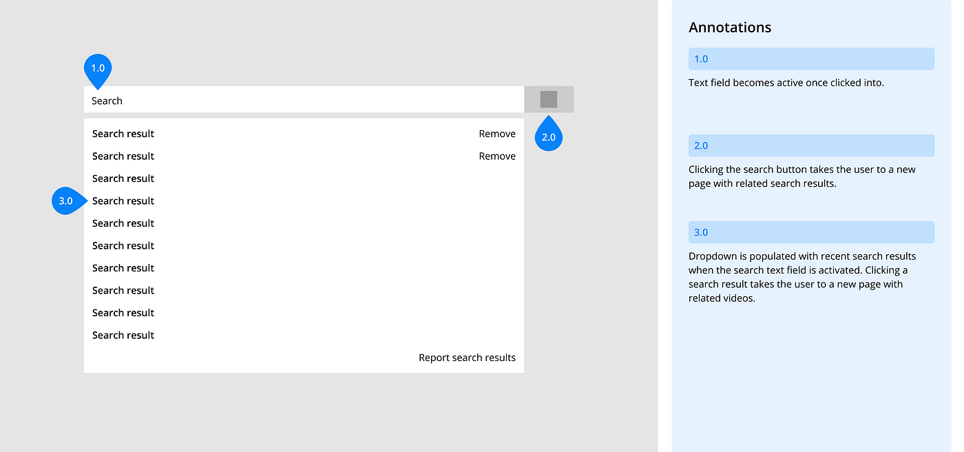
Identify and explain key functionality. This is important because the wireframes are static and can not demonstrate the intended behavior themselves.
For example, the Youtube search bar can be interacted with in several ways.
7. Show Different User Scenarios
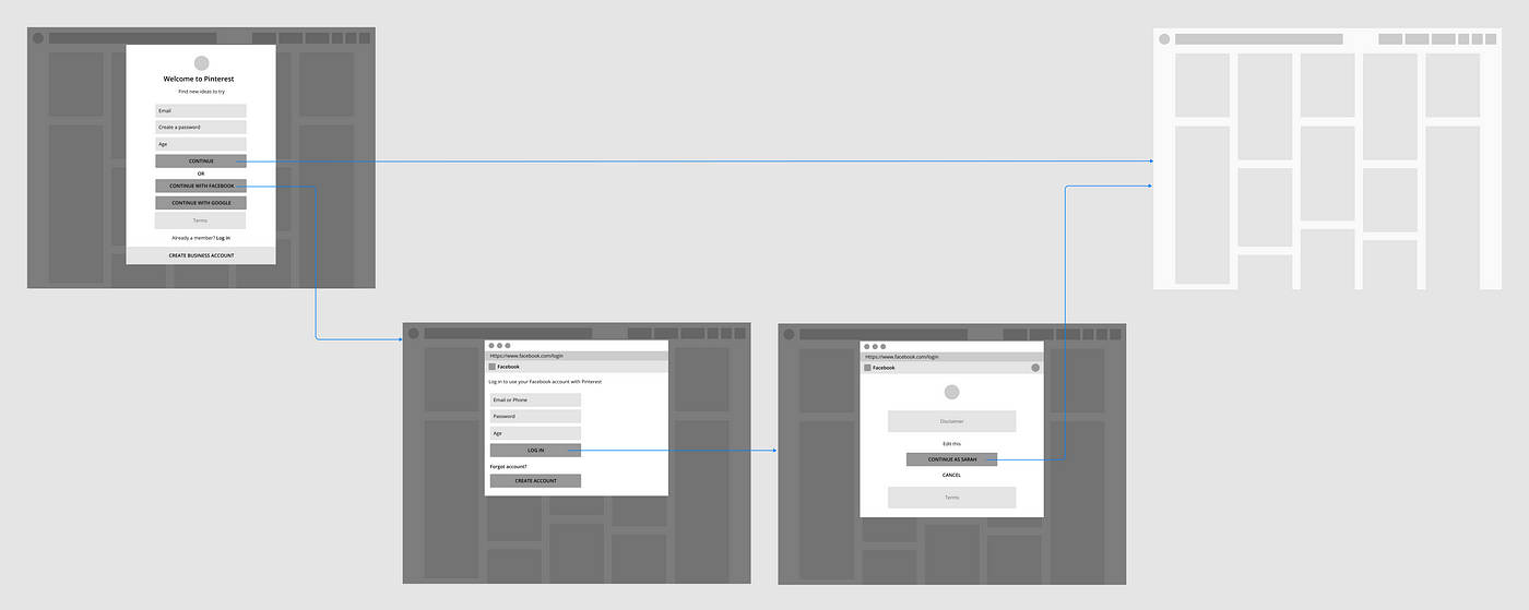
Show different paths a user can take in a single flow by mapping out the wireframes and documenting the rules for displaying certain types of information.
For example, when creating a new account on Pinterest a user can enter their details on the “create account” page or sign up through Facebook, which takes them on an alternate path before being brought to the home page.
8. Use Annotations
Annotations are used to explain the wireframes so clients and team members can understand how the design works and why it’s effective. These can be descriptions, an explanation or rules of a feature, or any other relevant information.
Annotation guide
- Keep annotations short and to the point.
- Use brightly colored numbered tags to indicate what each annotation is referring to.
- Use labels and speech bubbles to highlight important elements or functionality.
- Illustrate the user journey(s) with arrows.
https://cdn.embedly.com/widgets/media.html?src=https%3A%2F%2Fgumroad.com%2Fl%2FjsZMuM%3Fas_embed%3Dtrue&url=https%3A%2F%2Fgumroad.com%2Fl%2FjsZMuM&image=https%3A%2F%2Fstatic-2.gumroad.com%2Fres%2Fgumroad%2F8020988609155%2Fasset_previews%2F72a42bb5ea4d703333047c806b6cef7a%2Fretina%2FSlice_20%25289%2529.png&key=a19fcc184b9711e1b4764040d3dc5c07&type=text%2Fhtml&schema=gumroad
We’ve prepared a free annotation UI Kit for the next project. Each element has been created with saved styles and master components, to help you create better documentation.
9. Collect Valuable Feedback
Explicitly state the purpose of the wireframes and the goals they are meant to accomplish before presenting the work. With this information the client or team members will be able to evaluate the overall effectiveness of the wireframes and provide feedback that is relevant and valuable.
10. Increase Fidelity Incrementally
Once revisions have been made and there is consensus, bring the designs from low, to medium, to high fidelity. Start with only a few key screens to get buy-in then bring everything up to that level of fidelity.
Medium fidelity
- Some hierarchal visual design (ie. typography size)
- Realistic UI elements, but not styled
- Mock images and copy
High fidelity
- Emphasis on visual design and branding (ie. typography, color palette)
- Styled UI elements
- Realistic images and copy
For example, here is a module at low, medium, and high fidelity.

Closing
Wireframes are a great tool for experimenting with and communicating design solutions with the teammates or clients. They allow you to focus on what’s most important, high level concepts and functionality, before getting too focused on the branding aesthetics.