VMware inhouse Clarity Design System is a end-to-end design language to create simple, intuitive and beautiful experiences. Design System is a collection of UI components, foundations, and standards that help teams build beautiful product experiences. It offers three approaches for utilizing Clarity: just the UX guidelines, UX guidelines and our HTML/CSS framework, or and Angular implementation.
Versioning
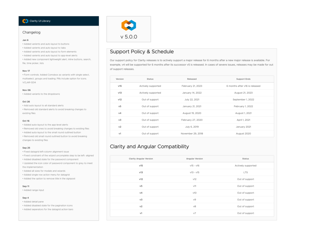
Clarity follows the pattern known as Semantic Versioning which is a description to change the version number for each release of Clarity based on what types of changes it has. This helps provide developers of Clarity a guarantee about what to expect when upgrading Clarity. By knowing the version of Clarity that users are using, you can figure out what features are available to use. User also can see what features have been added that users are not able to use unless you update, which may provide incentive to update.
Built in a clever way
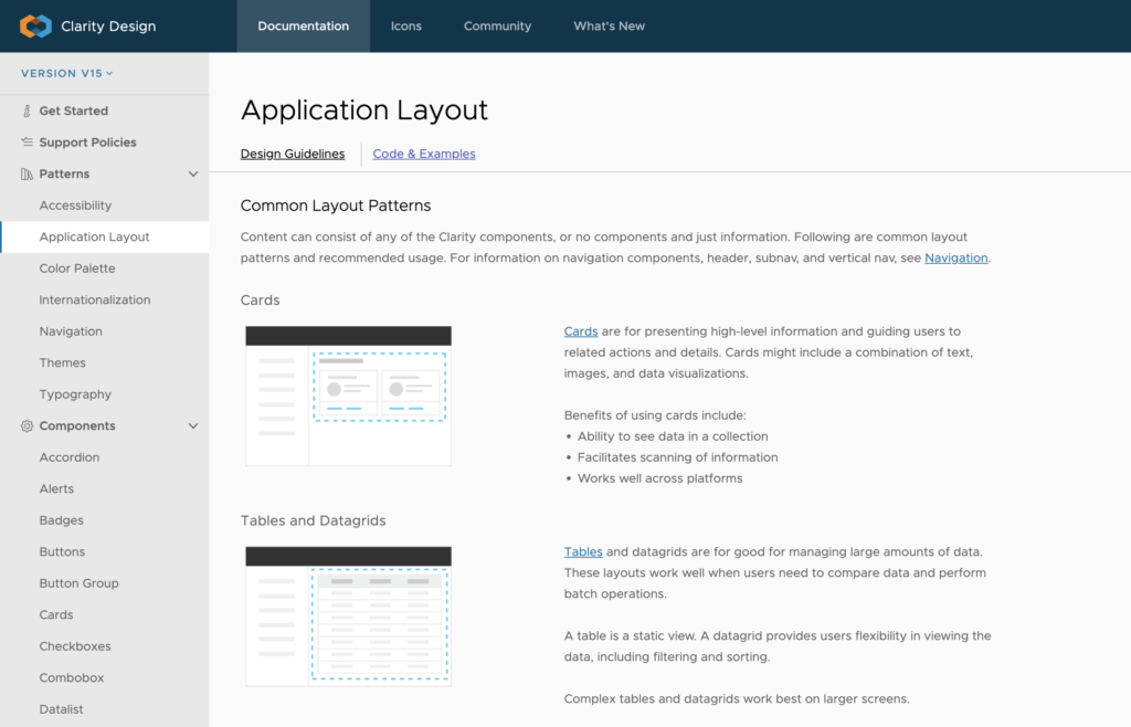
Components are separated into multiple pages and grouped inside each category, to provide the best navigation and best Instance menu experience. Many component and categories use emoji in their names to help you locate them faster.
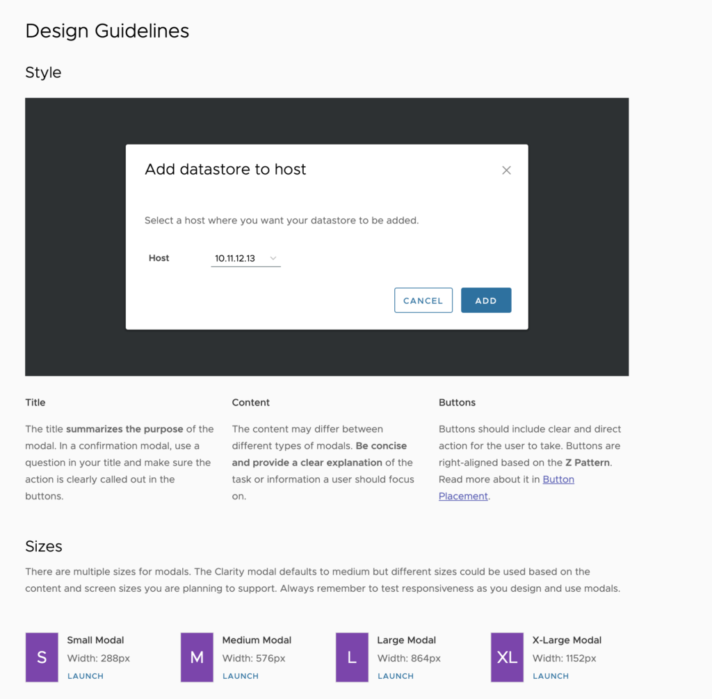
Design guidelines
These shared visual styles and components create harmonious experiences across Atlassian products.
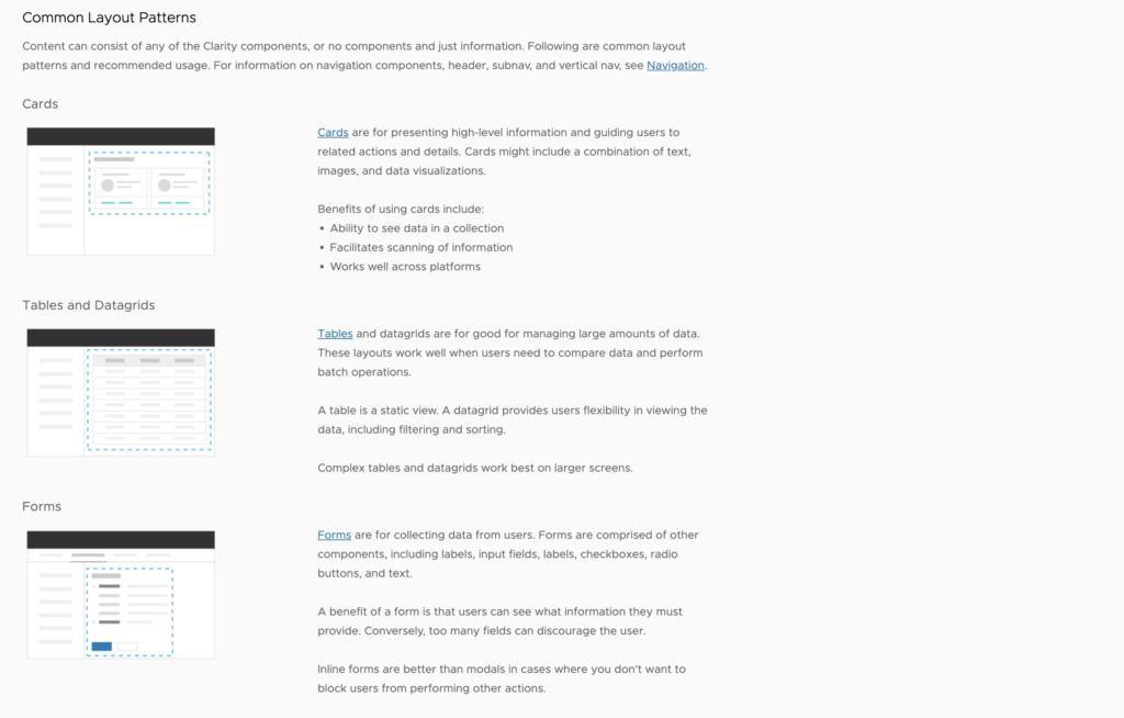
- Foundations are our core visual styles. Learn how to apply color, elevation, spacing, iconography, and typography to your designs.
- Components are reusable UI elements designed for specific interactions or needs. Explore our component documentation for design usage guides and visual examples.
- Patterns show common flows and solutions composed from our foundations and components.
- Content has writing guidelines for error messages and other common UI copy.
We established the visual language that a Clarity component should have (color, vertical rhythm, typography, etc.). They provide a natural place for the component design to be integrated into. It is from these files that the implementation details of the component will be documented as well as made available to other designers building Clarity applications once the component is released for production use.
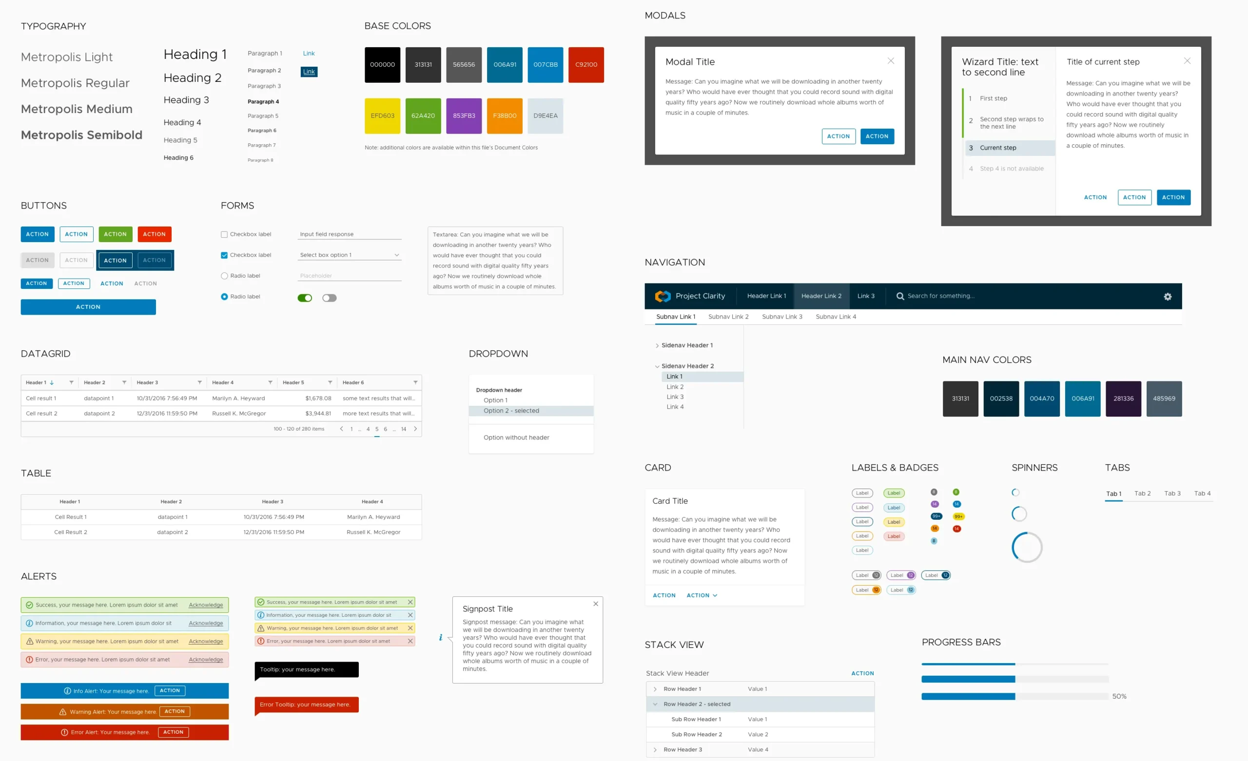
Color Palette
Full Clarity color palette, just for reference. All listed colors are available as Figma styles.

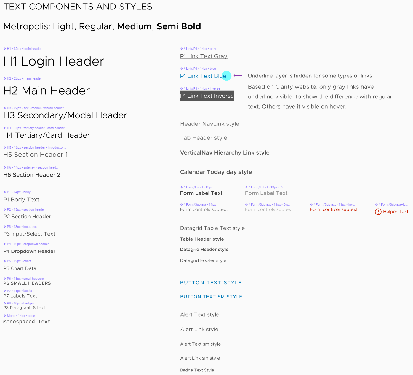
Typography
All paragraphs, links, and header styles are packed into text components for standalone use. All internal text elements are available as styles and in some cases as text components.
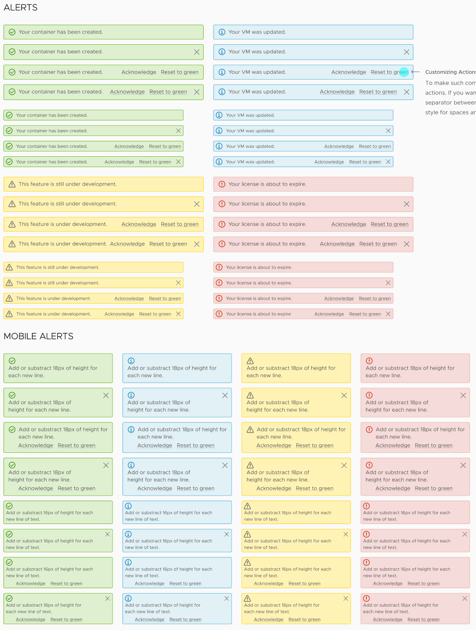
Alerts
Simple alerts in multiple variations and mobile versions.
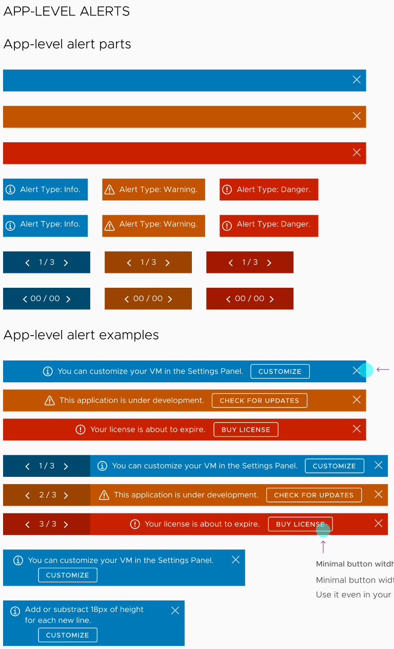
App Alerts
App-level alert constructor with multiple examples and mobile version
VMware design patterns are driven by our work with teams, customers, and product designers embedded directly within product teams. It does this by working with teams to better understand the standard patterns that can help them solve their problems.
Design system then bakes insights into code for engineering teams. Building a design system allows teams to focus more on the specifics of their user scenarios and less on the generic design patterns meant to deliver them. Clarity also ensures that as a company’s portfolio of user experiences grows, the look and feel and user expectations remain consistent.
Design Review
Design review is a process of refining the use cases, the visual look and feel, and discussing the dynamic behaviors for each of the use cases. Through this discussion, the desired features can be documented in the issue and preserved for the future.