Filters are everywhere. Filtering and Sorting helps you to find needed information from long lists of data. Let’s see best practices.

When I was working at company on a SAAS project, I faced a challenge which I never thought it can be so complicated. There was a page of Sales history, Shipments list, Clients list, Reports and Statistics… All lists had special filtering and sorting with different conditions like dates, statuses, categories and so on. I started searching best practices and tested their usability. So, I decided to share some of my findings.
Why do we need filter and sort?
Filtering helps to narrow down a large list of items based on specific criteria. For example, on an e-commerce website, a user may want to filter items by size, color, price, or brand to make it easier to find what they are looking for. Without filtering, the user would have to manually search through the entire list, which would be time-consuming and frustrating.
In this article I will talk about desktop version. Not mobile. In fact, mobile is another topic. I will write about filter for mobile apps later in another article. (Stay followed on medium or linkedin)
If you are UX designer you probably thought about these:
- Where to put filter components, top bar or sidebar?
- What should happen if any of filter element selected?
- How user will know which filters are selected?
- Where to put the buttons like “Apply”, “clear” or “reset filter” button?
- How to design complex filter with many criteria?
Basic concepts to understand
There are some common concepts to understand for all kind of filters.
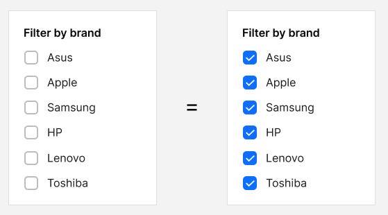
1. If there is nothing is checked that means everything will be shown. Some of websites (for ex: some airline booking sites) show all filters checked by default.
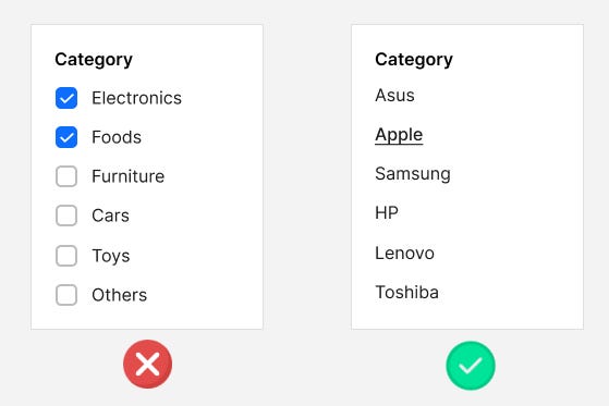
2. In most cases category should NOT be multi select by checkbox.
For ex. Toys and Foods are totally different items. It doesn’t make sense to show in the same list. Rather make it menu links.
3. There are two ways to let users filter:
- Automatically refresh list after each selection — interactive filtering (as known as Ajax reload)
- Batch filtering — selecting multiple filters and then click “Apply filter” or “Show result” button .
Both methods has its pros and cons. But today most websites using first variant: interactive filtering (refreshing content automatically)
Now let’s talk about different variants of filter
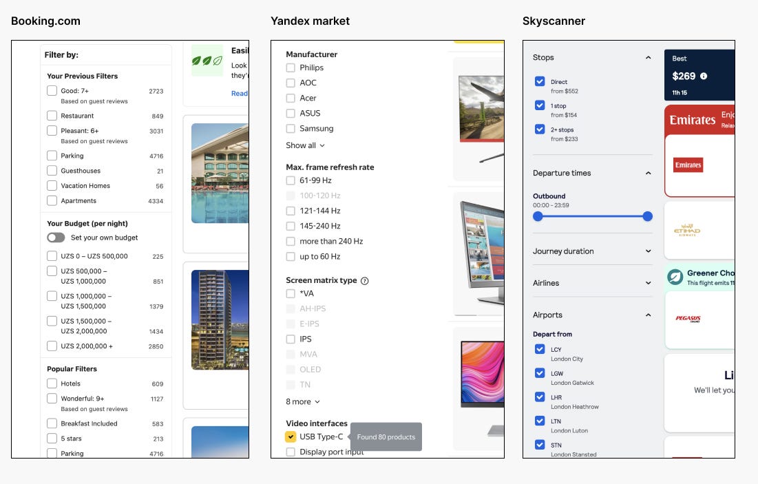
Sidebar filters (vertical filter)
Sidebar filters are common in most many websites. Here are some examples from the web:
Here is the most simple sidebar filtering:

Above example shows there is only “Reset” button after filter checked. Nothing extra needed.
But what to do if there are many filter groups (by brand, size, price) with long list of checkboxes?

It is recommended not to show entire list of available filter options (checkboxes or links). Show only 5–6 most important checkboxes/links and hide others under the “Show more” expandable button.
Also you can make whole group collapsible by clicking its title as shown above screenshot. In web development term it is called accordion.
Some websites use scrolling for long list of filter options. But it is not recommended.
So what should happen when something is checked?
First of all don’t forget to show loading box whenever filter is applied.

But there is a small problem with interactive filtering (auto reload page):
When user wants to filter by multiple brands and certain sizes, each checkbox reloads the content. Let’s imagine, user wants to filter by 10 criteria, That means 10 times useless reload. Each reload means sending request to server. So how to avoid useless reloads?
Here is the trick: Show false loading after each selection for 1 second or less. During the false loading period, the user can also select other filters. For ex. user selects a checkbox, then during the loading he may select another and another checkboxes. After multiple selection is done, false loading appears during 1 sec without sending request to make sure if user is not selection any filter. Then the filter will be applied by sending a request.
Some websites prefer batch filtering by clicking “Apply” or “Show result”
It is also helpful for user to know number of results within the button like “Show 12 results” before page reloads.

Both options has their cons and pros. But today it is very popular the first version: Auto-refresh content, especially for sidebar filter.
Here are some recommendations after filtering applied:
- Let user know how many items in total available based on that filter.
(For ex: 10 items found) - Let user clear all filter with single click “Clear all button”
- Show user which filters has been applied. User may forget that he/she is applied some filters from sidebar and that filter is hidden under “show more” link. There is a UI element called “chip”. We will show applied filter as “chip” at the top. “Chip”s can be removed individually.

Some websites don’t show applied filter at the top (as removable “chips”). So it depends on situation. If your app or any website like catalogue has too many criteria of filtering then it is better to show applied filters as “chips”.
More about chips:
https://mui.com/material-ui/react-chip/
https://m2.material.io/components/chips
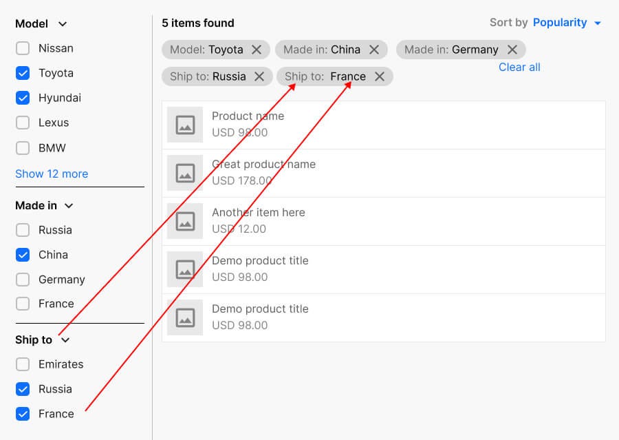
One more thing to keep in mind about showing applied filter:
Let’s imagine, some filter criteria are similar, For ex: Filter by: “Seat numbers” and “Number of wheels”. So, both are numbers. Another example: Filter by “Manufactured country” and filter by “Shipping to country”. Both lists are similar. In that case it is important to show the title of applied filter on every removable “chip”. Here is example:
Filter by single choice (radio button)
We have seen filtering by checkboxes which user can choose many options. But what about giving user selecting single choice?
We can do it by radio button.
More about radio buttons:
https://developer.mozilla.org/en-US/docs/Web/HTML/Element/input/radio
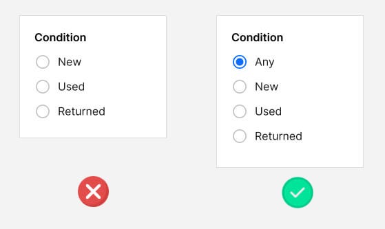
For ex: filtering by product’s condition: “New”, “Used”, “Returned”. User can select only single option.
By default, we should give the user the option to view all options.
Here is best practice for that.
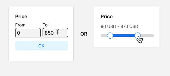
Filter by price
There is two ways of filtering by price. Typing manually or Range slider by dragging handle.
Filter bar at the top (horizontal filter)
This kind of filter is used in admin control panels, e-commerce sites and complex data lists. This is most challenging for UX Designers and Web developers. The list of options are hidden. So user must open dropdown to see filter options. This kind of filter is good, if you want to give user more wider content.
Filter bar at the top also can be interactive (auto-refreshing content) or batch filter by clicking “Apply” or “Show result”.
In the dropdown box we can put any UI component — checkboxes, radio buttons or input fields or just menu list.
Basic filter bar:
Usually we show all options by default. So dropdown button value is showing “Any” or “All”.
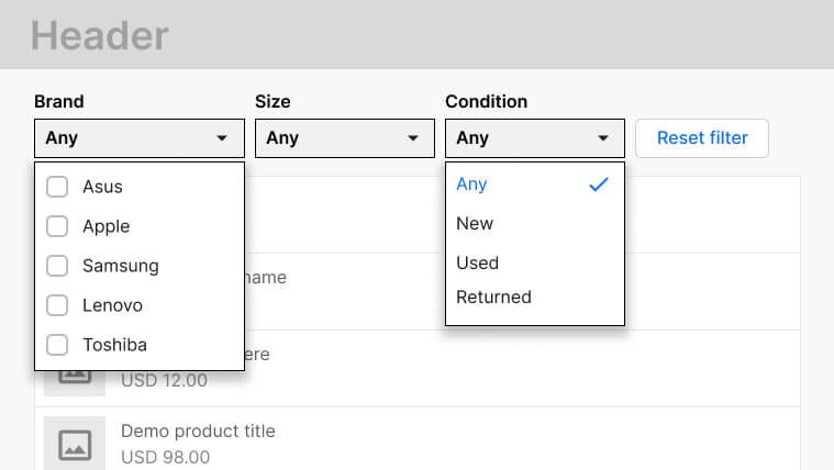
When filter options are selected, the page will reload (interactive filter)

In above example, “Brand” is multi selectable checkboxes, where user can select multiple options and close dropdown box.
But “Condition” part is single select only (menu list). Dropdown will be closed once option is clicked.

Advanced filter
Here is another UX approach for filters. Label text inside the select button.


The “chips” at the top help you see all the applied filters at a glance. Because the user may forget which filters have been applied. And it’s easy to remove. You should also always give the option to remove the entire filter with one click: “Reset filter”.
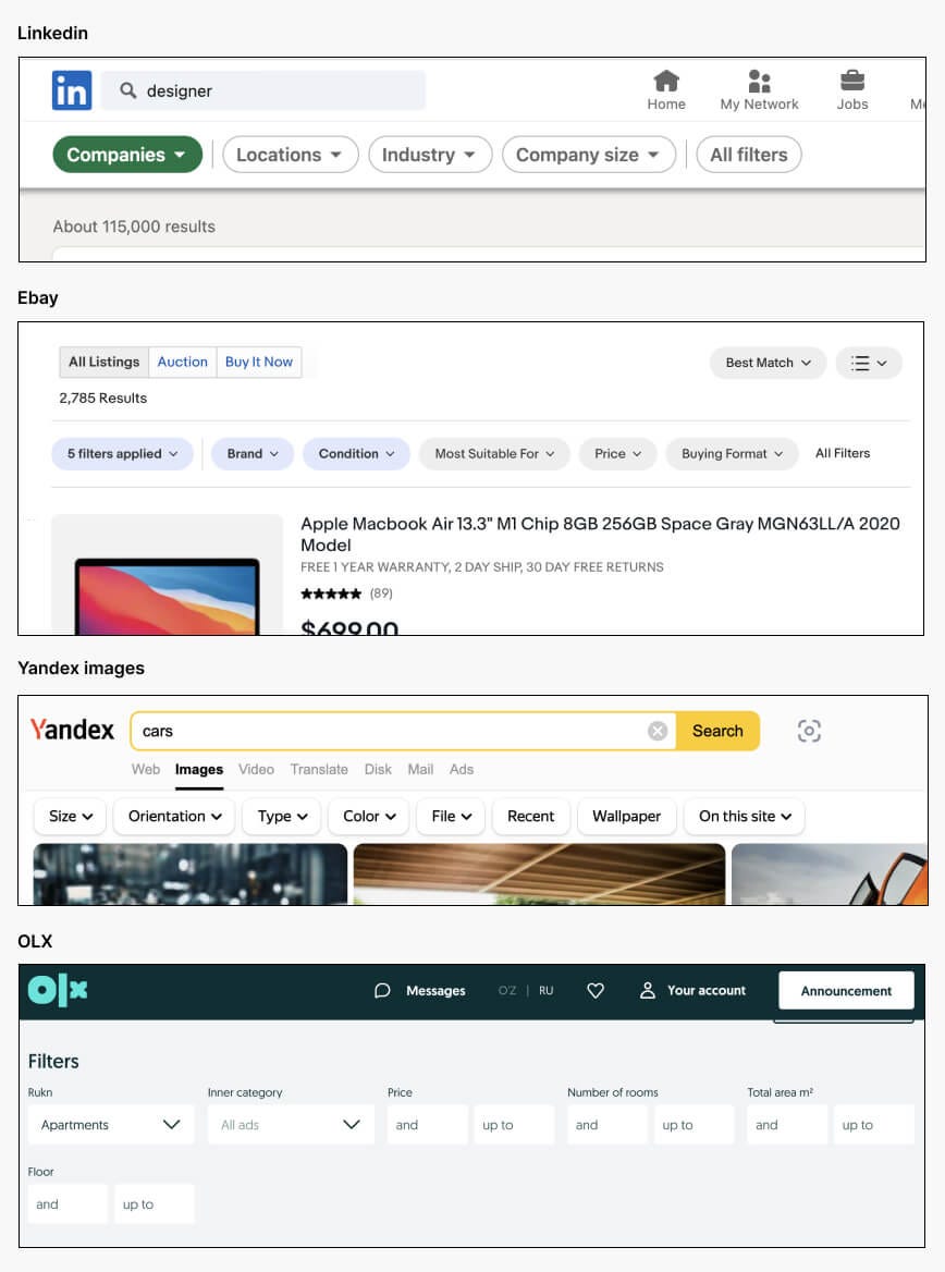
Filter bar with “All filters” button
What if there are many filter groups? For users there is no need all the filters to see at the top. Sometimes user will never use certain filters.
Show only most important filters. Rest can be opened by clicking button “All filters” or “Show all”
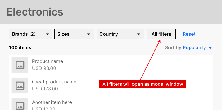

Another way to show as modal window at the center of screen.
For ex: Ebay and LinkedIn use this approach:

We can put any component on the modal window. For ex: Dropdown boxes , checkboxes and so on. Here is an example:

Remember! It is good practice to show all filters on modal window. Don’t show only remaining (hidden) filters on modal window. Why? Because if you are showing only some filters on modal window, then what should happen if user clicks “Clear filter” or “Reset” button. Should we clear all filters or only “visible” filters at the top bar. Or should we clear only filters on modal. This is debatable question.
Advanced dropdown box with search and action buttons
When user opens any dropdown, how to close it?
– Click on same place where you opened
– Click outside area of dropdown.
This sometimes may confuse users. When I did some usability testing. Some of users didn’t know how to close the dropdown after opening it.
Another problem: if you are showing full list of countries as dropdown list, it is very difficult to find and select from the list of 200 countries.
Here is the solution from my perspective:

On above screenshot, you can see there is a “Reset” button. You can put “Cancel” or “Close” also depending on situation. If nothing has changed on the list, then “Close” button will make sense. If user changes filter list, then “Reset” is more useful, rather than “Close”.
Another example with price filter:

Another way of showing list of applied filters
On ebay website there is special dropdown box which shows all list of applied filter criteria as known as “chips”.

That approach helps to save some extra space from content.
Filter with date range
Filtering by date is also important for some apps. If you are owner of ecommerce website. You might have an admin panel to see history of sales.
How you can see all sales made between xx and yy dates.

Here is better solution for date: First give option to quick select, like “Today”, “Yesterday”, “This month”, “Last month”, “This year” and at the last “Custom period”.

From my usability research it is easy for users to select “Start date” and “End date” separately. Not from single datepicker box. But might be different for your case.
Another method of showing date filter in single dropdown with quick selections:

If you are UX Designer be aware of what components is using your dev team. Don’t overcomplicate it. Talk with front-end developer if you are doing something new.
Here are some documentation about datepickers:
https://mui.com/x/react-date-pickers/date-range-picker/
https://rsuitejs.com/components/date-picker/
https://mui.com/x/react-date-pickers/date-range-picker/
Filter with custom conditions
There are some web apps with conditional filtering.
Here are some examples from the web


Filter + search
It is very common to apply filter with specific searching keyword. Search functionality is a very big topic.
Few thing you can add to improve UX for search component
- Using auto suggestion or autocomplete
- Button to clear whole text with single click
- Show recent search history as suggestion

For some cases you can give user to search among certain group:

By default search will find from all matching texts in database. But you can choose option to find from only certain group or category.
Sorting
Sorting allows user to arrange the data in a particular order, such as alphabetically or numerically. Sorting doesn’t hide or show extra information. It only re-arranges list order.
Here are most popular sorting options:
- Recommended
- Sort by A-Z
- Sort by Z-A
- Price: Cheapest first
- Price: Expensive first
- By rating
- Popular
- Newest
There might be other sorting options as well.
Read more about filtering:
1. https://www.nngroup.com/articles/applying-filters/
2. https://baymard.com/ecommerce-design-examples/filtering-options?desktopWeb=true