Autocomplete suggestions help save time by completing a word or phrase as a user is typing. Here are seven best practices for its design. Anything that helps users easily make a decision impacts their satisfaction and overall experience. Predictive search is one such tool. Like the name says, this search engine feature predicts what a user might be searching for, and is tied closely to what has already been typed into an input field like a search box.
1. Always Show Suggestions On Focus

When do we start showing suggestions? Typically, this happens after a few first keystrokes — and usually that’s a recipe for trouble. There will always be some portion of users who always look at the keyboard while typing — usually we just don’t know how many people do so.
Often it’s only after a user finishes at least some part of their input that they will verify it on screen. So if we display autocomplete suggestions too late, some people will never learn that your site provides an excellent autocomplete support.
We can indicate autocomplete with a search icon, or a chevron icon, as well as a sensible placeholder, such as “Select an option…”. It also works best to always display autocomplete suggestions immediately: with frequently used or most relevant options, for example. It’s just more obvious this way.
2. Use Tap-Ahead Autocomplete Suggestions

If you take a close look at the example below, can you spot the arrow on the right-hand side of keyword suggestions? Now, do you know exactly what they are, and how they are different from regular keywords? Chances are high that you don’t.
While the tap or click on the keyword will bring you to a search result page, the click on the arrow appends the search query to the search box, without executing search. So you can gradually construct a more sophisticated search query, relying on relevant suggestions. It’s useful as users can move forward confidently, and never end up on a zero-results page.

The problem is that this pattern has very low discoverability. Most people just don’t know how it works. A much better way to design this feature is by providing chips or badges underneath the search box, like the newer iteration of Google does. This pattern is often called tap-ahead suggestions — and it’s always a great add-on for every autocomplete.
3. Show A Diversity Of Suggestions
We often assume that users are just looking for the right search query, but it’s not always true. The search box is often used as a shortcut strategy to get to a particular category or products, and we can help users get there.

Additionally to keyword suggestions, we can show relevant categories, or even products with thumbnails, availability and pricing. Of course, they also need to include distinct icons and typographic treatment to be recognized as such.
Showing a diversity of suggestions helps users get where they need to go, faster — and it might work very well as an additional way to expose featured products. In fact, users might appreciate this feature very much.
4. Provide Autocomplete Filters

If a large number of your users are expert users, consider turning the search autocomplete into a sophisticated query builder — with filters, sorting and attributes that can be defined straight from the search box.
5. Support Keyboard Navigation

It’s worth stating that a good autocomplete UX always supports keyboard navigation. Usually users would use Up/Down keys to navigate the list, and Enter to submit a search query. This of course requires a selected search query to be highlighted during navigation in the list, and the search suggestion should be announced by screen readers as wel
You can find an example of an accessible autocomplete component in Adam Silver’s article on Building an accessible autocomplete control, along with the markup, CSS, JavaScript and a working demo.
7 UX Design Best Practices for Autocomplete Suggestions
1. Functionality over Aesthetics
Your user input field should be easy to find, use a text-entry search field, and leverage a visual cue like a “magnifying glass” icon to indicate that users can search.
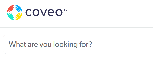
Adding a leading prompt inside the search field can help users orient themselves (e.g., “What are you looking for?”), as illustrated with our own search box below:
2. Focus on UX and Placement
Autocomplete features are only helpful if the placement of the search box is obvious.
In addition to being easy to find and use, the search box should be available on every page of your website. Put it in a place users expect to see it.
Research supports a search field that’s integrated with your website’s navigation, generally placed at the top right or center of the screen.
3. Avoid Common Interaction Issues
Pay attention to common interaction issues like lack of visible options when the user first activates their search box or only showing limited suggestions until a certain number of characters is entered. Here are some other things to avoid:
Inadequate font sizes
While the exact font size may vary, autocomplete options should be easily readable. Test font sizes on different devices so you can see how it appears across a range of devices, operating systems, screen sizes.
Cramped spacing
As with font size, adequate space for words and phrases contributes to improved readability. Font should be legible, with words and letters spaced in such a way that there’s no crowding.
Small hit areas
In the context of autocomplete design, “hit area” is the region that a user can click or tap on to select an autocomplete suggestion. Make sure you avoid small hit areas which can lead to mistakes or frustration. An appropriately sized hit area ensures that users can easily select the suggestion they want.
4. The Devil’s in The (UX Design) Details
There are a few design details that can not only improve UX, but also ensure that users are more likely to find the information they need. Make sure to:
Keep the autocomplete list manageable
Too many autocomplete suggestions can cause analysis paralysis in users. When suggestions exceed around 10 items on desktop (and around eight on mobile), users either ignore suggestions or spend too much time reading through them.
Differentiate scope and query suggestions
Scope suggestions prompt users to refine their search by narrowing down the list of results. For example, if someone types in “trees” into a garden center’s website, a scope suggestion could be “trees that thrive in California”.
Query suggestions suggest specific queries based on what a user types into the search box. These should be differentiated visually (e.g., through distinct colors, font weights, or icons).
Highlight suggested queries
A suggestion should appear when the user starts typing and remain visible until the user selects an option from the autocomplete list.
Highlighting the suggested query text helps users differentiate what the autocomplete is suggesting versus what the user typed in.
In the below example from Coveo’s search box, the user typed in the word “knowledge.” In the list of suggested queries, the autocomplete text is bold so it easily stands out from the user’s query.

5. Adhere to Desktop Best Practices
On desktops and laptops, autocomplete UX should focus on keeping search uncluttered, enhance usability, and reduce user frustration/confusion. Best practices include:
Offer keyboard navigation
When on their desktop, many users are comfortable navigating many search features using their keyboard navigation.
This means up and down arrows should navigate, as described, up and down a list of autocomplete suggestions.
The return key should submit the user’s choice.
Limit Number of Options Shown
To avoid choice paralysis, show a limited number of autocomplete suggestions. This also helps ensure that autocomplete suggestions are visible without scrolling.
If the input field has a fixed height, then it may force users to scroll through results, which can be challenging for users.
Lower visual noise
Visual noise like images, too many colors, and keyword separators can look cluttered and ultimately confuse users.
Keep it simple with a limited list of suggestions that get users to where they need to be without too much fuss.
Highlight the selected (“active”) suggestion
The active autocomplete suggestion is the suggestion that is highlighted or selected by the user. The user makes their selection by hovering the mouse over the term or phrase or using the arrow keys to navigate through the list of suggestions.
Highlighting the active suggestion with a different background or text color helps distinguish it from the other autosuggestions.
Make search stand out on the page
Give your entire search bar — including the autocomplete feature — visual depth so that it stands out from other elements on the page.
For example, give it a clear border or dim the webpage when a user activates search.
Use title case
Presenting autocomplete suggestions in title case (or “headline-style”) makes them easier to read.
6. Adhere to Mobile Best Practices
Auto-completion is a highly interactive and transient experience which can confuse and derail users, particularly when they’re searching from a smartphone or other mobile device. Adhering to mobile design best practices is essential.
Here are two guidelines to keep in mind:
Limit visual competition
On mobile, it’s particularly important to reduce visual competition from external elements like ads, chatbots, and images. Since screen size is small, your search bar is competing for limited space and user attention.
Maximize search term space
Providing adequate space for autocomplete query suggestions is crucial on mobile devices. Design for visual depth and simplicity, use text wrapping, and obscure the last visible suggestion for optimal visibility of the active suggestion.
Finally, it should be intuitive for the user to exit autocomplete by clicking an icon like an X or “Exit” button.
Wrapping Up
Autocomplete can do much more than just highlighting keyword suggestions. By showing suggestions on focus, using tap-ahead suggestions, exposing users to relevant details from the search box and allowing experts to make the best out of the results before even executing search, we can make autocomplete more efficient and relevant.
The main benefit of autocomplete is the increased speed of accurate and relevant input. Once users know that there is autocomplete, and understand how it works, we can help them increase task completion rates and task completion speed. And that’s something not many component can do as well as autocomplete does.